Admin guide
Everything you can do in the dashboard.
A configurator shows exactly what your organization's catalog says: the parts, what they are made of, which choices a shopper gets, and the rules that decide what is allowed. This guide walks the dashboard screen by screen — first the setup chain in the order it has to happen, then every other page, then the handful of things that catch people out.
Getting in
Your organization, your team, and where to find help.
Signing up creates an organization. Everything you build belongs to it, and everyone you add sees the same catalog.
Sign up and sign in
admin-configurator.imagine.ioSign up with an organization name, an email and a password, or with Google or GitHub. You must accept the Terms of Use and Privacy Policy to create an account — the box sits just above the Sign up button and applies to the social buttons too. The first user becomes the organization's owner. Forgotten your password? Forgot password? under the sign-in form emails you a reset link.
Switching workspaces
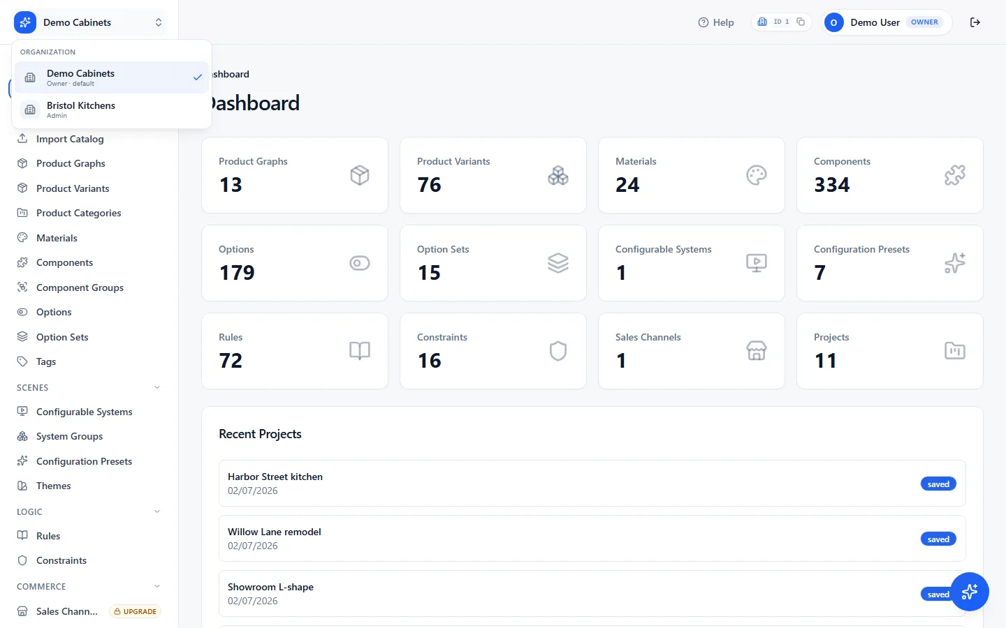
Top-left — your organization's nameIf you belong to more than one organization, the name at the top left is a switcher. Pick another and every page reloads under that organization: its catalog, its systems, its billing. The header shows which one you are in, with its ID and a copy button — support will ask for that ID, so it is one click away.
Roles
Settings › UsersThree roles, set per person. Owners and admins see everything under Settings; members see the catalog and scenes but cannot change them.
- Owner — everything, including transferring ownership to someone else.
- Admin — everything the owner can do, except transfer ownership. Users, branding, API keys and billing are all included.
- Member — read-only across the catalog, scenes and logic.
Help
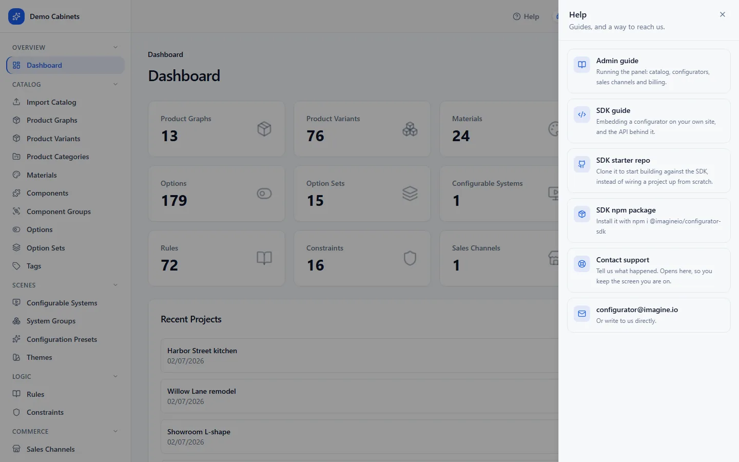
Top right — HelpThe Help button opens a drawer with this guide, the SDK guide for developers, the SDK starter repository on GitHub, a Contact support form, and the support address. The form opens in place — you keep the screen you were on — and it already knows your organization and the page you came from, so you only describe what happened. It takes attachments, so a screenshot goes straight in.
The assistant in the bottom-right corner is covered in its own section below — it does considerably more than answer questions.
Dashboard
A count of everything in the catalog.
The first page after signing in. Each card is a total and a shortcut: click one to open that list.
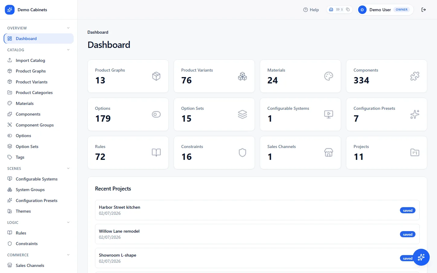
On the Free plan a banner above the cards says the organization is non-commercial and its configurators carry the imagine.io watermark, with an Upgrade button. Pages your plan does not include show an Upgrade pill in the sidebar and open to an explanation rather than disappearing — see Plan and billing.
The assistant
Ask it where things are. Or ask it to do them.
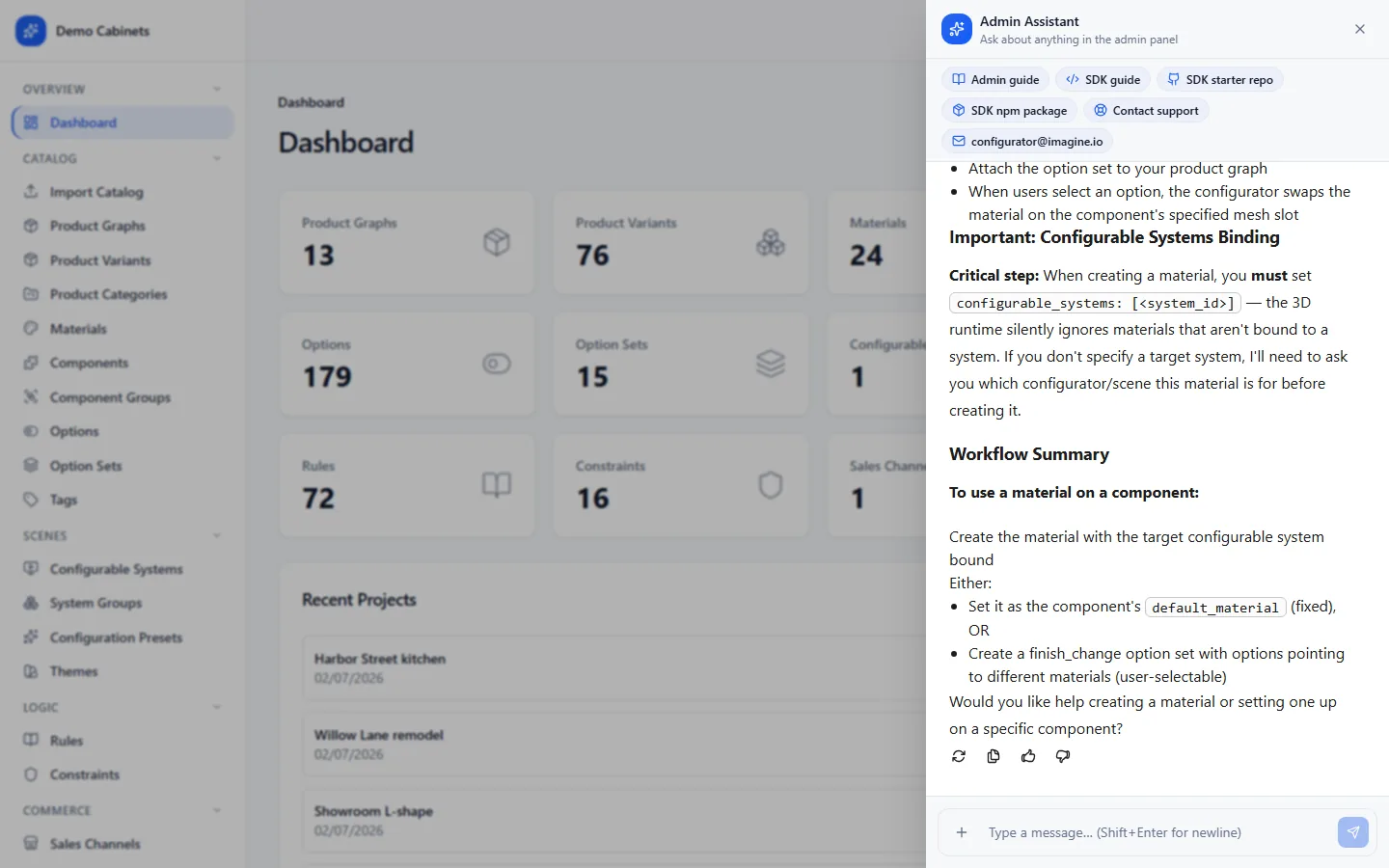
The sparkle button in the bottom-right corner of every page opens the Admin Assistant. It knows this dashboard, it knows your catalog, and it can change your catalog for you. Included on every plan.
Ask it things
It answers in terms of the dashboard you are looking at, not in developer terms: which page something lives on, what a field means, how to get from here to there. Where a page is the answer, it gives you a link straight to it. When a question is outside what it can do — a bug, an invoice, a person — it points you at the guides or the support form rather than guessing.
Ask it to do things
Describe what you want and it works in the catalog directly, then tells you what it did with links to each thing it touched:
- Create, edit or remove materials, components, products, variants, options, option sets, rules, constraints and more.
- Add options to an option set, or take them out.
- Wire a finish or part option to the component it swaps in, by name.
- Attach components and option sets to a product or a variant; add variants to a preset.
- Open a system's draft and add option sets to it.
Give it files
Use the + button, or drop files or a whole folder anywhere on the panel. It reads spreadsheets, PDFs, Word documents and text; it looks at images; it inspects 3D models for their structure. Two things this makes possible:
- Build a catalog from a folder. Drop a folder holding a README or spreadsheet that describes the products, alongside the
models/andtextures/it refers to. It reads the description, uploads the assets, and creates everything in dependency order — materials before components before products. - Fix an import. When Import Catalog reports problems in its review step, Ask AI about these issues opens the assistant with those problems already in front of it.
Two things it will not do
- Publish. Publishing is what puts a change in front of shoppers, so it is always yours. When its work is ready it stops and hands you a link to the system: Layouts › Publish.
- Place products in a scene. Where each variant sits is set in the configuration preset editor, by hand. It will get a system and its option sets ready, then point you there.
Do these in order
Set up a configurator: each step uses the one before it.
The catalog is a chain: materials and components exist first, variants group them, option sets present the choices, and a configurable system ties it together. Working out of order means going back.
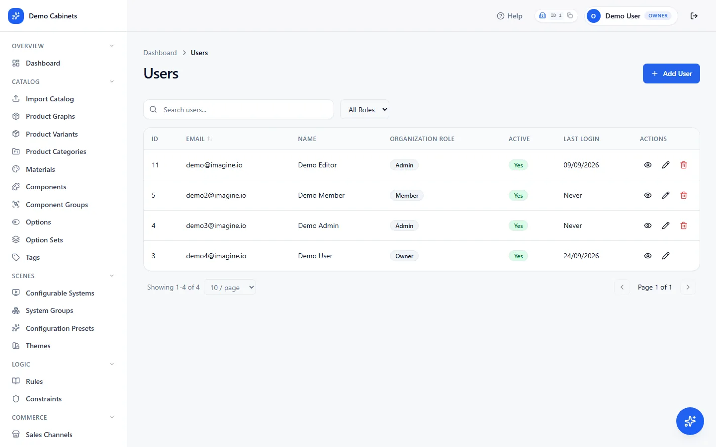
Create your organization and add the team
Settings › UsersSigning up creates your organization and makes you its owner. Add whoever else needs access with Add User: their name, email, role, and a password you choose and pass on to them. To change a role, or to set someone a new password, edit the person. Team size is unlimited on every plan.
- Owner — everything, including ownership transfer.
- Admin — everything except ownership transfer.
- Member — read-only.
Add materials
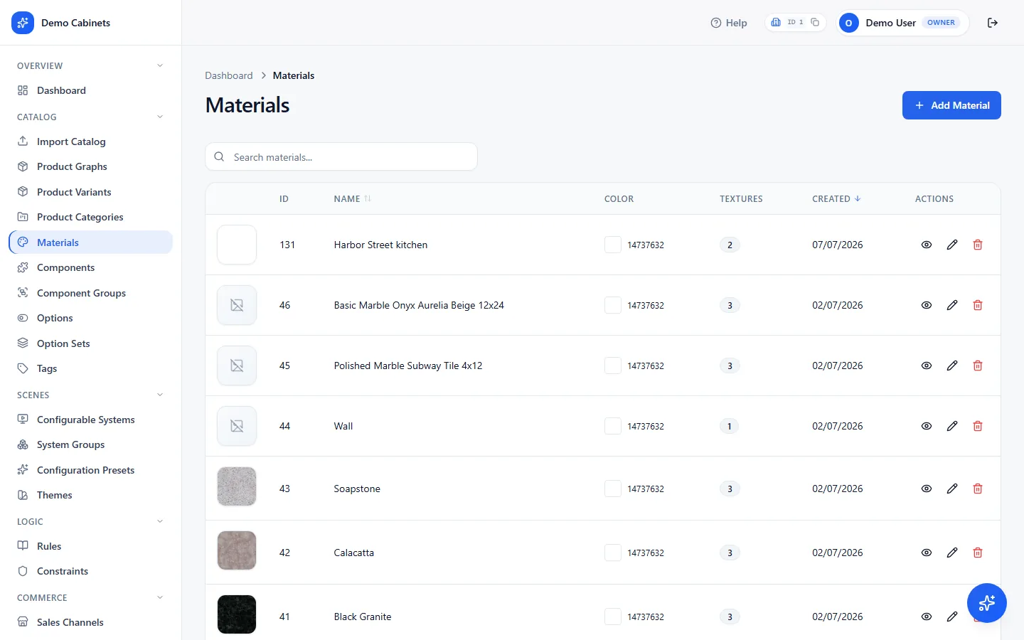
Catalog › MaterialsEvery finish a shopper can pick: an oak, a fabric, a worktop stone. A material has a type, a colour, and the surface properties the 3D scene uses — metalness, roughness, tiling — plus its texture maps. Upload a thumbnail; the shopper sees it as the swatch. Materials come first because components and options both point at them.
Upload components
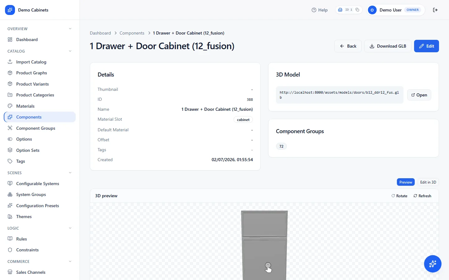
Catalog › Components · Component GroupsThe physical parts, each with its 3D model as a GLB file: a cabinet door, a sofa arm, a worktop run. Name the material slots on the model so a finish option knows which surface it changes. On the component's own page, add anchor points — the spots where other parts attach. Parts that can stand in for each other go in a component group, so a rule or an option can swap between them.
Build products and their variants
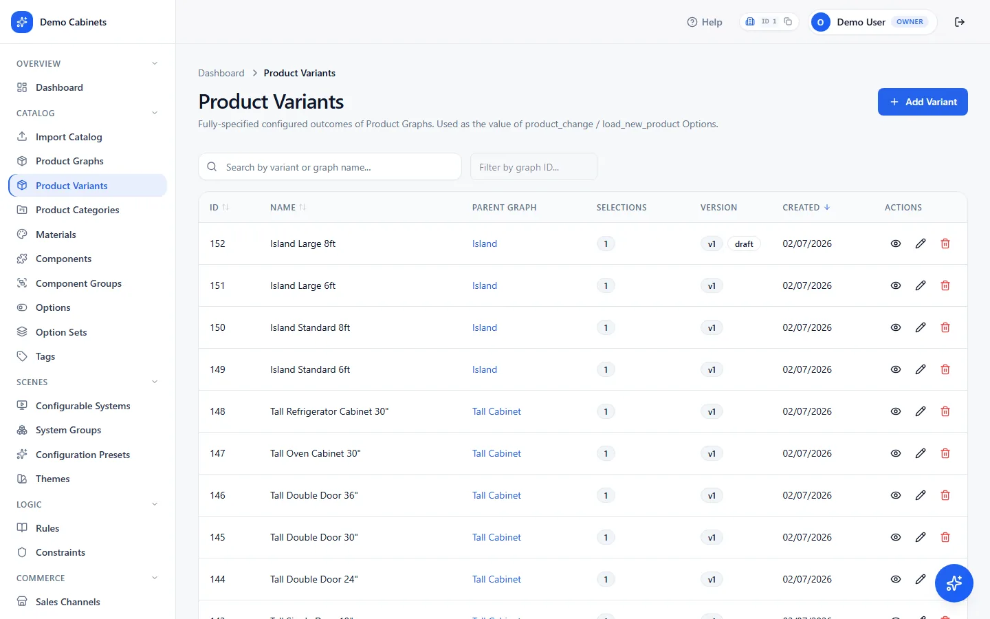
Catalog › Product Graphs · Product Variants · Product Categories · TagsA product graph is the catalog item and its structure — a base cabinet, say, with the components it is built from and the option sets that apply to it. A product variant is one fully specified version of it: the single door at a particular width, in a particular finish. Variants are what actually get placed in a scene; the base price sits on the product they belong to.
- Categories group products for browsing.
- Tags are a shared vocabulary you can put on products, components, materials and systems — useful for filtering, and for rules that need to say "any tall unit".
Create option sets and options
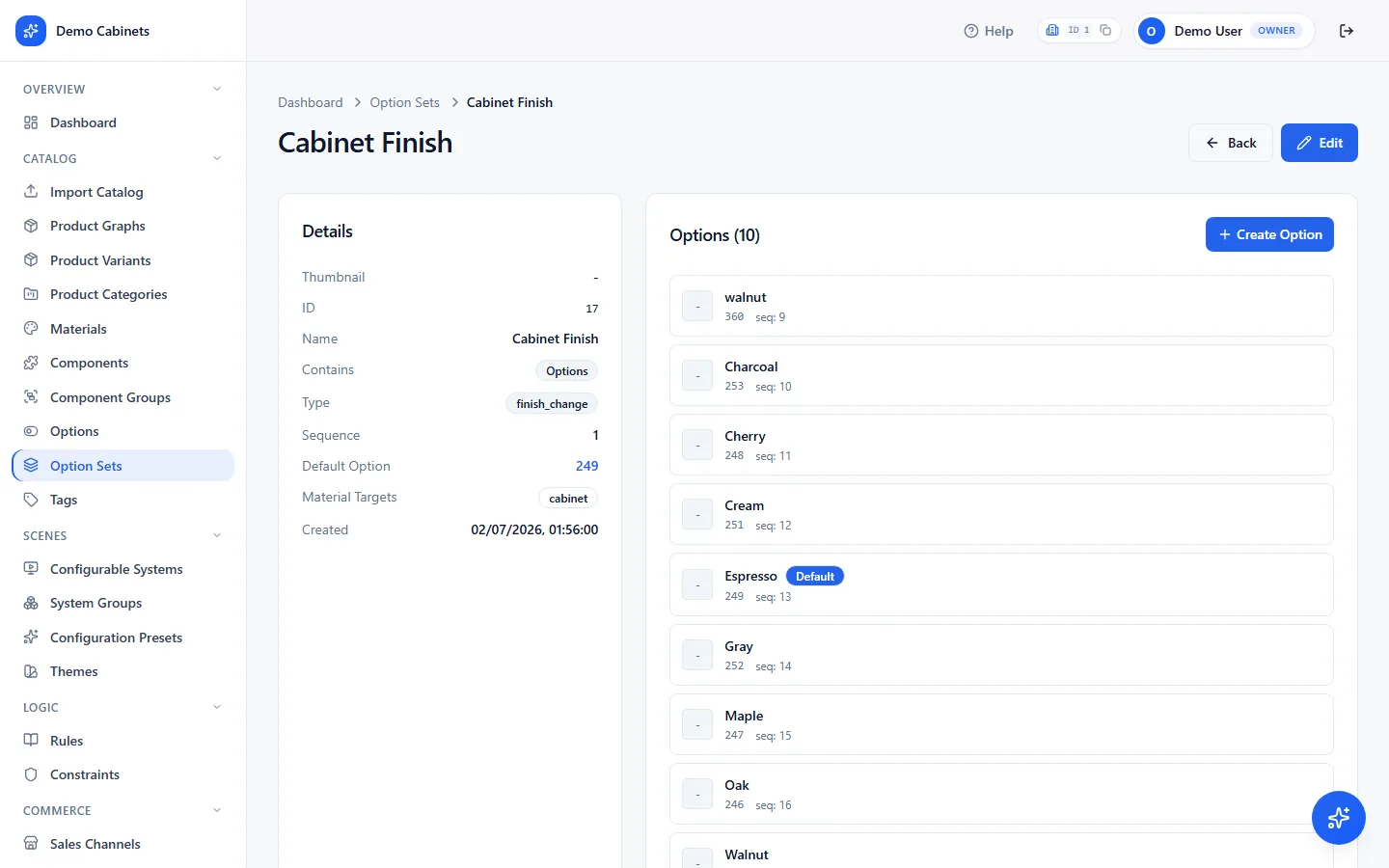
Catalog › Option Sets · OptionsThis is the shopper's interface. An option set is a choice group — Fabric, Worktop, Handle; an option is one choice within it. What picking an option does depends on the set's type:
- Finish change — swaps a material on named slots.
- Load new component — swaps one part for another.
- Load new product — adds a product variant to the scene, an appliance for instance.
- Product change — replaces the placed variant with another of the same product.
- Load configuration — applies a saved preset.
Add rules and constraints
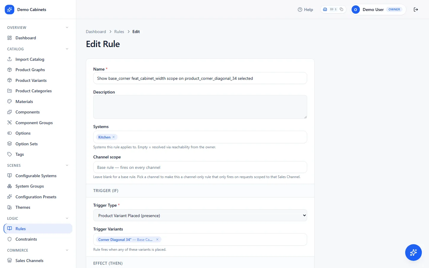
Logic › Rules · ConstraintsRules react: when this option is chosen, do that. Constraints are limits that always hold, like a maximum run length or a part that cannot sit above a hob. Both are evaluated on the server on every shopper action, so a shared link, an embed and an SDK integration all behave exactly the same.
Assemble a configurable system
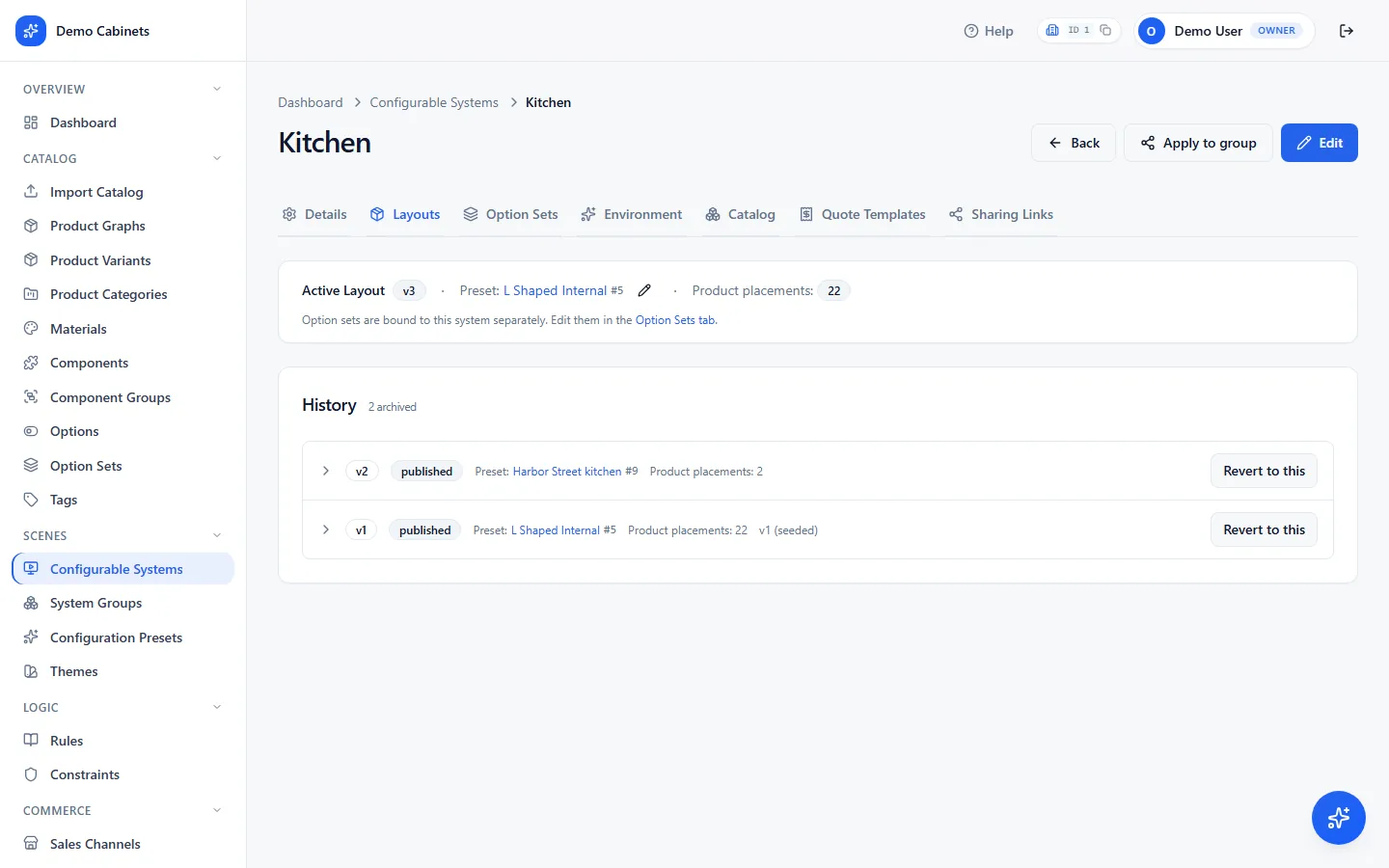
Scenes › Configurable Systems · Configuration Presets · System GroupsA system is one configurable product line — a kitchen, a sofa range — tying together the products, option sets and rules a shopper can reach. A system's page has tabs:
- Details — name, description and placement type (countertop, built-in, freestanding, wall-mounted or undermount). The interface toggles live here too: switch off the scene toolbar, the selection action panel, or the panels and assistant for this system, or leave each on Inherit.
- Layouts — the draft you are editing, the published version live sites load, and the history. This is where Publish lives.
- Option Sets — which choice groups this system offers, in what order, with what default.
- Environment — lighting, HDR backdrop and post-processing for the 3D scene.
- Catalog — everything assigned to this system: products, components, materials, rules and constraints, grouped.
- Sharing Links — the public links, covered in the next step.
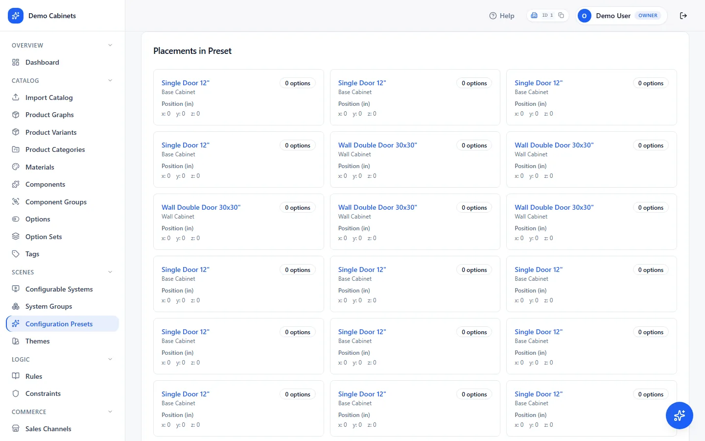
Presets: the scene a shopper starts from. A configuration preset is a saved arrangement — which product variants are placed, and where. A system points at one as its default, so every session opens on something finished rather than an empty scene. Three steps:
- Create it — Scenes › Configuration Presets › New. A name and a description.
- Place products — open the preset and, under Placements, add each product variant and set where it sits. Add as many as the scene needs.
- Point the system at it — open the system › Layouts › Change preset, pick it, then Publish. That publish records a new layout version.
System groups bundle systems so one system's settings can be applied to all of them at once.
Publish a public link — no developer needed
Scenes › Configurable Systems › Sharing LinksEvery system can have one or more links. Each is a ready-to-use URL that opens the full configurator on its own page. Share it directly, put it behind a button on your site, or embed it in a page with an iframe. Nothing has to be built for this to work. Each link has:
- Name — where this link is used, such as "Storefront" or "Dealer portal". Make one link per place so each can be switched off on its own.
- Theme — the look this link opens with. Leave it empty to use the default theme.
- Allowed domains — the websites permitted to embed this link in an iframe. Add your site's domain before you embed. Leave it empty while testing.
Links made here open the configurator with no sales channel. For a link that carries a channel's prices and option defaults, create it from the channel instead: Commerce › Sales Channels › System Config › Sharing Links.
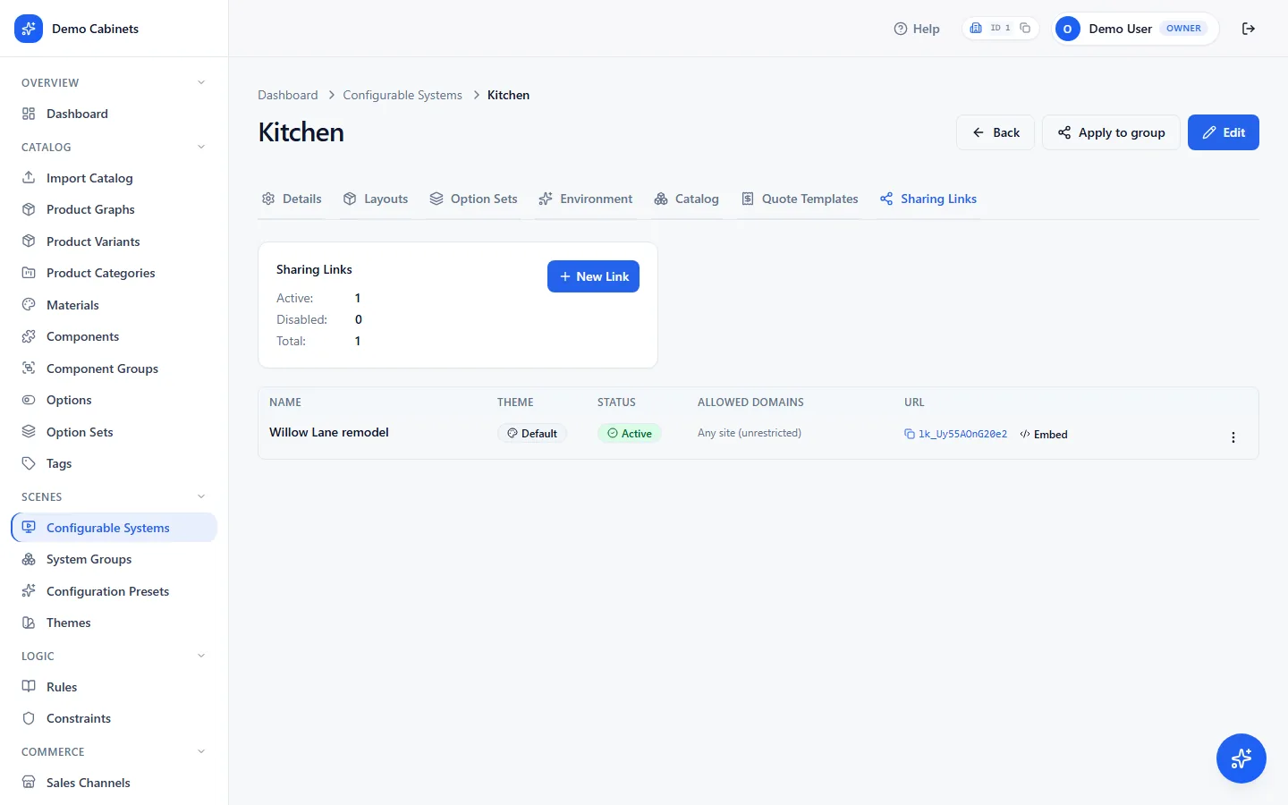
To embed, paste this where the configurator should appear, with the link's URL in place of YOUR_LINK — or use Copy embed code on the link, which gives you the same thing filled in. It works on any site builder or CMS that lets you add HTML.
<iframe
  src="YOUR_LINK"
  width="100%" height="720"
  style="border:0"
  allow="fullscreen; xr-spatial-tracking">
</iframe>
Create an API key and note the system id
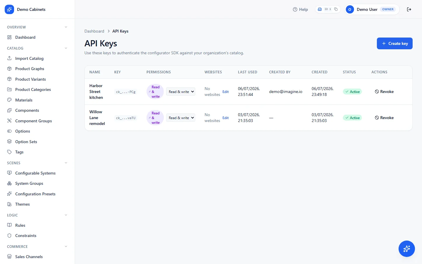
Settings › API Keys · Scenes › Configurable SystemsThe key and the system id are the two values a developer needs. Name the key after the site or tool that will use it, choose its permission, and list the websites that may use it:
- Read & write — the configurator can save and share projects and upload renders.
- Read only — browse, configure and price, never write. The safer choice for a page that never saves.
- Websites — at least one is required. Enter
shop.example.comfor a site,*.example.comfor all its subdomains, and for a developer's machinelocalhostwith its port —localhost:5173, notlocalhost. A key with an empty list works nowhere.
The system id is in the address bar when a system is open — …/configurable-systems/2 means 2.
Step 06 in detail · Rules and constraints
Everything you can pick, and what to write when the dropdowns run out.
A rule is when this happens, do that; a constraint is a limit that always holds. Both are built from dropdowns in the dashboard, and both have a Custom choice that takes a few lines of JSON. This section lists every dropdown value first, then the JSON vocabulary, then 17 worked examples you can paste. Every example was run against the Kitchen system and does what its result says.
1Rule triggers THE WHEN DROPDOWN
| Trigger | Plain meaning | You pick | Use it when |
|---|---|---|---|
| Product Variant Placed (presence) | A specific variant is in the scene. Fires when it is added, stays on while it is there, and fires on scene load with it. | One or more variants | Anything that should hold while a product is present: hide options, narrow widths, swap parts, show a message. |
| Product Variant Selected (focus) | The shopper clicked that variant in the 3D scene. | One or more variants | Extra options or a message only while the shopper looks at that product. |
| Component Loaded (presence) | A component (door, handle, panel…) is on some placement. | One or more components | Reacting to a part rather than a whole product. |
| Component Selected (focus) | The shopper clicked a component in 3D. | One or more components | Same as the variant focus trigger, for a part. |
| Option Selected | A given option is the current choice of its set, picked or default. | One or more options | Reacting to picker choices: No handle → hide handles. |
| Scene Loaded | The configurator has just loaded a scene (start or layout change). | Nothing | One-time setup: a welcome message, exclude hardware from spacing, apply a default. |
| Custom (JSONLogic) | Fires when an expression you write is true. | Trigger Params JSON | Anything the others cannot say: more than two tall cabinets, a gold customer. |
Presence triggers are the workhorse. Product Variant Placed and Component Loaded hold while the item is in the scene and switch off by themselves when it leaves, so there is no separate "removed" trigger to write.
2Rule effects THE THEN DROPDOWN
| Effect | What the shopper sees | Fill in |
|---|---|---|
| Hide Option | The option disappears from its picker. | Option(s) |
| Disable Option | The option stays visible but greyed out and not clickable. | Option(s) |
| Show Option | Only the listed options remain in their option set while the rule holds; everything else in that set is removed. | Option(s) |
| Swap Component | A part on the product is replaced by another part. | The part currently there and the part to install |
| Swap Via ComponentGroup | Every part in a group (all handles) is replaced by one chosen part. | Component group and the part to install |
| Hide Component / Show Component | A part is hidden on the product, or shown again. | Component(s) |
| Transform Component | A part is moved or rotated on the product. | Component, position and rotation |
| Hide Component Group | Every part of a group is hidden, the push-to-open, no-handles effect. | Component group(s) |
| Exclude Components From Bounds | Nothing visible. The auto-placer ignores these parts when measuring width, so cabinets sit flush. | Components or groups |
| Load Product | A new product appears next to the triggering product (a hood above a stove). | Variant to add |
| Unload Product | Products of that variant leave the scene, with anything sitting in them. | Variant, or product for all its variants |
| Load Material | A surface changes material (a door turns walnut). | Material and slot name(s) |
| Show Option Sets | Only the listed option sets are shown at the chosen scope: the piece's panel, or the scene sidebar when scene-wide. | Option set(s) |
| Show Message | A toast, banner or popup with your text. | Text, severity, display |
| Emit Event | Nothing in the picker; the 3D app receives a named event it can react to. | Event name and optional payload |
| Custom (JSONLogic) | Runs a list of actions you write. | Effect Params JSON |
Under Option Selected the effect dropdown offers nine of these: Swap Component, Swap Via ComponentGroup, Hide Component Group, Exclude Components From Bounds, Load Material, Show Option Sets, Show Message, Emit Event and Custom. To hide, disable or narrow options, or to load, unload, hide, show or move parts in response to a choice, put the same condition in a Custom trigger instead. Every other trigger offers all seventeen.
Effect scope says where: Placement (default) is the product that triggered the rule; Scene-wide is every product in the scene for the 3D effects, and the scene sidebar for Show Option, Hide Option, Disable Option and Show Option Sets. Priority only matters when two rules change the same thing; higher wins. A rule can be limited to one sales channel.
3Constraint types ALWAYS ENFORCED
| Type | Plain meaning | Target | Value fields | What the shopper experiences |
|---|---|---|---|---|
| Max Count | No more than N of this product. | product or variant | max; optional on_add_action: replace | Adding one too many is refused, or with replace the oldest is swapped out. |
| Mutually Exclusive | These products cannot be in the scene together. | product or variant | with_products / with_variants; on_add_action: block or replace | Adding the second is refused, or the first is removed automatically. |
| Positioned Above | This product must sit above one of the listed products (hood above stove). | product or variant | above_products / above_variants; auto_load_default or on_missing_anchor: remove | Snaps above its anchor; with no anchor the default is added or the product removed. |
| Requires Together | If this product is present, its partner must be too. | product or variant | with_product or with_variant | The partner is added automatically. |
| Fixed Position | Always sits at a fixed height, position or rotation. | product or variant | position / rotation per axis; enforcement: strict or on_add | Cannot be dragged off that position (strict), or only starts there (on_add). |
| Adjacency Required | Product A must be right next to product B. | product | a, b | Moving one makes the other follow. |
| Min Separation | At least N products between A and B. | product | a, b_any_of, min_cabinets_between; optional auto_fill_variant | Adding A next to B shifts it away, optionally filling the gap. |
| Custom (JSONLogic) | Any check you can write as an expression, with a message. | any or none | when, then | Refused with your message. |
Constraints are attached to one or more systems and can be limited to a sales channel.
4Custom JSON: where it goes and how it is shaped WHEN THE DROPDOWNS RUN OUT
Pick Custom as the trigger, the effect or the constraint type and a JSON box appears. Everything in the next four tables can go in that box. The ids in the examples are Kitchen ids; yours are shown next to each product, variant, option set and option in the dashboard lists.
Where the JSON goes
Rule with a custom trigger → Trigger Type: Custom → Trigger Params
{"mode": "triggered", "when": [ …conditions… ]}
Rule with a custom effect → Effect Type: Custom → Effect Params
{"actions": [ …actions… ]}
Custom constraint → Constraint Type: Custom → Value
{"when": [ …conditions… ], "then": [ …actions… ]}
You can mix: a Custom trigger with a normal effect, or a normal trigger with a Custom effect. "mode": "derived" re-runs the rule for every product on every change.
Writing a condition
Compare a path with a value. A list means all must hold; use or / not for the rest.
{"$me.category": "Base Cabinet"}          // equals
{"$me.width": {">": 24}}                  // > < >= <= != in !in
{"$me.selections.8": {"in": [8, 9]}}      // option chosen in set 8
{"$me.corner": true}, {"$me.is_middle_of_group": true}
{"or": [{"$me.category": "Appliance"}, {"$me.corner": true}]}
{"not": {"has_placement": {"graph_id": 5}}}
{"count_of": {"graph_id": 4}, ">": 2}
{"sum_of": {"field": "width", "filter": {"placement_group": "floor"}}, ">": 120}
{"$me.left_neighbor.graph_id": 6}
{"$user.tier": "gold"}
$me is the product being looked at, $scene the whole scene, $context.focus what the shopper has clicked. $user is reserved for shopper facts your website's developer sends; the configurator sends none by itself today. Numbers stay unquoted.
Writing an action
{"reject": {"message": "…"}}                      // block with a message
{"warn": {"message": "…"}}
{"emit_info": {"code": "X", "message": "…"}}
{"hide_component": {"on": "$me", "slot": "handle"}}
{"show_component": {"on": "$me", "slot": "handle"}}
{"set_material": {"on": "$me", "slot": "cabinet", "material_id": 18}}
{"set_transform": {"on": "$me", "slot": "leg_right", "position_delta": [0.1, 0, 0]}}
{"set_selection": {"option_set_id": 6, "option_id": 27, "scope": "system"}}
{"emit_event": {"name": "island_added", "payload": {"pid": "$me.id"}}}
{"swap_variant": {"on": "$me", "mapping": {"41": 40}}}
{"load_product": {"variant_id": 8, "placement_group": "wall"}}
{"mark_locked": {}}
Constraints may only reject, warn and emit_info. emit_event works from triggered rules only. "on" names the piece: "$me", a neighbour such as "$me.right_neighbor", or {"id": "p3"}.
5Custom JSON: what you can look at PATHS
| Path | Example condition | Means |
|---|---|---|
$me.variant_id | {"$me.variant_id": 29} | this piece is variant 29. Variant ids are shown in Catalog > Product Variants. |
$me.graph_id | {"$me.graph_id": 1} | this piece belongs to product 1 (any of its variants). Product ids are in Catalog > Product Graphs. |
$me.category | {"$me.category": "Appliance"} | its product category, exactly as written on the product. |
$me.width $me.depth $me.height $me.weight | {"$me.width": {">": 24}} | the size and weight fields typed on the variant, so this reads "wider than 24". Any variant field works, name included. |
$me.corner $me.edge | {"$me.corner": true} | the variant's corner flag, and its edge side ("left" or "right") for end pieces. |
$me.sequence | {"$me.sequence": 0} | its position in its row counted from the left, so 0 is the leftmost piece. |
$me.placement_group | {"$me.placement_group": "wall"} | the row it sits in: "floor", "wall", or whatever your system names its rows. |
$me.is_first_in_group $me.is_last_in_group $me.is_middle_of_group | {"$me.is_last_in_group": true} | true or false: is it at the start, the end, or somewhere inside its row. |
$me.left_neighbor.… $me.right_neighbor.… | {"$me.right_neighbor.category": "Appliance"} | any of the fields above, read on the piece directly to the left or right. Empty when there is no neighbour, so the condition is simply false. |
$me.selections.<option set id> | {"$me.selections.8": {"in": [8, 9]}} | the option currently chosen for that option set on this piece. Here: in option set 8 the shopper picked option 8 or 9. Ids are in Catalog > Option Sets. |
$me.overrides.visibility.<slot> $me.overrides.materials.<slot> $me.overrides.transforms.<slot> | {"$me.overrides.visibility.handle": false} | what another rule has already done to this piece: a part hidden (visibility false), a material set, a part moved. Here: "the handle was already hidden". Slot names are the component slot names on the product. |
$me.id | {"pid": "$me.id"} | the id of this placement. Only useful inside an emit_event payload so the 3D app knows which piece. |
$scene.placements $scene.selections | {"count": {"list": "$scene.placements", "where": {"$item.category": "Appliance"}}, ">": 2} | the list of everything placed, and the scene-wide option choices. Used with the list helpers in the next table; $item is the current list entry. |
$context.focus.placementId $context.focus.variantId $context.focus.componentId | {"$context.focus.variantId": 29} | what the shopper has clicked in 3D: the id of the selected placement, its variant id and, when a specific part was clicked, that component id (otherwise empty). The configurator sends this by itself on every action, and nothing when nothing is selected. These three are the only context keys it sends today. |
$user.<key> | {"$user.tier": "gold"} | reserved for facts about the shopper such as tier, region or dealer. The configurator sends none of these today; they exist only when your website's developer passes them in mutation.context.user, and there is no dashboard setting for it. Ask them which keys they send before writing a rule on one. A missing key makes the condition false, so such a rule stays silent. |
Operators
| Operator | Means |
|---|---|
== | equals; implicit when you write {"path": value} |
!= | not equal |
> < >= <= | numeric comparison |
in / !in | value is, or is not, one of a list |
and / or / not | combine conditions; a plain list is AND |
Filter keys INSIDE count_of / has_placement / sum_of
| Key | Matches |
|---|---|
graph_id | product id |
variant_id | variant id |
category | product category |
placement_group | row |
corner | true / false |
edge | left / right |
and / or / not | combine filters |
6Custom JSON: counting and testing the scene HELPERS
| Helper | Returns | Means |
|---|---|---|
count_of | int | how many placements match a filter |
has_placement | bool | at least one placement matches a filter |
sum_of | number | total of a product field (width…) over placements matching a filter |
has_host_variant_in_graph | bool | this appliance sits inside a cabinet of the given product |
count / any / all / find / filter / map / sum | various | generic list helpers over a list such as $scene.placements, with a where clause on $item |
7Custom JSON: what you can do ACTIONS
| Action | Allowed in | Does |
|---|---|---|
reject | rules and constraints | blocks the change with your message |
warn | rules and constraints | a non-blocking warning |
emit_info | rules and constraints | an informational note in the response |
hide_component / show_component | rules | hide or show a part by slot name |
set_material | rules | change a surface material by slot name |
set_transform | rules | move (position_delta), rotate (degrees) or scale a part |
set_selection | rules | force an option choice, scene-wide or on the piece |
swap_variant | rules | replace the piece named in on with another variant, via an id map |
load_product | rules | add a product to a row; optional if_no_variant_in to skip when one is already there |
mark_locked | rules | stop the shopper dragging the piece |
emit_event | triggered rules only | send a named event with a payload to the 3D app |
Every action that touches a piece takes "on": "$me" (default), a neighbour such as "$me.right_neighbor", or an exact placement {"id": "p3"}. Any value starting with $ is read live. See the worked examples below for each of these in use.
8Worked examples: custom rules 10 RECIPES, EACH RUN AGAINST THE KITCHEN SYSTEM
Warn when the kitchen has more than two tall cabinets
Logic › Rules · Trigger Type: Custom · Effect Type: Show MessageTrigger Params
{"mode": "triggered", "when": [{"count_of": {"graph_id": 4}, ">": 2}]}
Effect Show Message → "That is a lot of tall storage", severity info.
Result. The toast appears on the evaluate where the third tall cabinet lands.
No island in the scene → grey out the island width options
Trigger Type: Custom · Effect Type: Disable OptionTrigger Params
{"mode": "triggered", "when": [{"not": {"has_placement": {"graph_id": 5}}}]}
Effect Disable Option → options 8 and 9 (6 ft / 8 ft).
Result. Both options are marked unavailable until an island is added.
Gold customers see a message
Trigger Type: Custom · Effect Type: Show MessageTrigger Params
{"mode": "triggered", "when": [{"$user.tier": "gold"}]}
Effect Show Message → "Gold perks unlocked".
Result. Fires only when your website's developer sends mutation.context.user = {"tier": "gold"} with the shopper's actions. The configurator does not send any user keys by itself today, so without that developer step the rule stays silent.
Island placed → set its material, force the handle style, tell the 3D app
Trigger Type: Product Variant Placed → Island Standard 6ft · Effect Type: CustomEffect Params
{"actions": [
  {"set_material":  {"on": "$me", "slot": "cabinet", "material_id": 18}},
  {"set_selection": {"option_set_id": 6, "option_id": 27, "scope": "system"}},
  {"emit_event":    {"name": "island_added", "payload": {"pid": "$me.id"}}},
  {"emit_info":     {"code": "ISLAND", "message": "Island configured"}}
]}
Result. The island gets material 18 on its cabinet slot, the Door Handle set switches to option 27 scene-wide, events[] carries island_added, warnings[] carries the ISLAND note. Pick a slot the Cabinet Finish set does not own, or the shopper's finish choice wins on the next evaluate.
Hide the side panel of every base cabinet with an appliance to its right
Trigger Type: Custom · Effect Type: CustomTrigger Params
{"mode": "derived", "when": [{"$me.graph_id": 1}, {"$me.right_neighbor.category": "Appliance"}]}
Effect Params
{"actions": [{"hide_component": {"on": "$me", "slot": "single_body"}}]}
Result. On the default preset the base cabinets at positions 2, 8 and 10 get the slot hidden, and it updates by itself whenever cabinets move. Derived rules re-run on every change, never block, and do not appear in fired[].
Hide the handle on the first cabinet of the run
Trigger Type: Custom · Effect Type: CustomTrigger Params
{"mode": "derived", "when": [{"$me.graph_id": 1}, {"$me.is_first_in_group": true}]}
Effect Params
{"actions": [{"hide_component": {"on": "$me", "slot": "handle"}}]}
Result. The Single Door 9" at the start of the floor run loses its handle. Move another cabinet to the front and the handle follows the position. "handle" is the component slot name, read it from the variant's Components tab.
No sink in the kitchen → grey out the Dishwasher option
Trigger Type: Custom · Effect Type: Disable Option → Dishwasher (option 76)Trigger Params
{"mode": "triggered", "when": [{"not": {"has_placement": {"graph_id": 6}}}]}
Result. Remove the sink and the Dishwasher card in the Appliances picker greys out. Put a sink back and it is selectable again.
Refrigerator placed → lock it in place and tell the 3D app
Trigger Type: Product Variant Placed → Refrigerator (variant 5) · Effect Type: CustomEffect Params
{"actions": [
  {"mark_locked": {}},
  {"emit_event": {"name": "fridge_placed", "payload": {"pid": "$me.id"}}}
]}
Result. The new refrigerator placement carries locked: true, so the shopper cannot drag it, and events[] carries fridge_placed with its placement id.
A 30" drawer unit next to the sink becomes the 24" one
Trigger Type: Custom · Effect Type: CustomTrigger Params
{"mode": "derived", "when": [{"$me.variant_id": 41}, {"$me.right_neighbor.graph_id": 6}]}
Effect Params
{"actions": [{"swap_variant": {"on": "$me", "mapping": {"41": 40}}}]}
Result. On load, the Double 2 Drawer 30" left of the sink is replaced by the 24" version and stays stable afterwards. swap_variant only changes the piece named in "on"; it does not walk the whole scene.
A stove with no range hood → add one
Trigger Type: Custom · Effect Type: CustomTrigger Params
{"mode": "triggered", "when": [
  {"has_placement": {"graph_id": 12}},
  {"not": {"has_placement": {"graph_id": 13}}}
]}
Effect Params
{"actions": [{"load_product": {"variant_id": 8, "placement_group": "wall"}}]}
Result. Delete the range hood while a stove is in the scene and a Range Hood is added back on the wall run in the same evaluate. placement_group is required and must be one of the system's groups.
9Worked examples: custom constraints 7 RECIPES
Corner cabinets only at the ends of a run
Logic › Constraints · Type: Custom · target: noneValue
{"when": [{"$me.corner": true}, {"$me.is_middle_of_group": true}],
 "then": [{"reject": {"message": "Corner cabinets belong at the end of a run."}}]}
Result. Dropping a corner base cabinet in the middle of the row is refused with that message (CONSTRAINT_VIOLATION_HARD). The scene stays as it was.
Warn once when the floor run is wider than 10 ft
Type: Custom · target: noneValue
{"when": [{"$me.placement_group": "floor"}, {"$me.is_first_in_group": true},
          {"sum_of": {"field": "width", "filter": {"placement_group": "floor"}}, ">": 120}],
 "then": [{"warn": {"message": "This run is wider than 10 ft."}}]}
Result. An untargeted custom constraint is checked once per product; anchoring on the first piece of the row makes the warning appear once instead of 22 times.
Dishwasher should sit next to the sink
Type: Custom · target: Dishwasher (product)Value
{"when": [{"not": {"or": [{"$me.left_neighbor.graph_id": 6}, {"$me.right_neighbor.graph_id": 6}]}}],
 "then": [{"warn": {"message": "The dishwasher should sit next to the sink."}}]}
Result. Targeting the product means $me is only ever a dishwasher, so no anchor trick is needed. Prefer the typed Adjacency Required constraint when one exists; it also moves the sink along when the dishwasher is dragged.
An island needs a run of at least 8 ft
Type: Custom · target: noneValue
{"when": [{"$me.graph_id": 5},
          {"sum_of": {"field": "width", "filter": {"placement_group": "floor"}}, "<": 96}],
 "then": [{"reject": {"message": "An island needs a run of at least 8 ft."}}]}
Result. With only a couple of base cabinets on the floor, dropping an island is refused; on the default preset (12.75 ft) it is accepted. Widths are in inches, like the product fields.
Two tall cabinets side by side → warn
Type: Custom · target: Tall Cabinet (product 4)Value
{"when": [{"or": [{"$me.left_neighbor.graph_id": 4}, {"$me.right_neighbor.graph_id": 4}]}],
 "then": [{"warn": {"message": "Two tall cabinets side by side make a wall."}}]}
Result. Place two tall cabinets next to each other and the warning appears, once per cabinet in the pair. Because the product is targeted, no other piece is checked.
A corner base cabinet wants a corner wall cabinet above it
Type: Custom · target: noneValue
{"when": [{"$me.graph_id": 1}, {"$me.corner": true},
          {"not": {"has_placement": {"graph_id": 3, "corner": true}}}],
 "then": [{"warn": {"message": "Add a corner wall cabinet above the corner base cabinet."}}]}
Result. The default preset has both corners, so nothing shows; delete the wall corner and the warning appears on the next evaluate. Filters accept corner: true alongside graph_id.
The floor run is longer than 12 ft → warn once
Type: Custom · target: noneValue
{"when": [{"$me.placement_group": "floor"}, {"$me.is_first_in_group": true},
          {"sum_of": {"field": "width", "filter": {"placement_group": "floor"}}, ">": 144}],
 "then": [{"warn": {"message": "This kitchen run is longer than 12 ft."}}]}
Result. Exactly one warning, anchored to the first piece of the run. Use sum_of for totals over product fields such as width; the generic sum primitive cannot read $item.width.
Commerce
One configurator, sold through many storefronts.
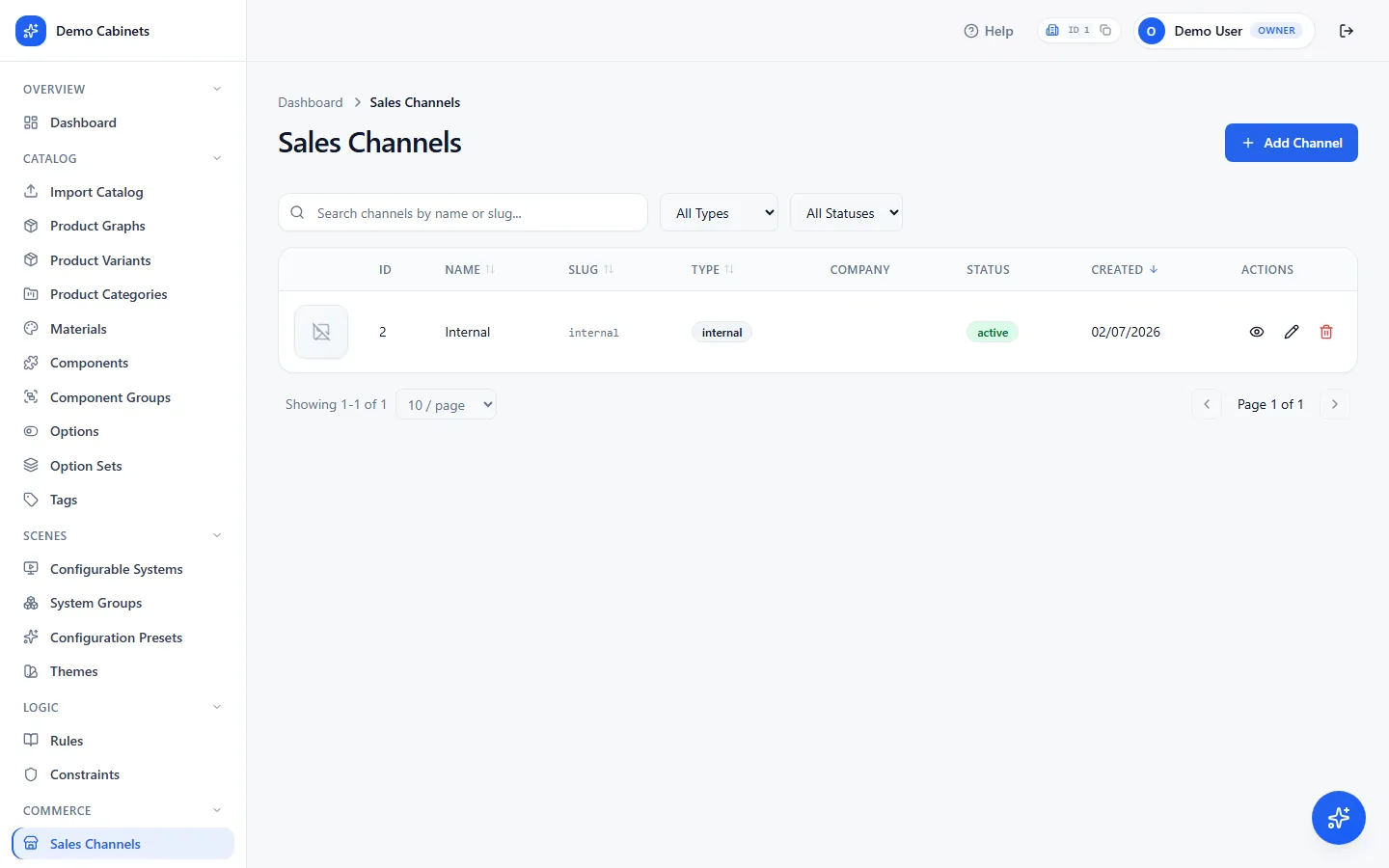
A sales channel is a storefront, dealer or portal that sells the same catalog on its own terms. Each channel gets its own prices, option defaults, theme and links, without touching the catalog itself.
A channel's tabs
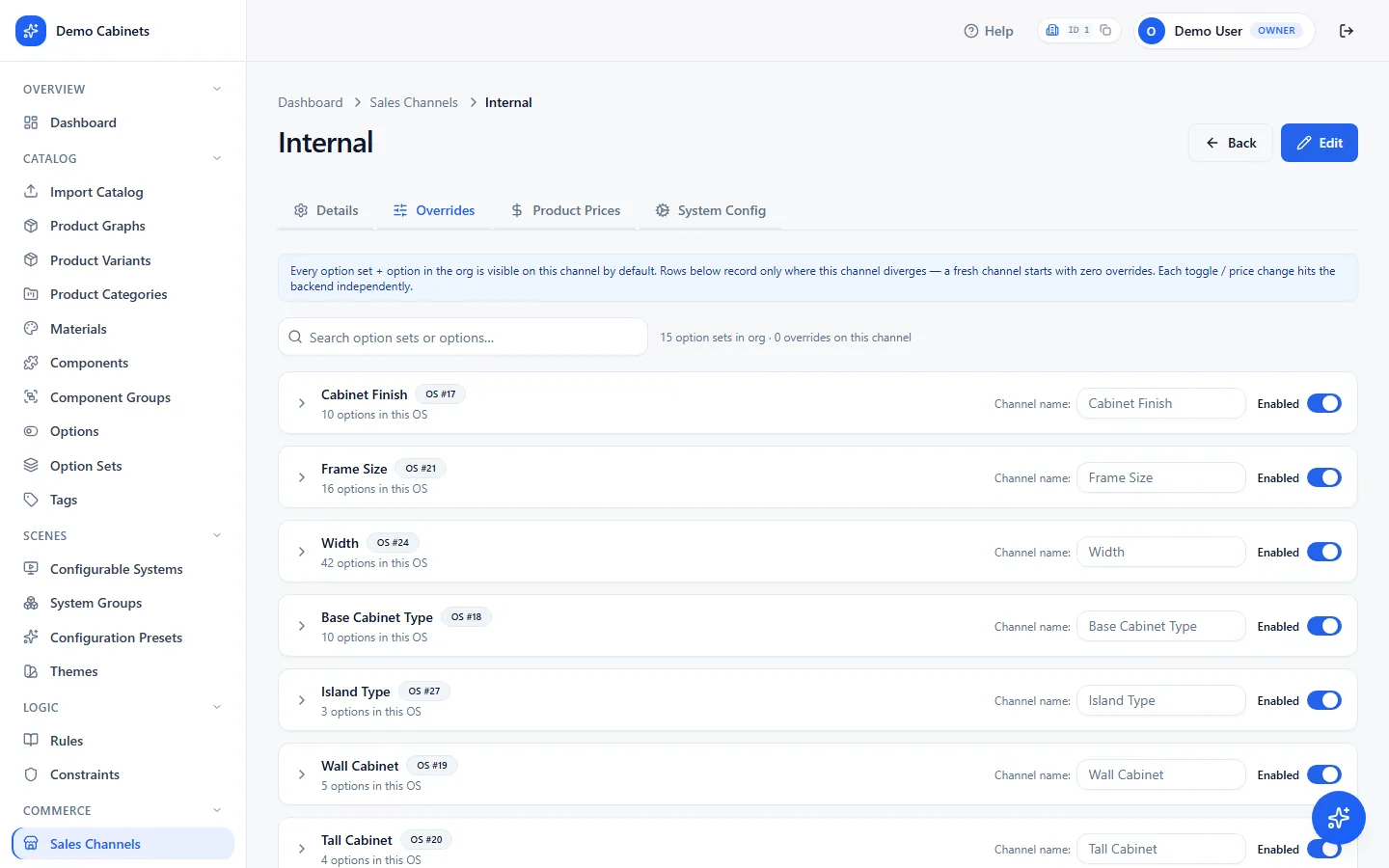
Commerce › Sales Channels › a channel- Details — name, and the products, option sets and systems this channel sells; a channel only exposes what you attach to it. Also the channel's Embed Token: a dealer's site passes it as
?channel=…so the configurator opens with this channel's prices and defaults. Regenerate it to cut off every embed still using the old one. - Overrides — the option defaults this channel opens with. Set channel-wide defaults, then override them for a single product where a dealer wants something different.
- Product Prices — a price per product that replaces its base price for this channel only. Clear it to fall back to the catalog price.
- System Config — per-system settings for this channel: a starting preset and a theme that override the system's own for this channel, its own Sharing Links, and the same interface toggles as on the system. A link made here carries the channel's prices and defaults; a link made on the system carries none.
What shoppers create
Saved projects, quotes and generated images.
Shoppers can save a configuration and share it on every plan. Seeing those saves in the dashboard — with customer details, totals and a PDF — is a paid feature.
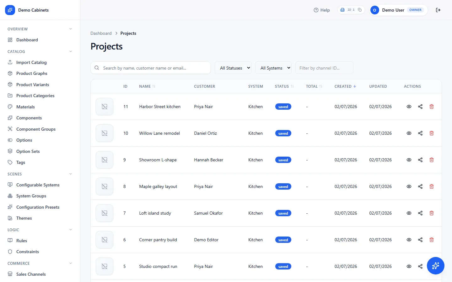
Projects and quotes
Every saved configuration, with its customer, the system it came from, its status and its total. Open one to see the items, the renders the shopper generated, and to download a quote as a PDF.
Projects › Projects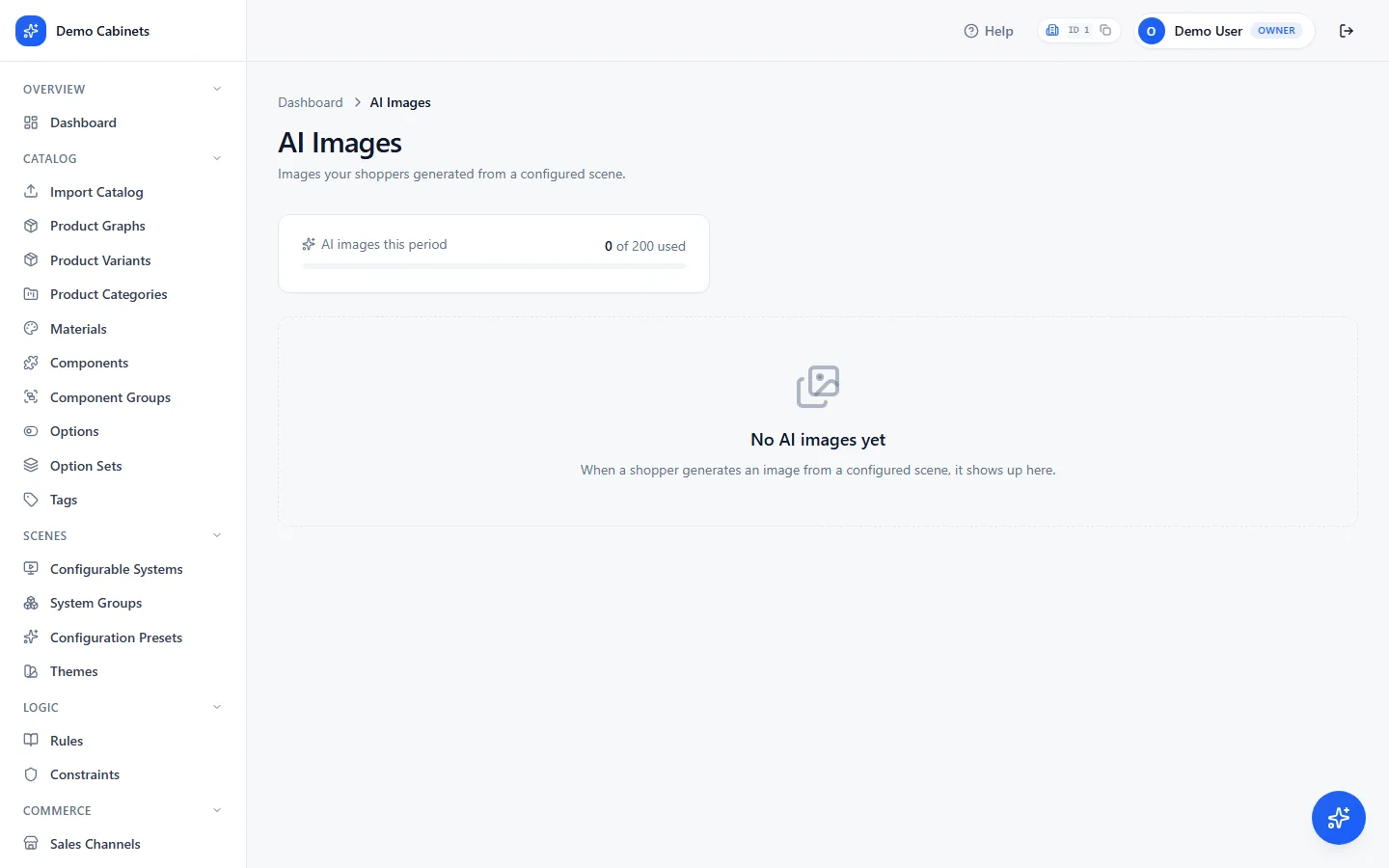
AI images
Silo and lifestyle images shoppers generated from a configured scene. The card above the grid shows the allowance used this period; the plan sets the monthly number. Filter by date, and step through images with the arrow keys.
Projects › AI ImagesLook and feel
Branding is your organization. A theme is the configurator.
Two pages that are easy to confuse. Branding is set once and describes who you are; themes describe how a configurator looks, and you can have several.
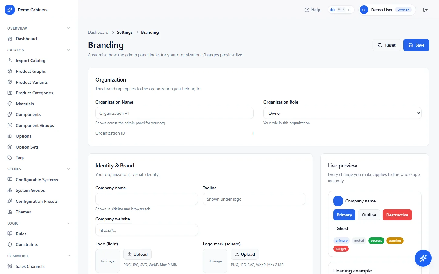
Branding
Company name and website; logos for light and dark backgrounds plus a square mark; favicon. Then the dashboard's own appearance — heading and body fonts, font size scale, button style, corner radius, content density — and your locale: timezone, date format and currency.
Settings › Branding
Themes
A stock look for the configurator a shopper sees: colours (accent, borders, card surfaces), typography (body font, base size, weights), buttons (radius, control height), corner radius, card width and padding, and layout density. Themes themselves are read-only. Open one and Customize to change any of that for your organization: your changes are kept as an override on top of the theme, other organizations still see the original, and later improvements to the theme still reach you for everything you did not touch. Pick a theme on each sharing link, or for a whole channel, per system, under Commerce › Sales Channels › System Config.
Scenes › ThemesIn bulk
Import a catalog instead of entering it screen by screen.
Bring an existing catalog in from a spreadsheet, with its models and textures alongside. Owners and admins only.
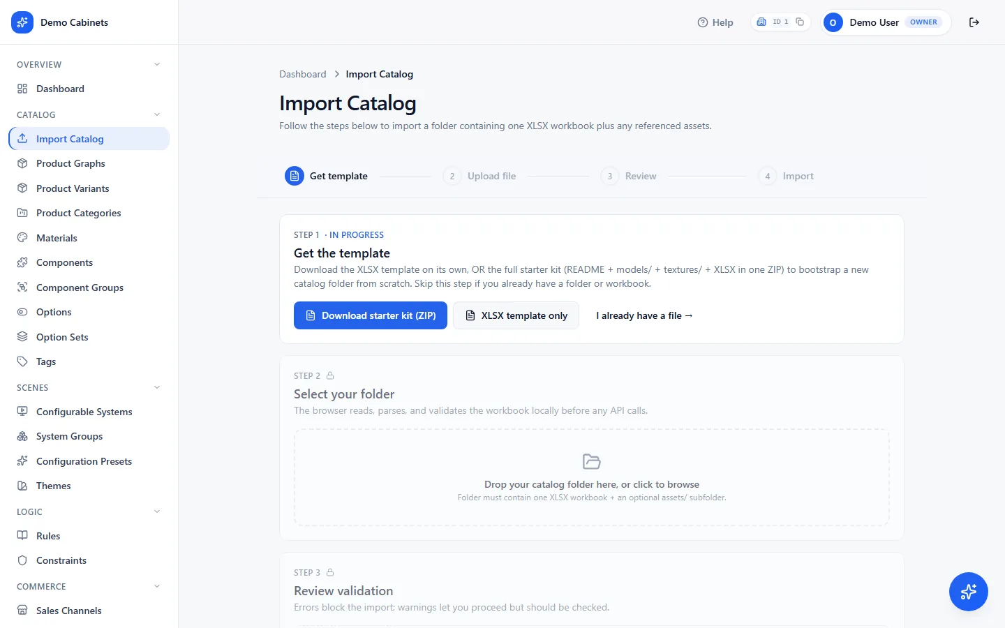
How it runs
- Get the template. A spreadsheet with one sheet per thing — materials, components, products, variants, option sets, options — and the columns each needs.
- Upload. A CSV or XLSX on its own, or a folder or zip that holds the spreadsheet next to its
models/,textures/andassets/folders. If you give it a folder, the paths in the sheet resolve relative to it. - Review. The importer first runs without writing anything and shows what would be Created, Skipped and in Error — a missing model file, a duplicate name, a malformed JSON column. Fix the sheet and upload again, or choose Skip existing or Create anyway for the rows it flags.
- Import. Rows are created in dependency order — materials before components before products — so a later row can reference an earlier one by name.
- Publish. The import stops at a draft, exactly as the dashboard does. Open the system it created, then Layouts › Publish.
Plan and billing
Free to build and evaluate. Upgrade to sell.
Every organization starts on Free: build, embed and share real configurators while you evaluate, for non-commercial use, with the imagine.io watermark on every configurator. A paid plan licenses commercial use, removes the watermark, and unlocks the pages marked Upgrade.
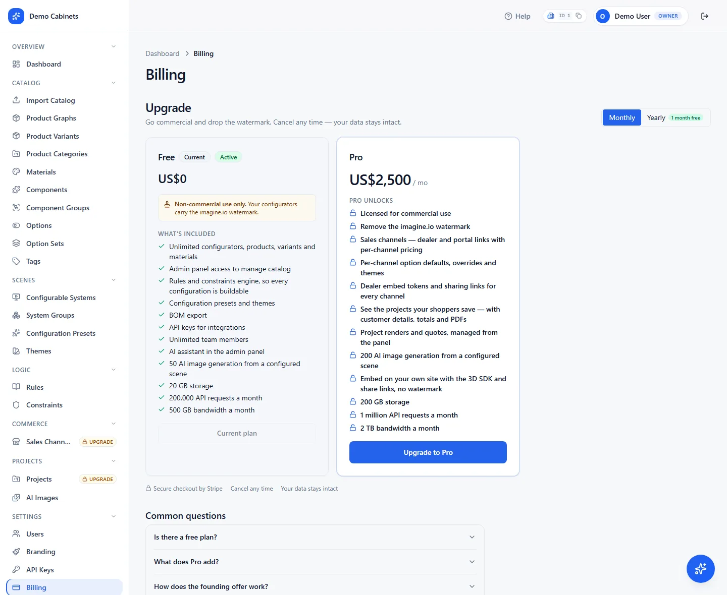
What the page shows
- Current plan — the plan, its cadence and renewal date, and the list of what it includes. Usage figures for storage, API requests and bandwidth are listed per plan.
- Upgrade — on Free, opens secure checkout. Payment is handled by Stripe; the dashboard never sees your card.
- Change plan and Manage billing — on a paid plan, open the billing portal to switch cadence, update the card, or download invoices. A scheduled change shows on the card until it takes effect.
- Payment needs attention — if a renewal fails, a notice appears with a button to the portal to fix the card. Access continues for a grace period while it retries.
- Available on request — a feature your plan can carry that is switched on per account rather than sold. Contact us to enable opens the support form with the request filled in.
- Common questions — answers to the billing questions we are asked most, kept up to date by the imagine.io team.
Worth knowing
Six things that catch people out.
An empty scene with no error almost always means an unpublished system. The importer and the editor both stop at a draft, and a draft is invisible to the SDK and to links. Open the system, Layouts, Publish.
A configurator shows nothing until the catalog exists. If a developer takes a key before you have built and published a system, they get an empty scene and assume something is broken. Finish the setup chain first, then hand over the key and the system id.
An API key must list the website that uses it — with the port, for a developer's machine. localhost alone matches port 80 only; a dev server on 5173 needs localhost:5173. A key with no websites works nowhere. The key looks valid in the dashboard either way.
A read-only key loads fine and fails later. Everything renders and prices; then save and share do nothing. If that is the symptom, the key is read only.
Links made on a system carry no sales channel. If a dealer sees catalog prices instead of theirs, the link was made under Scenes › Configurable Systems. Make it from the channel's System Config tab instead.
Changes to a published system reach every site immediately. A price, a rule or a new option applies to every configurator running against your organization, with no code change and no release. That is the point of the split — and the reason to edit the draft and publish a new version rather than change what is live.
Next
Hand it to a developer.
Install and mount the configurator, replace any part of its interface with your own, drive it from your storefront, and react to the rules you write here.
Platform overviewWhat the platform does, how an integration is shaped, and the authentication model, in a few minutes.
Package on npm@imagineio/configurator-sdk — the SDK itself, with its README, versions and install command.