Developer documentation
Add a 3D product configurator to your site.
The imagine.io Configurator SDK is the complete configurator your customers use: a live 3D scene, options with live pricing, save and share, AR on the phone, AI-generated product images and an assistant. Your products, rules and prices are set up once in the imagine.io admin panel; the SDK renders them. Install the package, call mount() once, and it runs. Then change anything about how it looks and behaves — theme, layout, individual components, or drive it from your own page — without waiting for an SDK release.
npm install @imagineio/configurator-sdk react@^18.2 react-dom@^18.2
Package: @imagineio/configurator-sdk on npm ↗
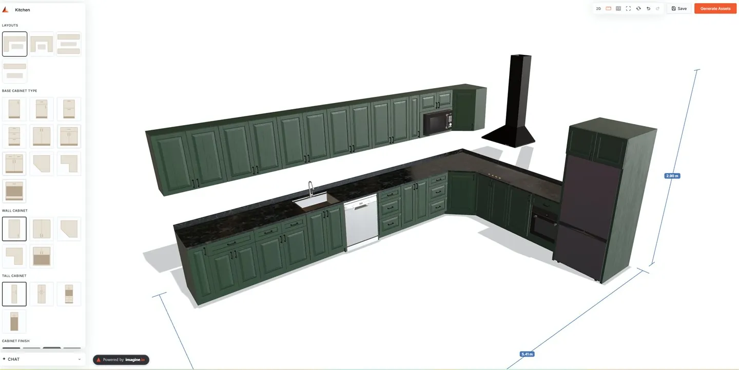
mount() call. Every surface of it is themeable or replaceable below.Products, options, rules, constraints and prices live in imagine.io. Change them there and every site running the SDK updates — no code, no release.
Restyle it with theme tokens or plain CSS, swap any component for your own, pick a layout, or run it inside your storefront and talk to it over postMessage. Each has a working default, so you only touch what you want to change.
What's in each section
Install, initialize and mount — an empty Vite app to a live configurator, including every configuration value the SDK reads.
02Customise the UITheme tokens, layout templates, overriding the built-in components, custom quote & BOM documents — and the full component library.
03Embed a public linkPut a ready-made configurator on a store page with one iframe — no install, no key, no build step — and drive it from your own buttons.
04E-commerce bridgeDrive the configurator from a parent page over postMessage — the complete wire protocol for a store integration.
05Events & rulesThe SDK lifecycle bus and the backend rule bus — react to everything without owning any of it.
06Rule & constraint evaluationWhat the engine is asked on every change, what it answers, and how to read that answer — visibility, availability, price, messages, rejections.
07GuidesTwelve step-by-step walkthroughs, each ending in a reference of what it used: theme & layout, buttons, custom 3D, quote templates, e-commerce platforms, popups, your own APIs, rules & constraints, placement logic, the loading screen, dimensions.
08API referenceThe complete reference — every function, hook and namespace, each with a runnable example.
How it fits together
Two ideas explain every extension point, so you can predict the API instead of memorising it.
imagine.io decides, the SDK shows
The SDK never invents behaviour. Every choice a shopper makes is sent to imagine.io, which answers with what is allowed, what it costs and what the scene should look like. That is why one SDK serves a kitchen, a sofa or any other product line: the difference is your data, not the code.
Name it in data, supply it in code
Every customisation is a register<Thing>(name, implementation) call that returns an unregister. Registering a name twice keeps the latest; a name imagine.io asks for that you have not registered falls back to the built-in and never throws. So the admin panel can pick a layout, a placement strategy, a quote template or a component by name, and your code provides that name's implementation — the two are wired without either side hardcoding the other.
configure({...}) registers many extensions at once — components, slots, theme, labels, events, middleware, placement strategies — and returns a single teardown that reverses all of them. It's the right entry when an integration mounts and unmounts as a unit.
The words on this page
Thirteen terms carry the whole documentation. Skim these once and every section below reads normally:
| engine | your backend rules service. Every change the shopper makes is sent to it (“an evaluate”), and it answers with the authoritative scene + prices. The SDK renders; the engine decides. |
| system | one configurable product line — a sofa, a kitchen. systemId (from onboarding) picks which one loads. |
| product & variant | a product is the catalog item (“Base Cabinet”); a variant is one concrete version of it (“Single Door 9″”). Adding to the scene takes both ids. |
| placement | one product placed in the scene, with an engine-minted id like 'p1'. Payloads sometimes call it a piece or an instance — same thing. |
| option set & option | a choice group (“Fabric”) and its choices (“Cognac”). Selected by optionSetId + optionId. |
| hosted product | a product that mounts ON another product — an appliance on a cabinet. The carrier is its host. |
| run & placementGroup | products chain side-by-side into rows (“runs”). placementGroup names which row a placement belongs to ('floor', 'wall'). |
| preset | a saved starting arrangement for a system (also called a scene config) — what a layout picker applies. |
| shell | the page arrangement around the scene (where the sidebar sits, wizard vs single page). Registered/selected via ui.registerLayout. |
| anchor | holding a product “on the cursor” so the shopper clicks where it goes — the two-step add flow. |
| admin panel | where your organisation sets everything up — catalog, systems, rules, prices, users and API keys — at admin-configurator.imagine.io. |
| API key | your organisation's long-lived credential, created in the admin panel as read & write or read only. Fine in internal tools and development; never in a public page. |
| session token | a 30-minute credential imagine.io issues when your server presents the API key. What a public page runs on; the SDK asks your server for a fresh one as needed. |
Get running
Quickstart
From an empty project to a live configurator. Every step below is one a stock Vite app actually runs.
Two values: your org API key and the system id of each configurator built for you (a system is one configurable product line — a sofa, a kitchen). Both come from the imagine.io admin panel; the first step below shows where.
Create a Vite React app
Skip this if you're adding the SDK to an existing app. Vite is required — the SDK ships modern ESM/JSX source, which Vite transforms natively.
npm create vite@latest my-configurator -- --template react
cd my-configurator
Install the SDK
The 3D stack (three, fiber, drei) is installed for you — npm 7+ adds the SDK's peer packages automatically, at the exact versions the SDK is built against. The React 18 pin in the command matters: a fresh Vite template ships React 19, which the 3D stack doesn't support yet, so installing the SDK alone there fails with ERESOLVE; pinning in the same command resolves everything to React 18:
npm install @imagineio/configurator-sdk react@^18.2 react-dom@^18.2Add the Vite plugin
One plugin, two jobs: serves the SDK's 3D assets (the Draco decoder models load from /assets/draco/) in dev and copies them into your build, and keeps react/three deduped so a second copy pulled in by another dependency can't blank the canvas:
// vite.config.js
import imagineConfigurator from '@imagineio/configurator-sdk/vite';

export default defineConfig({
  plugins: [react(), imagineConfigurator()],
});
Get your API key and system id
Both live in the imagine.io admin panel at admin-configurator.imagine.io. Sign in — or sign up first if your organisation does not have an account yet.
The configurator shows nothing until your organisation has a catalog. Before you take a key, set it up in the admin panel: products and their variants, materials, components, option sets and options, then a configurable system that ties them together. The Admin documentation walks through each of these in order.
Then go to Settings › API Keys and press Create key. Name it after the site or tool that will use it, choose its permission, and list the websites that may use it:
| Read & write | the full key. The configurator can save and share projects and upload renders. Use it in your own tools and on your server to request session tokens. |
| Read only | browse, configure and price; nothing is ever written. The safer choice for a page that never saves. It can only request read-only (catalog) session tokens. |
| Websites | at least one is required. Enter shop.example.com for a site, *.example.com for all its subdomains, and for a developer's machine localhost with its port — localhost:5173, not localhost. The browser is refused before the key is even checked on any site not listed, so a key with an empty list works nowhere. |
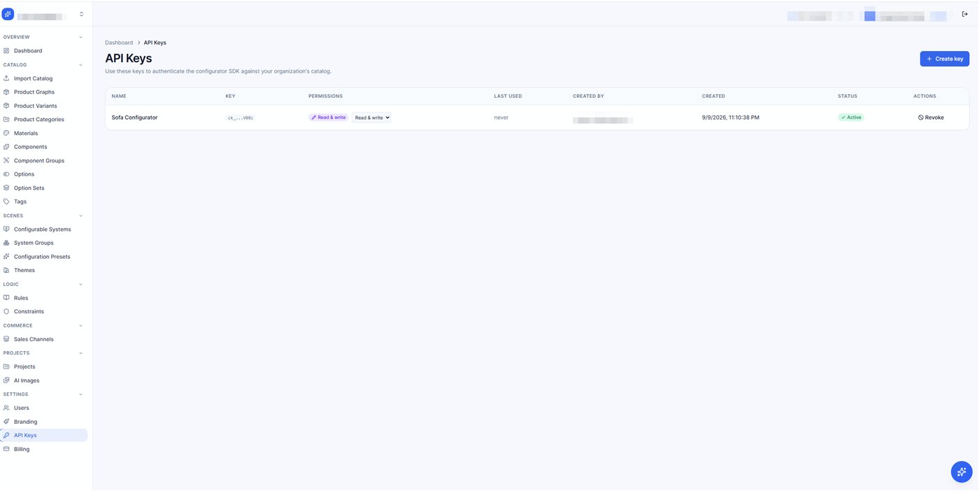
The system id is under Scenes › Configurable Systems, where each configurator built for you is listed with its id. One key serves every system in your organisation.
Add your API key
Put the key in an env file, not in your source. Create .env.local next to package.json (Vite loads it automatically, and the file is git-ignored by default):
VITE_API_KEY=YOUR_ORG_API_KEY
The SDK reads VITE_API_KEY on its own — there is no call to make. Prefer a different variable name? Keep the env file and pass it yourself: config.setApiKey(import.meta.env.VITE_MY_KEY). Then replace your src/main.jsx with this; the SDK brings its own styles, nothing else to import.
import { mount, config } from '@imagineio/configurator-sdk';

// 1. The org API key comes from .env.local (VITE_API_KEY) — nothing to write here.
//    The backend endpoint and the AI-chat runtime are built into the SDK — nothing to configure.
//    Using your OWN variable name? Read it and hand it over, before mount():
// config.setApiKey(import.meta.env.VITE_MY_KEY);

// 2. OPTIONAL — sales channel (per-channel prices, hidden options, theme)
config.setChannelId('dealer-42');

// 3. Boot the system, load catalog + scene, render the full default UI
const app = mount('#root', { systemId: 1 });
// later: app.unmount();
Production: a session token instead of the key
The API key is long-lived and reads your whole catalog, so it must never reach a browser. In production your server asks imagine.io for a session token — a 30-minute credential the browser can safely hold — and the SDK uses that instead. Three parties, one direction:
Browser (SDK)  ──►  your server  ──►  imagine.io   POST /api/v1/auth/token/  (X-Api-Key)
               ◄──  token        ◄──  imagine.io creates it and answers { access_token, expires_at, … }
Your server — one route. The key stays in an env var here and nowhere else; the response goes back to the page as-is.
// server.js — your backend
app.post('/configurator-token', async (req, res) => {
  const r = await fetch('https://api-configurator.imagine.io/api/v1/auth/token/', {
    method: 'POST',
    headers: { 'X-Api-Key': process.env.CONFIGURATOR_API_KEY, 'Content-Type': 'application/json' },
    body: JSON.stringify({ scope: 'session', system_id: 12, origin: 'https://www.your-site.com' }),
  });
  res.status(r.status).json(await r.json());
});
The three body fields are optional. Each one narrows what the token can do, and narrower is safer:
scope | session can save projects and upload renders; catalog can only load, configure and price. Use catalog for anonymous pages. A read-only key gets catalog tokens only. |
system_id | lock the token to the one system this page shows. |
origin | lock the token to your site, so one lifted from the page is useless anywhere else. |
Your page — hand mount() the route as a callback. No VITE_API_KEY exists in this build.
const app = mount('#root', {
  systemId: 12,
  getToken: async () => (await fetch('/configurator-token', { method: 'POST' })).json(),
});
The SDK sends the token as Authorization: Bearer on every request and never the key. It calls your route again shortly before the token expires and once more on a 401, so there is nothing to refresh by hand. If the key ever leaks, revoke it in the admin panel: every token made from it stops working within about 30 seconds. Refusals and what they mean: Troubleshooting › Session tokens.
Run
npm run devWhat you should see: a brief loader, then the option sidebar on the left and the 3D scene on the right — like the screenshot in the Overview. Blank page or missing models? The Troubleshooting section covers every known cause. A different systemId is a different configurator — a sofa, a kitchen, a wardrobe — with no frontend change.
What next
You have a running configurator. The three things most teams do next each have a step-by-step guide:
| Make it look like your brand | change one colour, build a whole theme, or swap the page layout. |
| Change what a button does | add to Save, replace Add to cart, or add a button of your own. |
| Connect your store | run it inside Shopify or any storefront and hand the configuration to your cart. |
All twelve: Guides. Each ends with a reference of every function it used.
Reshape the interface
Customise the UI
Prefer a walkthrough? Customize Theme & Layout · Override Button Functionality · Add a Custom Button · Add Custom Popups · Customize the Loading Screen.
Everything the default UI shows can be restyled, replaced or removed — the default UI is itself built from these same seven mechanisms, so there is no surface you can't reach. Start from what you want to change, and use the cheapest mechanism that does it:
| You want to… | Use | Effort |
|---|---|---|
| change colors, fonts, corner radius, spacing — the brand look | Theme tokens | a config object |
| restyle or hide one specific element (a tile, a button, a heading) | Plain CSS | a normal stylesheet |
| change how one part LOOKS or BEHAVES (your own swatch, your own dialog) | Override a component | one React component |
| ADD something ours doesn't have (a promo banner, a “book a designer” button) | Slots | one React component |
| move the panels around — sidebar right, wizard steps, your own page frame | Layouts | compose from parts.* |
| change the quote / BOM document | BOM & quote PDF | a template, or the raw data |
| keep only our logic and write ALL the markup yourself | Headless (below) | your app, our hooks |
Every mechanism is a registration: call it any time (even after mount() — the UI re-renders live), and it returns an unregister function that puts ours back. Calling it is safe in any order: an unregister whose change a later call has already replaced does nothing, so it can never undo someone else's work.
One exception: ui.applyTheme returns nothing. A theme is applied, not registered — it writes CSS variables and root attributes rather than something we hold a previous copy of, so there is no record to put back and a theme stays applied. To change it, apply the record you want instead. (This is why configure()'s teardown reverses a labels: block but leaves a theme: in place.)
Theme tokens
One call restyles the whole UI — pass a theme record and every color, font and radius follows. Tokens you don't set keep their defaults. surface is the field people miss: set only background and cards/dialogs stay white.
import { ui } from '@imagineio/configurator-sdk';

ui.applyTheme({ name: 'brand', config: {
  colors: {
    primary: '#1a936f',      // buttons, highlights — hover/light shades derived automatically
    accent: '#f2542d',
    background: '#f5f1e8',   // the page — a dark value switches the UI to dark mode automatically
    surface: '#fdfaf2',      // cards, dialogs, panels
    text: '#20221f', textMuted: '#6b6f66',
    border: '#e2ddd0',       // omit it and rules derive from your text color
  },
  sizing:     { cardWidth: 360, cardPadding: 16, radius: 10, controlHeight: 40, gap: 8 },  // px
  typography: { fontFamily: '"Inter", "Inter Fallback", sans-serif', baseSize: 14, labelSize: 12, headingSize: 22, fontWeight: 600 },
  buttons:    { buttonStyle: 'filled', buttonRadius: 999, shadow: 'sm' },   // shadow: 'none' | 'sm' | 'md'
}});
Every token, and what it drives:
| Group | Token | Drives |
|---|---|---|
colors | primary | buttons, active states, highlights. Hover and light shades are derived, and the whole brand family (header, modals, PDFs) follows it. |
accent | secondary emphasis; falls back to primary. | |
background | the page itself. A dark hex flips the UI into dark mode automatically (or set mode: 'dark' explicitly on the record). | |
surface | cards, dialogs, panels — the raised layer above the background. | |
text | the main ink. Secondary/tertiary text shades derive from it. | |
textMuted | labels and secondary copy. | |
border | rules and outlines. Omitted → derived from text so dark/warm themes never look half-applied. | |
sizing (px) | cardWidth | option-panel width |
cardPadding | panel content padding | |
radius | corner radius of cards and thumbnails | |
controlHeight | button/input height | |
gap | spacing between option tiles | |
typography | fontFamily | the UI font — a Google Font is fetched automatically when needed |
baseSize | body text size (px) | |
labelSize | section titles / labels (px) | |
headingSize | headings (px) | |
fontWeight | section-title weight | |
buttons | buttonStyle | 'filled' or 'outline' |
buttonRadius | button corner radius (px) — 999 = pills | |
shadow | button shadow preset — exactly 'none', 'sm' or 'md'; any other value is ignored | |
| text | labels | any UI string by key — the admin's Text & labels panel writes this map ({ 'panel.delete': 'Remove piece', 'save.snapshots': '' }). A value rewrites our text; an empty string hides it — headings, hints and captions render nothing, a button becomes icon-only. A key your code set with ui.setLabels keeps your text whichever arrives last, and switching themes replaces the previous theme's wording rather than stacking on it. |
| record | layoutDensity | overall compactness |
logoUrl | your logo in the header | |
faviconUrl | the browser-tab icon | |
layout | which page shell mounts — 'default', 'wizard', 'showroom' or 'showcase'. Omit it and the record's name decides (see below). |
Your call wins. ui.applyTheme() from app code — before or after mount() — marks the theme as yours, and the backend's theme (applied during boot, and again when the shell mounts) yields to it. The one thing that still outranks you is the ?theme=<id> URL preview, on purpose: it lets anyone preview a preset without touching code or backend. It takes string ids only (?theme=theme3), never a record.
Two code paths. A string — ui.applyTheme('theme3') — selects one of the shipped preset palettes (theme2…theme5) from our stylesheet. A record — { name, config } — writes your tokens as CSS variables. A record named after a preset ({ name: 'Theme 3' }) selects that preset's palette too, with any tokens you pass layered on top.
The name also picks the page shell. A record's name is slugified into a layout key: 'Theme 2' → the wizard shell, 'Theme 3' → showroom, 'Theme 4' → showcase. Any other name ('brand', 'studio') matches no shell, so the default shell renders — the palette still applies, and the console says so. To choose the shell independently of the name, set layout on the record, or call ui.setLayout(), which outranks everything.
A record's colours land as --color-*, most component CSS reads --bg-*, --text-* and --border-*, and a third family — --color-brand-* — sits upstream of both: variables.css defines --color-primary: var(--color-brand-primary), and a dozen stylesheets read the brand tokens directly. applyTheme writes all three from the one record, which is why the record path just works.
Theme with CSS instead of a record and you own all three. Setting only --color-primary recolours the sidebar and leaves the header, the save dialog and the generated-assets modal on our orange; setting only --color-* leaves every dialog on our default surfaces. The full list is below — set what you need from it, or pass a record to ui.applyTheme and let it derive the rest.
Every variable applyTheme writes, what it derives from, and what it costs to miss it. The lighten/darken percentages are exact. A value your record does not supply is not written at all — the stylesheet default stands — and ui.applyTheme(null) removes every row here at once.
| Family | Variable | Derived from | What it paints / why it matters |
|---|---|---|---|
| brand | --color-brand-primary | colors.primary, verbatim | The root brand colour, not a derivative: the header, sidebar active states, the save and generated-assets modals, the AR viewer and the wizard shell read it directly. |
--color-brand-primary-dark | primary darkened 15% | hover / pressed states of brand surfaces | |
--color-brand-primary-light | primary lightened 30% | tints and subtle fills | |
--color-brand-primary-rgb | primary as an R, G, B triple | the rgba(var(--color-brand-primary-rgb), .1) pattern — a hex value here makes every such rule invalid | |
--color-brand-accent | colors.accent, else primary | secondary emphasis on brand surfaces | |
--color-* | --color-primary | colors.primary | In styles/variables.css this one defaults to var(--color-brand-primary) — the brand family above is upstream of it. That inversion is why setting only --color-primary from CSS leaves the header and the modals on our orange. |
--color-primary-dark | primary darkened 15% | primary-button hover | |
--color-accent | colors.accent | accents and secondary emphasis | |
--color-background | colors.background | the page ground | |
--color-surface | colors.surface | the raised layer | |
--color-foreground | colors.text | the main ink | |
--color-secondary | colors.textMuted | muted copy | |
--color-border | colors.border | rules and outlines | |
--bg-* | --bg-primary | surface, else background | the raised surface — cards, dialogs, panels. Derived from surface rather than background on purpose; the steps below move away from it. |
--bg-secondary | background, else surface darkened 4% | the layer behind the raised one | |
--bg-tertiary | (background, else surface) darkened 8% | wells, inset areas | |
--bg-muted | (background, else surface) darkened 2% | quiet fills, disabled rows | |
--text-* | --text-primary | colors.text | body ink across every component |
--text-primary-rgb | text as an R, G, B triple | the theme shells tint their surfaces with rgba(var(--text-primary-rgb), .08). Skip it and a themed sidebar sits inside a shell still tinted with our ink — the classic half-applied look. | |
--text-secondary | textMuted, else text lightened 45% | labels, secondary copy | |
--text-tertiary | textMuted, else text lightened 60% | hints, captions | |
--border-* | --border-default | colors.border, else text lightened 86% | every rule and outline. Derived from the ink when no border is named, because a palette that states its ink and paper has implied its rules. |
--border-light | the resolved rule lightened 35% | hairlines, dividers inside a card | |
--border-dark | the resolved rule darkened 20% | emphasised or focused outlines | |
| sizing | --sidebar-width | sizing.cardWidth | option-panel width |
--sidebar-content-padding | sizing.cardPadding | panel content padding | |
--radius-xl | sizing.radius | card corner radius | |
--thumbnail-border-radius | sizing.radius | thumbnail corner radius — the same input drives both | |
--btn-height-md | sizing.controlHeight | button / input height | |
--thumbnail-gap | sizing.gap | spacing between option tiles | |
| typography | --font-size-md | typography.baseSize | body text |
--sidebar-section-title-size | typography.labelSize | section titles and labels | |
--font-size-2xl | typography.headingSize | headings | |
--sidebar-section-title-weight | typography.fontWeight | section-title weight | |
--font-family-base | typography.fontFamily, else typographyTokens.bodyFont | the UI font — a Google Font is fetched automatically | |
--font-family-heading | typographyTokens.headingFont, else typography.fontFamily | headings, when the record separates them | |
| buttons & shell | --btn-border-radius | buttons.buttonRadius | button corners (999 = pills) |
--btn-shadow | buttons.shadow preset — 'none' / 'sm' / 'md' | button shadow only. Deliberately not --shadow-md, which every card uses. | |
--layout-density | layoutDensity | overall compactness | |
--brand-logo-url | logoUrl, wrapped as url("…") | the header logo — a bare URL will not work here | |
| attributes (not variables) | data-theme | layout if the record sets one, else its name, slugified | picks the page shell (theme2 → wizard, theme3 → showroom, theme4 → showcase) |
data-theme-preset | set only when name matches a shipped preset | renders that preset's palette block from themes.css, under your explicit tokens | |
data-theme-mode | mode, else the luminance of the resolved background | light / dark — the shared dark skin hangs off this | |
data-button-style | buttons.buttonStyle | filled or outline; any other value is ignored | |
data-theme-id | theme.id | debugging only — nothing styles off it |
Style any part with plain CSS
When a theme token can't express what you want, just write normal CSS in your own stylesheet. Every element the SDK renders carries a data-part attribute — a stable name that never changes between releases — and the SDK deliberately keeps its own styles in a weaker CSS layer, so your plain CSS wins over our component styles — no specificity battles, no digging for class names. One scoped exception: theme tokens (--color-*, --font-*, --bg-*, --text-*…) are written by applyTheme as inline styles on <html>, and inline beats any stylesheet regardless of layer. Overriding a token from CSS therefore does need !important — or, better, pass it through ui.applyTheme and skip the fight. Going the CSS route, work from the derived-token list: there are three colour families, and setting one of them recolours part of the UI.
Find the part
Right-click the element → Inspect. The attribute is right there: <div data-part="option-card">.
Write a normal selector against it
Target [data-part="…"] — never our class names (those are internal and may change; data-part is the contract).
That's it
Put it in any stylesheet your app already loads. It applies immediately and survives every SDK update.
A small makeover, line by line:
/* your-app.css — plain CSS, loaded like any other stylesheet */

/* 1. round the option swatches and brand the selected one */
[data-part="option-card"] { border-radius: 12px; }
[data-part="option-card"][aria-selected="true"] { outline: 2px solid #1a936f; }

/* 2. make every toolbar button pill-shaped */
[data-part="toolbar-button"] { border-radius: 999px; }

/* 3. hide one specific button (pair data-part with data-button) */
[data-part="toolbar-button"][data-button="fullscreen"] { display: none; }
Every data-part the SDK stamps, with a copy-paste starter for each:
| data-part | What it is | Starter |
|---|---|---|
option-set | one option-set section in the sidebar | [data-part="option-set"] { margin-bottom: 20px; } |
option-set/title | that section's heading | [data-part="option-set/title"] { text-transform: none; } |
option-set/options | the grid holding its options | [data-part="option-set/options"] { gap: 10px; } |
option-set/toggle | its expand/collapse control | [data-part="option-set/toggle"] { display: none; } |
option-card | a single option / swatch tile | [data-part="option-card"] { border-radius: 12px; } |
toolbar-button | one scene-toolbar button — add [data-button="…"] to hit a specific one | [data-part="toolbar-button"] { background: #111; color: #fff; } |
popover | any floating popover panel | [data-part="popover"] { box-shadow: 0 12px 40px rgb(0 0 0 / .18); } |
modal | the backdrop behind a host-registered modal (ui.registerModal) — dims and blurs the page; the blur amount is the --modal-backdrop-blur token (default 4px), shared by every dialog backdrop of ours | [data-part="modal"] { background: rgb(20 18 15 / .6); } |
modal/panel | the panel your modal component renders inside — centred, themed, scrollable | [data-part="modal/panel"] { max-width: 720px; border-radius: 4px; } |
sidebar-frame | the sidebar's outer container (desktop, embedded and mobile variants) | [data-part="sidebar-frame"] { border-right: 1px solid var(--border-default); } |
loading | the loading screen — boot overlay and the compact in-context form (data-compact="true") | [data-part="loading"][data-compact="true"] { border-radius: 999px; } |
quote | the whole on-screen quote document | [data-part="quote"] { font-family: Georgia, serif; } |
quote/brand | the logo + company block at the top | [data-part="quote/brand"] { justify-content: center; } |
quote/head | the header: quote title + date | [data-part="quote/head"] { border-bottom: 2px solid #111; } |
quote/for | the reference / recipient line (“Quote 1042 · For …”) | [data-part="quote/for"] { font-style: italic; } |
quote/scene | the scene-selections summary line (“Finish: Oak · …”) | [data-part="quote/scene"] { display: none; } |
quote/lines | the line-items table | [data-part="quote/lines"] { font-size: 12px; } |
quote/additional | the additional-options table (scene-level cost lines) | [data-part="quote/additional"] { margin-top: 16px; } |
quote/totals | the item-count + grand-total row | [data-part="quote/totals"] { font-size: 15px; } |
quote/renders | the render-image grid | [data-part="quote/renders"] { gap: 12px; } |
quote/render | one render image in that grid | [data-part="quote/render"] { border-radius: 8px; } |
quote/qr | the AR QR-code block | [data-part="quote/qr"] { display: none; } |
quote/terms | the notes / terms footer | [data-part="quote/terms"] { font-size: 11px; } |
Possible values of data-button (on toolbar-button) — always paired with the part selector:
| data-button | Button | Starter |
|---|---|---|
toggle2d3d | the 2D / 3D view switch | [data-part="toolbar-button"][data-button="toggle2d3d"] { font-weight: 700; } |
dimensions | dimension overlay on/off | [data-part="toolbar-button"][data-button="dimensions"] { background: #1a936f; color: #fff; } |
walls | wall visibility | [data-part="toolbar-button"][data-button="walls"] { border-radius: 999px; } |
resetCamera | reset the camera | [data-part="toolbar-button"][data-button="resetCamera"] { opacity: .6; } |
fullscreen | enter/exit fullscreen | [data-part="toolbar-button"][data-button="fullscreen"] { display: none; } |
undo | undo the last change | [data-part="toolbar-button"][data-button="undo"] { display: none; } |
redo | redo the undone change | [data-part="toolbar-button"][data-button="redo"] { display: none; } |
uiToggles keys — the backend's system.uiToggles and ui.setToggles() share one key set. A key set to false removes the control (distinct from disabled, which is a state reason); an absent key means shown. The host's value wins over the backend's, per key.
| Key | Removes | Note |
|---|---|---|
dimensions · walls · resetCamera · fullscreen · undo · redo | the matching toolbar button | same names as data-button above |
liveStatus | the live status / debug panel | — |
selectionPanel | selecting pieces at all: a click on a piece does nothing, no selection or hover outline is drawn, and the per-piece action panel never mounts — even if code sets a selection | the master switch for the six keys below; placement-target clicks (placing a hosted product) still work |
panelPrice | the price chip in the per-piece action panel | — |
panelMoveLeft · panelMoveRight | the reorder buttons | — |
panelAdd · panelDuplicate · panelDelete | the add / duplicate / delete buttons | named after the panel's label keys (panel.add, …); a control the piece does not offer is absent regardless |
The SDK's own styles live in a CSS @layer, and layered CSS always loses to your unlayered CSS — that ordering is the published contract. Prefer hiding buttons via ui.setToggles({ fullscreen: false }) when you want them gone functionally; use CSS when you're reskinning.
Override a component
“Component” here means a React component of the UI. Elsewhere (scene.hideComponent, componentId, parts.ComponentMesh) it means a physical part of a product — a door, a handle, a leg. Context makes it clear, but they are unrelated.
Your component receives our built-in as Default — wrap it rather than reimplement. Registering after mount() re-renders live.
// overrides.jsx — a .jsx file, because the override returns markup
import { ui } from '@imagineio/configurator-sdk';

ui.registerComponent('OptionThumbnail', ({ Default, ...props }) => (
  <div className="brand-thumb">
    <Default {...props} />
    {props.option?.isNew && <span>New</span>}
  </div>
));
The complete set of overridable components:
SidebarOptionSetSectionOptionThumbnailFinishThumbnail
LayoutThumbnailHostedProductThumbnailAddProductToggleSceneToolbar
SelectionActionPanelSaveProjectButtonGenerateAssetsButtonLiveStatusPanel
ChatBarConfirmDialogSceneDimensionsARViewerLoadingScreen
What each one receives. Every override also gets Default (the built-in, injected by the registry — it is only present when an override is registered). Props below are extracted from the actual render sites; shapes in metres/ids as noted.
| Component | Props it receives | Renders |
|---|---|---|
Sidebar | embedded?: boolean, optionSetIds?: string[] (wizard/showcase shells pass the step's option-set ids), backHeader?: boolean (default true — the '‹ Selected' row above a focused piece's options; pass false when your shell already names the selection) | Main option panel — desktop panel, mobile tab, all shells |
SceneToolbar | variant: 'desktop' | 'mobile' | Header (desktop) / above the scene (mobile, shells) |
SaveProjectButton | disabled: boolean, className?: string | Header, mobile top bar, shell CTAs |
GenerateAssetsButton | onClick: () => void, isGenerating: boolean, disabled: boolean, className: string | Header, mobile top bar, shell CTAs |
LiveStatusPanel | embedded?: true (mobile tab) — no props on the desktop float | Status/debug panel when the panels region is on |
ChatBar | alwaysExpanded?: true (mobile tab, shell FAB popup) — no props on the desktop chat card | AI assistant input |
OptionSetSection | title: string, presentation: 'inline' | 'accordion', flow: 'column' | 'row', gridClassName, className, labelKey: optionSetId, sectionRef, beforeGrid?, kind?: 'group', depth?, defaultOpen?, children | Every option-set block in the sidebar (8 sites) |
OptionThumbnail | option: { id, name, value, thumbnail?, disabled?, disabledReason? }, isSelected: boolean, onClick: () => void | Generic option grids |
FinishThumbnail | option (as above), material: { thumbnail?, textures?: { diffuse? }, color? }, isSelected, onClick | Material/finish grids (thumbnail → diffuse → color fallback) |
LayoutThumbnail | option: { id, value, thumbnail? } (value is the layout class, e.g. l_shaped), isSelected, onClick | Layout picker grid |
HostedProductThumbnail | appliance: { id, name, thumbnail?, icon?, isPlaced, canReplace, isDisabled, … }, isSelected, isPlaced, canReplace, isDisabled, onClick | Hosted-product (appliance) cards |
AddProductToggle | optionSet — the option-set record, getOptionsForSet(set) — the set's options, getSelection(optionSetId), onSelectionChange(optionSetId, optionId, set) | An add-a-product option set rendered as an on/off toggle |
ConfirmDialog | dialog: { title?, message, hint?, confirmText?, cancelText?, singleButton?, onConfirm?, onCancel? } | null, onClose: () => void | Overlap/confirm prompts (all sidebar variants) |
SelectionActionPanel | actions: { onMoveLeft, onMoveRight, onDuplicate?, onDelete, disabledActions: { moveLeft?, moveRight?, duplicate?: { disabled, reason } } }, priceInfo: { unitPrice, adjustments, currency } | null | DOM overlay over the canvas while a piece is selected |
SceneDimensions | bbox: { minX, maxX, minZ, maxZ, w, d, h, height } — metres; h = wall height, height = tallest piece top. Renders inside the scene canvas, not the DOM | When the dimensions toolbar toggle is on and the scene has extent |
ARViewer | no props — reads the ?src GLB URL itself | The /ar-viewer route (QR-code landing page) |
A worked override for every component — each is complete and copy-paste-ready; swap the class names and inner components for your own. These return JSX, so they belong in a .jsx / .tsx file; MySwitch, MyModal, MyMobileBar and MyCallouts stand in for your own components:
Sidebarput the whole option panel in your own frame (everything inside still works)import { ui } from '@imagineio/configurator-sdk'; ui.registerComponent('Sidebar', ({ Default, ...props }) => ( <aside className="acme-panel"> <img src="../logo.svg" alt="" height={28} /> <Default {...props} /> </aside> ));
OptionSetSectionforce every option group open, with your own heading styleimport { ui } from '@imagineio/configurator-sdk'; ui.registerComponent('OptionSetSection', ({ Default, ...props }) => ( <Default {...props} presentation="inline" title={props.title.toLowerCase()} /> ));
OptionThumbnailbadge new options; keep our tile underneathimport { ui } from '@imagineio/configurator-sdk'; ui.registerComponent('OptionThumbnail', ({ Default, ...props }) => ( <div className="brand-thumb"> <Default {...props} /> {props.option?.isNew && <span className="brand-thumb__badge">New</span>} </div> ));
FinishThumbnailrender material swatches your own way (thumbnail → texture → flat color)import { ui } from '@imagineio/configurator-sdk'; ui.registerComponent('FinishThumbnail', ({ option, material, isSelected, onClick }) => ( <button className={isSelected ? 'swatch on' : 'swatch'} onClick={onClick} title={option.name} style={{ backgroundImage: `url(${material?.thumbnail ?? material?.textures?.diffuse ?? ''})`, backgroundColor: material?.color ?? '#ddd' }} /> ));
LayoutThumbnailbigger layout tiles with the name under the imageimport { ui } from '@imagineio/configurator-sdk'; ui.registerComponent('LayoutThumbnail', ({ option, isSelected, onClick }) => ( <figure className={isSelected ? 'layout-tile on' : 'layout-tile'} onClick={onClick}> <img src={option.thumbnail} alt="" /> <figcaption>{option.value.replace('_', ' ')}</figcaption> {/* e.g. "l shaped" */} </figure> ));
HostedProductThumbnailshow placed state and why a card is disabledimport { ui } from '@imagineio/configurator-sdk'; ui.registerComponent('HostedProductThumbnail', ({ appliance, isPlaced, isDisabled, onClick }) => ( <button className="card" disabled={isDisabled} onClick={onClick}> <img src={appliance.thumbnail} alt="" /> <span>{appliance.name}</span> {isPlaced && <em>In scene — click to remove</em>} </button> ));
AddProductTogglerender an add-a-product option set as your own switchimport { ui } from '@imagineio/configurator-sdk'; ui.registerComponent('AddProductToggle', ({ optionSet, getOptionsForSet, getSelection, onSelectionChange }) => { const [offOpt, onOpt] = getOptionsForSet(optionSet); const isOn = String(getSelection(optionSet.id)) === String(onOpt?.id); return <MySwitch label={optionSet.name} checked={isOn} onChange={(v) => onSelectionChange(optionSet.id, (v ? onOpt : offOpt).id, optionSet)} />; });
SceneToolbardesktop keeps our toolbar; mobile gets your compact oneimport { ui } from '@imagineio/configurator-sdk'; ui.registerComponent('SceneToolbar', ({ Default, variant, ...props }) => variant === 'mobile' ? <MyMobileBar /> : <Default variant={variant} {...props} /> );
SelectionActionPanelyour own action pill — same handlers, plus the live unit priceimport { ui } from '@imagineio/configurator-sdk'; ui.registerComponent('SelectionActionPanel', ({ actions, priceInfo }) => ( <div className="pill"> <button onClick={actions.onMoveLeft} disabled={!!actions.disabledActions.moveLeft}>←</button> <button onClick={actions.onMoveRight} disabled={!!actions.disabledActions.moveRight}>→</button> {actions.onDuplicate && <button onClick={actions.onDuplicate}>Duplicate</button>} <button onClick={actions.onDelete}>Remove</button> {priceInfo && <b>{priceInfo.currency} {priceInfo.unitPrice}</b>} </div> ));
SaveProjectButtonrestyle the save CTA (the built-in keeps the whole save flow)import { ui } from '@imagineio/configurator-sdk'; ui.registerComponent('SaveProjectButton', ({ Default, ...props }) => ( <Default {...props} className="acme-btn acme-btn--ghost" /> ));
GenerateAssetsButtonyour button, our generation pipelineimport { ui } from '@imagineio/configurator-sdk'; ui.registerComponent('GenerateAssetsButton', ({ onClick, isGenerating, disabled }) => ( <button className="acme-btn" onClick={onClick} disabled={disabled || isGenerating}> {isGenerating ? 'Rendering…' : 'Create images'} </button> ));
LiveStatusPanelhide the status panel entirelyimport { ui } from '@imagineio/configurator-sdk'; ui.registerComponent('LiveStatusPanel', () => null);
ChatBarkeep the assistant, change its frameimport { ui } from '@imagineio/configurator-sdk'; ui.registerComponent('ChatBar', ({ Default, ...props }) => ( <div className="acme-chat"><Default {...props} alwaysExpanded /></div> ));
ConfirmDialogroute confirms through your own modal systemimport { ui } from '@imagineio/configurator-sdk'; ui.registerComponent('ConfirmDialog', ({ dialog, onClose }) => { if (!dialog) return null; return <MyModal title={dialog.title ?? 'Are you sure?'} onClose={onClose} onConfirm={() => { dialog.onConfirm?.(); onClose(); }} confirmText={dialog.confirmText ?? 'Continue'}>{dialog.message}</MyModal>; });
SceneDimensionscustom measurement callouts (renders INSIDE the scene canvas)import { ui } from '@imagineio/configurator-sdk'; ui.registerComponent('SceneDimensions', ({ bbox }) => ( <MyCallouts width={bbox.w} depth={bbox.d} height={bbox.height} /> // metres ));
ARViewerbrand the AR landing page a phone opens from the QR codeimport { ui } from '@imagineio/configurator-sdk'; ui.registerComponent('ARViewer', ({ Default, ...props }) => ( <div className="acme-ar"><header>Acme Studio</header><Default {...props} /></div> ));
Add net-new UI — slots
When: you want to ADD something the UI doesn't have — a promo banner, a “book a designer” button, a live chat bubble — without touching what's already there. A slot is a fixed spot where the SDK renders nothing of its own; register a component and it appears there. A custom div in the sidebar reflows its siblings automatically (the sidebar is normal flex flow). There are five slots — each renders at a fixed spot and hands your component a context object:
| Slot | Renders | Context props |
|---|---|---|
toolbar | beside the scene-toolbar buttons (2D/3D, undo, walls…) | { isMobile } |
sidebar-top | top of the option panel, above every option set | { placementId } |
sidebar-bottom | bottom of the option panel, below every option set | { placementId } |
selection-panel | inside the floating action pill shown when a piece is selected | { placementId, actions } |
overlay | a full-scene layer above the 3D canvas — you position it yourself | — |
import { ui } from '@imagineio/configurator-sdk';
import MyPromoBanner from './MyPromoBanner';   // your own component

ui.registerButton({ slot: 'toolbar', label: 'Book a designer', onClick });
ui.registerSlot('sidebar-top', ({ placementId }) => <MyPromoBanner />);
ui.registerSlot('overlay', () => <div style={{ position: 'absolute', bottom: 24 }}>…</div>);
Rearrange everything — layouts
“Layout” here means the page shell (where the sidebar and scene sit). The product arrangement layout — L-shaped vs U-shaped — is a normal option the shopper picks (see LayoutThumbnail, and the bridge's setLayout command drives that one).
When: the pieces are right but the page isn't — you want the sidebar on the right, a wizard flow, or your own frame around everything. A layout owns where the panel sits, the chrome, the mobile shape. Compose it from parts.* (~50 exported components) instead of rebuilding. Read ui.activeLayout() before registering — the backend may have selected another shell.
import { ui, parts } from '@imagineio/configurator-sdk';

function MyShell({ Scene }) {
  return (
    <div className="my-shell">
      <parts.Header />
      <main className="my-shell__scene">
        <Scene />                           // a COMPONENT — render it, don't interpolate it
        <parts.SceneToolbar />
      </main>
      <aside><parts.Sidebar /></aside>
      <parts.SlotHost name="overlay" />    // where ui.registerSlot content renders
      <parts.ModalHost />                   // where ui.registerModal content renders
      <parts.Modals /><parts.NotificationContainer />
    </div>
  );
}
ui.registerLayout(ui.activeLayout() ?? 'default', MyShell);
Render <Scene />, never {Scene}. It is a component; interpolating it hands React a function, which renders nothing — a shell with no 3D scene and no error.
Mount parts.SlotHost and parts.ModalHost. They are the render points for ui.registerSlot and ui.registerModal; without them every such registration silently stops working in your shell. One host per slot name — and only for slots nothing else renders. overlay is the one a custom shell always owns, because it replaced the layout that used to render it. The other three come free with the part that owns them: toolbar with parts.SceneToolbar, sidebar-top and sidebar-bottom with parts.Sidebar, selection-panel with the selection pill. Mount a second host for one of those and the part that owns it, and the registration renders twice.
Size the scene's box. The canvas fills its container. In a full-height column beside a panel (every built-in shell) that just works; in a grid with a top bar and a bottom deck, the scene row will size to the viewport and push later rows off-screen. Give that row min-height: 0 and its scene container position: relative; overflow: hidden, and the canvas will take the row, not the page.
Whole pages & canvas-only
When: you need to own an entire page (like the AR landing page a QR code opens), or you want ONLY the 3D scene and none of our chrome. Replace a page a QR opens, or hide our UI entirely and build your own around the 3D scene. Hidden regions aren't rendered, so they don't compete for space.
import { ui } from '@imagineio/configurator-sdk';
import MyArPage from './MyArPage';   // your own page component

ui.registerRoute('/ar-viewer', MyArPage);
ui.hide('sidebar', 'toolbar');   // bare canvas + your own chrome
Headless — your markup, our logic
When: your design system must own every pixel and none of our components fit — you write all the markup, and the hooks hand you the data and the dispatch so your UI behaves exactly like ours. React hooks expose option resolution, availability, hidden-option filtering and dispatch, so custom markup never re-derives them. select() routes through the same path our sidebar uses.
import { useOptionSets } from '@imagineio/configurator-sdk';

const { optionSets, getOptionsForSet, visibleOptions,
        optionDisabledPropsFor, select } = useOptionSets();
// render your own buttons; select(set.id, option.id, set)
The other headless hooks — each re-renders your component exactly when its data changes. They are all flat named exports from the same package:
import { usePrice, useProducts, useSelection, useSelectionActions,
         useToolbar, useLabels, useBootStatus } from '@imagineio/configurator-sdk';
usePricethe live total for your own price displayimport { usePrice } from '@imagineio/configurator-sdk'; function MyPrice() { const { grandTotal, currency } = usePrice(); // re-renders on every engine re-price return <b>{currency} {grandTotal?.toLocaleString()}</b>; }
useProductseverything placed in the scene, as plain rowsimport { products, useProducts } from '@imagineio/configurator-sdk'; function MyPartsList() { const products = useProducts(); // [{ placementId, productId, variantId, sequence, placementGroup, … }] return <ul>{products.map((p) => <li key={p.placementId}>{p.variantId}</li>)}</ul>; }
useSelectionreact to what the shopper has selectedimport { useSelection } from '@imagineio/configurator-sdk'; function MyInspector() { const { isSelected, placementId, piece } = useSelection(); if (!isSelected) return <p>Click a product to inspect it</p>; return <h4>Selected: {placementId} (variant {piece.variantId})</h4>; }
useSelectionActionsthe selected piece’s actions + price, for a custom panelimport { useSelectionActions } from '@imagineio/configurator-sdk'; function MyActionBar() { const { panelActions, priceInfo } = useSelectionActions(); if (!panelActions) return null; // nothing selected return (<> <button onClick={panelActions.onDelete}>Remove</button> {priceInfo && <span>{priceInfo.currency} {priceInfo.unitPrice}</span>} </>); }
useToolbarall toolbar state + handlers, for building your own toolbarimport { useToolbar } from '@imagineio/configurator-sdk'; function MyToolbar() { const { is3D, handleToggleView, canUndo, handleUndo, isOn } = useToolbar(); return (<> <button onClick={handleToggleView}>{is3D ? '2D' : '3D'}</button> {isOn('undo') && <button disabled={!canUndo} onClick={handleUndo}>Undo</button>} </>); }
useLabelsevery UI string through one function — localize or rebrand textimport { useLabels } from '@imagineio/configurator-sdk'; function MyHeading({ setId }) { const label = useLabels(); // returns the getLabel(key, fallback) function return <h3>{label(`optionSet.${setId}`, 'Options')}</h3>; }
useBootStatusdrive your own loading screenimport { useBootStatus } from '@imagineio/configurator-sdk'; function MyShellGate({ children }) { const boot = useBootStatus(); // { loading, progress, themeReady, ready, … } if (!boot.ready) return <MySpinner progress={boot.progress} />; return children; }
Custom scene dimensions
The measurement overlay is replaceable like any component — and the geometry it draws from is public, so an elevation-style overlay (callouts per piece, imperial units, your typography) is an override plus one reader:
import { ui, scene } from '@imagineio/configurator-sdk';

// Replace the built-in dimensions overlay. Your component renders INSIDE the R3F tree
// (drei Html/Line available, no manual disposal), receives the run's bbox + our Default,
// and rides the same toolbar toggle the user already knows.
ui.registerComponent('SceneDimensions', ({ bbox, Default }) => (
  <MyElevationCallouts bbox={bbox} />        // or <Default bbox={bbox} /> to keep ours too
));

// Need per-piece geometry (a callout on each product's back panel)? Read render truth —
// no scene traversal, no name heuristics:
await scene.onSettled();                     // wait for late-loading models first
const { total, pieces } = scene.readBounds();
// total:  { min, max, w, h, d }             — the whole run
// pieces: [{ placementId, productId, worldBox, localBox, matrixWorld }]Hide built-in buttons at runtime with ui.setToggles({ fullscreen: false }) — it merges over the backend's toggles and can also switch one back on. Option availability and visibility (greyed / hidden options) are backend-driven per the option-set records.
Custom BOM / quote PDF
Prefer a walkthrough? Customize or Create Quote Templates.
The quote & bill-of-materials document is fully replaceable. Style the on-screen quote with quote.registerTemplate, or take the raw data below and build the document anywhere — your own renderer, your ERP, your invoicing system.
Take the raw data and do anything (no SDK PDF path at all)
import { commerce } from '@imagineio/configurator-sdk';

// The raw bill of materials — one row per placed piece, in order, with the ids a commerce
// platform keys on and the engine's own per-piece price (never computed locally).
const { lines, grandTotal, currency, metadata } = commerce.readBom();
// lines[i] = { placementId, productId, variantId, sku, name, qty,
//              unitPrice, adjustments, selections, metadata }
// → build your own PDF, or POST straight to your ERP / invoicing system.Everything you can put in a BOM — the readers
These return plain data you can drop into any PDF, cart, or ERP:
| Get | Call | Returns |
|---|---|---|
| Placed products + prices | commerce.readBom() | { lines, grandTotal, currency } — each line has sku, name, qty, unitPrice, adjustments, variantId, selections, selectionsNamed, components, materials |
| Priced, display-ready lines | quote.read() | { lines, totals } — the same rows plus formatted prices and totals.grandTotal |
| Ready-made document model | commerce.collectBom() | { groups, title, summary, currency } — one flat “Bill of Materials” list: every part is a line, duplicates collapsed with qty, priced hardware (handles etc.) as regular lines. What our built-in BOM PDF renders. Async. |
| Silo / lifestyle images + AR link | quote.images() | { images, ready } — each { type: 'silo'|'lifestyle'|'ar'|'pdf', url, status, label } |
| Generate those assets first | quote.generateAll() | renders silo + lifestyle + AR server-side; quote.generationStatus() reports progress |
| A live scene render | scene.capture() | { perspective, front, top } data-URLs — an alternative image source |
import { commerce, quote } from '@imagineio/configurator-sdk';

// PRODUCTS IN THE SCENE, WITH PRICES. One row per placed piece, in order. Prices are
// backend-authoritative (echoed on every /evaluate/), never computed locally.
const { lines, grandTotal, currency } = commerce.readBom();
// lines[i] = { placementId, productId, variantId, sku, name, qty,
//              unitPrice, adjustments, selections, metadata }

// Or the display-ready version — same rows with formatted prices + a total:
const priced = quote.read();          // { lines, totals: { grandTotal, subtotal, ... } }

// Everything is plain data — feed it into your own PDF, your ERP, or a cart.Trigger the PDF however you like — a custom button (ui.registerButton), a rule, or the Generate-Assets flow:
import { quote, scene } from '@imagineio/configurator-sdk';

await quote.savePdf();             // build + download it in the browser
const blob = await quote.toPdf();  // get the Blob (upload / attach / POST it)
await quote.generateBomPdf();      // produce the BOM as a Generate-Assets artefact
const b = await scene.buildPdf();  // the same document, as a Blob
There is one BOM. quote.generateBomPdf() (the Generate-Assets pdf artefact) and scene.buildPdf() (what a saved project attaches) are the same builder over the same commerce.collectBom() model — so the copy a customer downloads and the copy attached to their saved design cannot disagree about what is in the configuration or what it costs.
Only the three pictures differ, because each flow has different ones to hand: the Generate-Assets copy uses that run's AI lifestyle renders, the saved copy uses 3D captures of the live scene. Pass images to scene.buildPdf to choose your own. QR pages follow the data — the AR page appears when an AR asset exists, the reopen-design page when the design has a share link.
Brand every document — without writing a renderer
Most integrations don't need their own PDF code; they need their name on ours. One object does that, and it is read by every document the SDK produces — the on-screen quote, quote.toPdf(), the Generate-Assets PDF and the file a saved project attaches. Set it once, at boot.
import { quote } from '@imagineio/configurator-sdk';

quote.setDocument({
  company:  'Acme Interiors',          // "From Acme Interiors" on the cover
  customer: 'J. Marsh',                // "For J. Marsh"
  logoUrl:  'https://acme.com/l.png',  // top-right of the cover (CORS-fetched)
  accent:   '#0b7285',                 // bands, rules, headings — hex only in PDFs
  reference:'ACME-2026-0431',          // your number instead of our BOM-… ref
  title:    'Product Specification',   // overrides the system name as the heading
  notes:    'Lead time 6–8 weeks.',    // printed on the cover
  terms:    'Prices valid 30 days.',
  arQr: true, arQrLabel: 'Scan to view in your room',
  showSceneSelections: true,           // false → a bare parts list, everywhere
  dateFormat: { day: '2-digit', month: 'short', year: 'numeric' },
});
// Returns a reset(). Unset fields keep our defaults — nothing is all-or-nothing.
columns and images shape the quote — its table columns and its render strip. The BOM has its own table (line no · item · qty · unit · total) and its own three cover/view images, so those two fields do not apply to it. Everything else in the spec applies to both.
accent accepts rgb(), hsl() and var() for the on-screen document, but a PDF has no DOM to resolve them against — so in PDFs a non-hex accent falls back to our default rather than drawing nothing. Use #rrggbb if you want it everywhere.
Replace the PDF everywhere, from one registration
Register your own builder and it becomes the document — in all four places a PDF can come out of the SDK: quote.toPdf(), quote.savePdf(), the Generate-Assets pdf artefact, and the file attached to a saved project. Register once; there is no second place to keep in step.
import { quote } from '@imagineio/configurator-sdk';

// A. You already render PDFs server-side — point us at it (one line).
quote.registerPdfEndpoint({ url: '/api/quote-pdf' });
// We POST `{ quote, options }` and expect a PDF back. Auth via `headers`,
// reshape with `body: (quote, opts) => ...`, `timeoutMs` defaults to 30s.

// B. You want to draw it in the browser — return a Blob.
quote.registerPdf(async (q, opts) => {
  // q       — quote.read(): { lines, totals } with formatted prices
  // opts.bom    — the full commerce.collectBom() model, already built and priced
  // opts.images — { perspective, front, side } for this document
  // opts.shareUrl / opts.arUrl — print them as QR codes if you want them
  // opts.source — 'generate-assets' | 'save-project' | undefined (a direct toPdf call)
  return myRenderer(q, opts);          // Blob | Promise<Blob>
});

// Several designs? Key them — the backend-selected quote design picks one.
quote.registerPdf('dealer', dealerBuilder);
If your builder throws or your endpoint is unreachable, the SDK logs the reason and renders the built-in BOM instead. A document that fails to generate is worse than one that is not on your letterhead — and the Generate-Assets pipeline still has to produce its artefact. Pass fallback: false to registerPdfEndpoint if you would rather it fail loudly.
opts.bom, opts.images, opts.shareUrl, opts.arUrl and opts.source are supplied when the SDK is building the BOM document. A direct quote.toPdf(opts) call passes only what you give it, so read them defensively — or call commerce.collectBom() and quote.images() yourself.
The active quote design is backend-selectable. Register your on-screen template under a key — quote.registerTemplate('dealer', C) — to ship several and let the backend choose which one a session uses.
Generated assets — silo, lifestyle, AR
Beyond live captures, the platform renders marketing-grade assets of the current configuration server-side: a silo (product on white), a lifestyle image (product in a styled room), and an AR link (a QR-ready page that opens the model in augmented reality on a phone). Generation is asynchronous — kick it off, then read the finished URLs.
import { quote, scene } from '@imagineio/configurator-sdk';

// 1 — generate (server-side, async). All three, or one at a time:
await quote.generateAll();             // or generateSilo() / generateLifestyle() / generateAr()
quote.generationStatus();              // poll progress if you want a UI for it

// 2 — read the finished URLs (only assets that completed carry a url):
const { ready } = quote.images();
const silo      = ready.find((a) => a.type === 'silo')?.url;
const lifestyle = ready.find((a) => a.type === 'lifestyle')?.url;
const arLink    = ready.find((a) => a.type === 'ar')?.url;

// 3 — or skip generation and capture the LIVE scene as three view data-URLs:
const { perspective, front, top } = await scene.capture();Component library parts.*
Every building block the default UI is made of, exported for composing your own shell — import as parts.<Name> and drop into your layout (see the composed-shell example under Layouts). The 16 marked ⭐ can also be overridden in place via ui.registerComponent; the rest are composition-only.
Option UI — the picker panel and its pieces
parts.Sidebar ⭐ | the whole option panel (sections, pickers, appliances) |
parts.SidebarFrame | the panel's chrome without its content — floating card / mobile tab body / bare column when embedded. A wholesale Sidebar override renders inside it so the custom panel lands where ours did (see Example 5) |
parts.OptionSidebar | the lean, domain-agnostic picker — every scene-level option set, nothing else |
parts.OptionSetSection ⭐ | one titled option-set block (inline or accordion) |
parts.OptionThumbnail ⭐ · parts.FinishThumbnail ⭐ · parts.LayoutThumbnail ⭐ · parts.HostedProductThumbnail ⭐ | the four tile types: generic option, material swatch, layout picker, appliance card |
parts.ColorSwatch · parts.WidthSlider · parts.FrameSizeButton · parts.ProductFeaturePickers | smaller inputs the pickers are built from |
parts.AddProductToggle ⭐ | the on/off control for an add-a-product option set |
Chrome — header, toolbar, status
parts.Header | the top bar (brand, toolbar, actions) |
parts.SceneToolbar ⭐ | the 2D/3D · dimensions · walls · undo/redo button row |
parts.SaveProjectButton ⭐ · parts.GenerateAssetsButton ⭐ | the two header CTAs |
parts.LiveStatusPanel ⭐ | the engine status/debug panel |
parts.ChatBar ⭐ | the AI assistant input |
parts.NotificationContainer | where ui.notify toasts render — mount it once in a custom shell |
Modals & overlays
parts.Modals | all built-in modals in one mount — or pick them individually below |
parts.SaveProjectModal · parts.ExportModal · parts.ARModal · parts.GeneratedAssetsModal | the individual dialogs |
parts.Modal · parts.Button | the primitives they are built from — reuse for visual consistency |
parts.ConfirmDialog ⭐ | the confirm / overlap prompt |
parts.LoadingScreen · parts.EvaluatingOverlay | the one loading UI (boot overlay, or compact pill), and the busy veil during engine round-trips — the veil renders LoadingScreen in compact form, so a registered LoadingScreen changes every loader |
parts.Popover | floating panel primitive (styleable via data-part="popover") |
parts.SlotHost · parts.ModalHost | render points for ui.registerSlot / ui.registerModal content — mount them in custom shells so registrations keep working |
Scene — the 3D building blocks
parts.SceneStage · parts.SceneEnvironment · parts.SceneRoom | canvas stage, lighting/ground, and the room box (walls / floor / ceiling) |
parts.ProductInstance · parts.ComponentMesh | one placed product, and the mesh loader it renders its components with |
parts.SelectionBox · parts.SelectionActionPanel ⭐ | the selection outline in 3D, and the floating action pill in the DOM |
parts.SceneDimensions ⭐ | the measurement overlay (renders inside the canvas) |
parts.FreeMovable | drag / rotate wrapper for free-floating pieces (islands, ottomans) |
parts.PlacementGaps · parts.PlacementTargets | the "+" insertion markers, and the candidate tiles of the anchor flow |
parts.CameraAnimator | animates the camera to focus targets — mount once per custom scene |
Quote & AR
parts.QuoteRenders · parts.QuoteQr | drop-in blocks for a custom quote template: the generated images grid, and a scannable AR QR code |
parts.ARViewer ⭐ | the standalone AR landing page a phone opens from the QR |
No install, no build step
Embed a public link
Already installing the package? Quickstart mounts it in your own app instead. The commands below are the same ones documented in The e-commerce bridge.
A public link is a ready-made configurator on a URL — https://configurator.imagine.io/lk_qyYEAKXys-nP. It carries its own system, catalog, theme and credentials, so a store page embeds it in an <iframe> and is finished: no npm install, no API key on the page, no build step. This is the fastest route from “we have a configurator” to “it is on the product page”. See it running — the live demo has a drawer that shows every response and every command on the wire.
Get the link
Links are created in the admin panel, one per system, and can be revoked there. See the Admin guide for creating and managing them. A link is safe to put in public page source: it grants that one system and nothing else, and it carries no org key.
Put it on the page
One element. The configurator boots, loads its catalog and renders itself:
<iframe
  src="https://configurator.imagine.io/lk_qyYEAKXys-nP"
  style="width:100%; height:640px; border:0"
  allow="xr-spatial-tracking; fullscreen"></iframe>
Open your page from a web server, not from the file system. A file:// page has no origin the browser will deliver replies to, so the events below still arrive while every command times out — the confusing half-working state. Any static server does: npx serve .
Show only what you want
Two URL parameters decide how much of our interface appears, both read once when the frame boots. Use them when your page already has its own chrome:
?hide=sidebar              // our option panel goes, the scene stays
?hide=sidebar,save         // several at once, comma separated
?hide=all                  // the bare 3D scene and nothing else
?gui=false                 // as above, and drops in-scene overlays too
The names are the UI regions: sidebar, header, toolbar, panels, chat, notifications, plus the individual controls save, generateAssets and selection. Hiding a region hides what it contains — so ?hide=sidebar also takes the Save and Generate Assets buttons with it on the themes that put them there. The same regions can be switched at runtime with the hideUI / showUI commands below.
Call into the frame
The postMessage bridge activates by itself inside a public link — there is nothing to enable. Wait for configurator:ready, then command it. Write callConfigurator once (ten lines, in the bridge section) and every command becomes one await:
const iframe = document.getElementById('imagine-cfg');

window.addEventListener('message', (e) => {
  if (e.data?.type === 'configurator:ready') start();      // it is listening
});

async function start() {
  // What can this product be asked? Build your own swatches from the answer.
  const sets = await callConfigurator(iframe, 'getOptionSets');

  // Your swatch → our scene. By name, or by id when your CMS stores ids.
  await callConfigurator(iframe, 'selectOption', { optionSet: 'Fabric', option: 'Cognac' });
  await callConfigurator(iframe, 'selectOption', { optionSetId: 579, optionId: 5706 });

  // Switch off part of our UI after boot (the URL form above is boot-time only).
  await callConfigurator(iframe, 'hideUI', { regions: ['sidebar'] });
}Some option sets belong to a single placed product rather than the whole scene — arms, legs, modules. selectOption resolves those from whatever the shopper has selected in 3D, and a button on your page has no such selection, so name the product instead: read getProductInstances, then call setProductOption with its placementId. Scene-wide sets (finishes, fabrics, layouts) need none of this.
Wire it to your cart
Three calls turn what the shopper built into a cart line — the itemised price, a picture of it, and a snapshot that can reopen the exact build later:
<iframe id="imagine-cfg" src="https://configurator.imagine.io/lk_qyYEAKXys-nP?hide=sidebar"></iframe>
<button id="add" disabled>Add to cart</button>
<script>
const iframe = document.getElementById('imagine-cfg');
const add = document.getElementById('add');

window.addEventListener('message', (e) => {
  const m = e.data;
  if (m?.type === 'configurator:ready') add.disabled = false;
  // The price follows every change the shopper makes — no polling.
  if (m?.type === 'configurator:event' && m.event === 'price.changed') {
    add.textContent = `Add to cart — ${m.data.currency} ${m.data.grandTotal}`;
  }
});

add.onclick = async () => {
  const quote      = await callConfigurator(iframe, 'getQuote');          // itemised, engine-priced
  const { dataUrl }= await callConfigurator(iframe, 'getScreenshot');     // cart thumbnail
  const snapshot   = await callConfigurator(iframe, 'getConfiguration');  // reopen it later

  await fetch('/cart/add', {
    method: 'POST',
    headers: { 'Content-Type': 'application/json' },
    body: JSON.stringify({
      title: quote.system.name,
      price: quote.totals.grandTotal,
      currency: quote.currency,
      lines: quote.lines,
      image: dataUrl,
      properties: { configuration: snapshot },
    }),
  });
};
</script>Nothing above is specific to one platform: the payload is plain data, and Shopify, WooCommerce, BigCommerce or your own checkout all accept it. For platform-specific carts see Integrate with E-Commerce Platforms.
Every URL parameter
Everything you can change without running a single line of script. All are read once, when the frame boots — to change something later, use a command from the next table.
| Parameter | Example | What it does |
|---|---|---|
hide | ?hide=sidebar,save | Hide named UI regions. ?hide=all leaves the bare 3D scene. An unrecognised name is ignored with a console warning that lists the valid ones. |
gui | ?gui=false | Hide the whole interface and the in-scene overlays (selection outlines, hover labels, dimension text). Blunter than hide=all; use it for a clean display or a capture. |
theme | ?theme=theme2 | Preview a theme without changing the backend. Overrides the system's configured theme for that page load — useful for showing a client two looks side by side; the admin panel is where you set the real one. |
project | ?project=4821 | Open a saved project instead of the default configuration — a shopper returning to their build from an order confirmation or a wishlist. |
config | ?config=<token> | Restore a configuration from a share token (what project.shareUrl() produces). The scene opens exactly as it was shared. |
Combine freely: ?hide=sidebar,header&project=4821 opens a saved build with your own chrome around it.
Every postMessage command
Seventeen commands, in four groups. Each is documented once, with its payload, its real reply and a runnable example, in the bridge chapter's full protocol — the single list this page maintains. The frame can also tell you: an unknown action replies with an error naming every action it accepts.
| Change the configuration | selectOption · setSceneOption · setProductOption · setLayout |
| Read the state | getQuote · getSelections · getOptionSets · getProductInstances · getSceneSelections · getConfiguration · getScreenshot |
| Camera & view | setCameraPosition · resetCamera · toggleView |
| Our interface | setUIRegions · getUIRegions · setGuiVisible |
The store checklist
The eleven things a product page wires — the iframe as it should look, then the rows that get the configurator on the page, make it sellable, and cover what stores add after the first sale — are kept in one place: E-commerce integration points in the bridge chapter. Each row there points at the section that shows it running. Everything on this page is rows 1 to 7.
Worth knowing before you ship
- Any page that frames a public link can drive it. The bridge accepts commands from its parent whatever that parent is, because a public link cannot know in advance which site will embed it. Treat the link as public, and keep anything you would not publish out of that system.
- A reply means the engine accepted it, not that a rule allowed it. Commands are applied by the same engine your sidebar clicks go through. A rule can still reject the result a moment later, which arrives as an
evaluate.rejectedevent — roll a cart line back on that event, not on the command's reply. - The option list is the whole catalog.
getOptionSetsanswers with every option the system defines, not only the ones currently selectable, so a button you build from it can still be refused. ReadoptionAvailabilityfrom the evaluation if you want to grey yours out the way ours are. - Our branding stays in the scene. The “Powered by imagine.io” mark moves out from under panels rather than being covered, and links to the platform. It is part of the free plan, not part of the UI regions.
Talk to Shopify & other platforms
The e-commerce bridge
Prefer a walkthrough? Integrate with E-Commerce Platforms · Integrate Custom APIs.
When the configurator runs in an iframe on your store, a postMessage bridge activates automatically. The parent page commands the configurator and hears everything that happens inside it — no setup in the iframe.
Configurator in an iframe — a public link, or your own page that mounts the SDK. The store page talks to it with postMessage. That is this chapter.
SDK mounted on the store page itself — no iframe, no bridge: call the functions directly. Prices and selections arrive through Events & rules, the catalog and the bill through the options and quote reference, and Integrate with E-Commerce Platforms walks through a whole store.
E-commerce integration points
The eleven things a product page wires, in the order they come up, whether the frame holds a public link or a page of your own that mounts the SDK. Each row points at the section of this chapter that shows it running.
The iframe, as it should look. Every row below assumes this element — copy it first, then work down the list.
<!-- one element: the configurator boots, loads its catalog and renders itself -->
<iframe
  id="configurator"
  title="Product configurator"
  src="https://configurator.imagine.io/lk_YOUR_LINK"
  style="width:100%; height:640px; border:0; display:block"
  allow="xr-spatial-tracking; fullscreen"
  referrerpolicy="strict-origin-when-cross-origin"
  loading="lazy">
</iframe>

<!-- your controls start disabled and wake on configurator:ready (row 4) -->
<button id="add-to-cart" disabled>Add to cart</button>
src — the public link (row 1) · allow — AR and the fullscreen toggle (row 2) · referrerpolicy — keeps the referrer the domain check reads (rows 2, 3) · the disabled button wakes on configurator:ready (row 4).
Do not add a sandbox attribute that strips allow-scripts or allow-same-origin, and do not set referrerpolicy="no-referrer" — both break the configurator from your side. Serve the page over http, not file://.
| # | Point | What you wire | Shown in |
|---|---|---|---|
| 1 | Embed URL | A public link as the iframe src, or a page of your own that mounts the SDK (mount()). The bridge activates automatically whenever the configurator finds itself inside an iframe. | Get the link |
| 2 | The iframe element | allow="xr-spatial-tracking; fullscreen"; referrer visible (referrerpolicy="strict-origin-when-cross-origin" or looser) so the licence and domain checks can identify your store; responsive sizing; no script-stripping sandbox. | Put it on the page |
| 3 | Domain & licence | A link’s Allowed domains and the org’s plan decide where a configurator may run. Test on the real store domain; on refusal the shopper sees a fixed licence notice (no Retry) or a “not authorized” card. | Admin guide · Error shapes |
| 4 | Ready handshake | Enable controls on { type: 'configurator:ready' }. Commands { action, payload, requestId } in; { type: 'configurator:response', requestId, success, data | error } out. Write the helper once. | The helper |
| 5 | Live price & state | price.changed ({ grandTotal, currency, … }) drives the button; option.selected, product.added / product.removed, selection.changed, layout.changed keep a cart preview honest; evaluate.rejected = the engine refused a change. | Hearing the configurator |
| 6 | Add to cart | getQuote (itemised, engine-priced), getScreenshot (thumbnail), getConfiguration (snapshot) — posted as the cart line’s price, image and properties. | Add-to-cart, complete |
| 7 | The order record | project.saved → { shareToken, shareUrl, pdfUrl }; store shareUrl with the snapshot on the order line. No inbound command loads a snapshot — reopening is by share link. | Events · project.* |
| 8 | Driving it from the store | setSceneOption / setProductOption / setLayout from your own swatches (ids from getOptionSets); hideUI, showUI, setUIRegions to fit the page. | Their button → our option |
| 9 | Origin lock | On a page that mounts the SDK, setAllowedOrigins(['https://shop.example.com']): unlisted origins are dropped, not answered. Unset stays open — the public-embed default. | Scope |
| 10 | Errors | { success: false, error } under the same requestId; evaluate.rejected; the error event. Surface them. | Error shapes |
| 11 | Content-Security-Policy | Your store’s CSP allows the iframe origin in frame-src; the configurator host already permits framing. (The CSP inside the configurator is in the package README.) | Put it on the page |
Write the helper once
Every command is one postMessage in and one reply out, matched by requestId. Wrap that in a promise once and the whole protocol becomes await-able:
// Ten lines you write once — every example below uses it.
// Posts a command into the iframe and resolves with that command's reply.
function callConfigurator(iframe, action, payload) {
  return new Promise((resolve, reject) => {
    const requestId = 'req-' + Math.random().toString(36).slice(2);
    const onReply = (e) => {
      const m = e.data;
      if (m?.type !== 'configurator:response' || m.requestId !== requestId) return;
      window.removeEventListener('message', onReply);
      m.success ? resolve(m.data) : reject(new Error(m.error));
    };
    window.addEventListener('message', onReply);
    iframe.contentWindow.postMessage({ action, payload, requestId }, '*');
  });
}Their button → our option
selectOption is the flagship command — a fabric swatch, size button or finish picker in your store UI selects the option inside the configurator, exactly as if the shopper had clicked our sidebar:
// Their swatch, our scene — by display name (ambiguous names are refused, not guessed):
await callConfigurator(iframe, 'selectOption', { optionSet: 'Fabric', option: 'Cognac' });

// By ids when your CMS stores them (exact — never ambiguous):
await callConfigurator(iframe, 'selectOption', { optionSetId: 41, optionId: 118 });

// success means the option resolved and was dispatched (same path as a sidebar
// click). A backend rule can still veto it a moment later — that arrives as an
// 'evaluate.rejected' event, so roll a cart line back on THAT, not on the reply.Scene-wide vs one product
selectOption routes like our own sidebar (scene-wide, or to the selected product). When you need to be explicit, two precise commands take over — and setLayout swaps the whole arrangement:
// Scene-wide: one finish for everything (what a "Finish" picker on the store page wants)
await callConfigurator(iframe, 'setSceneOption', { optionSetId: 41, optionId: 118 });

// One product only: needs the placementId — read them first, then target one
const products = await callConfigurator(iframe, 'getProductInstances');
const firstId = Object.keys(products)[0];
await callConfigurator(iframe, 'setProductOption',
  { placementId: firstId, optionSetId: 41, optionId: 119 });

// Swap the whole arrangement (an L-shaped / U-shaped picker on the store page):
await callConfigurator(iframe, 'setLayout', { layoutId: 'l_shaped' });Reading what the shopper built
The get* commands are how the store page renders its own UI and its cart line — the catalog to build buttons from, the current picks to highlight them, the quote to charge from:
// Build the store page's own option buttons from the live catalog:
const sets = await callConfigurator(iframe, 'getOptionSets');
for (const set of Object.values(sets)) {
  console.log(set.name, '→', set.options.map((o) => o.name).join(', '));
  // "Fabric → Cognac, Slate, Oat"  — render a button per option,
  // wire each to selectOption with { optionSetId: set.id, optionId: o.id }
}

// What is picked right now (to preselect those buttons):
const { scene, placements } = await callConfigurator(iframe, 'getSelections');
// scene:      { '41': 118, '42': 205 }            — scene-wide picks
// placements: { 'p1': { '41': 119 }, … } — per-product picksCamera, view & screenshots
Everything the scene toolbar does, the parent can do — most usefully: capture a clean product image for the cart:
// A clean hero shot for the cart thumbnail: hide the UI, frame, capture, restore.
await callConfigurator(iframe, 'setGuiVisible', { visible: false });
await callConfigurator(iframe, 'resetCamera');
const { dataUrl } = await callConfigurator(iframe, 'getScreenshot');
await callConfigurator(iframe, 'setGuiVisible', { visible: true });
cartThumb.src = dataUrl;   // 'data:image/jpeg;base64,…'

// Or drive the camera to your own angle first (metres, scene coordinates):
await callConfigurator(iframe, 'setCameraPosition', { position: [4, 2.2, 4] });Hearing the configurator
Commands are request/reply; everything the shopper does inside the iframe streams outward as configurator:event — no polling. The two you almost always want: price.changed (keep the price on your page live) and configurator:ready (enable your buttons).
window.addEventListener('message', (e) => {
  const m = e.data;
  if (m?.type === 'configurator:event' && m.event === 'price.changed')
    updateCartPrice(m.data);
  if (m?.type === 'configurator:ready') enableButtons();
});
The complete store page
All of it together — live price, then quote + screenshot + reopenable snapshot on “Add to cart”. This is the whole integration; there is no SDK on the store page:
<iframe id="imagine-cfg" src="https://configurator.example.com/embed/acme-sofas"></iframe>
<button id="add-to-cart" disabled>Add to cart</button>

<script>
const iframe = document.getElementById('imagine-cfg');
const btn = document.getElementById('add-to-cart');
let price = null;

window.addEventListener('message', (e) => {
  const m = e.data;
  if (m?.type === 'configurator:ready') btn.disabled = false;   // bridge is listening
  if (m?.type === 'configurator:event' && m.event === 'price.changed') {
    price = m.data;                                             // { grandTotal, currency, … }
    btn.textContent = `Add to cart — ${price.currency} ${price.grandTotal}`;
  }
});

btn.onclick = async () => {
  // 1. The itemised bill — one line per configured product, engine-priced:
  const quote = await callConfigurator(iframe, 'getQuote');

  // 2. A thumbnail of exactly what they built:
  const { dataUrl } = await callConfigurator(iframe, 'getScreenshot');

  // 3. The full snapshot — store it on the order line so the buyer
  //    (or your support team) can reopen this exact build later:
  const snapshot = await callConfigurator(iframe, 'getConfiguration');

  await fetch('/cart/add', { method: 'POST', headers: { 'Content-Type': 'application/json' },
    body: JSON.stringify({
      title: quote.system.name, price: quote.totals.grandTotal, currency: quote.currency,
      lines: quote.lines,                    // itemised: variant, qty, unit, selections
      image: dataUrl,
      properties: { configuration: snapshot },
    }) });
};
</script>The full protocol
The complete wire spec — every action with a runnable example (all use the helper above) and its real reply. Inbound envelope: { action, payload?, requestId? } — requestId is echoed verbatim on the reply. All payload fields accept ids; the selection actions also accept display names.
Change the configuration
Same validated paths as our own sidebar — a backend rule can still veto after dispatch (watch evaluate.rejected).
selectOptionselect an option like a sidebar click — names or ids// By display names (an ambiguous name is refused with candidates, never guessed):
await callConfigurator(iframe, 'selectOption', { optionSet: 'Fabric', option: 'Cognac' });
// By ids (exact — use these when your CMS stores them):
await callConfigurator(iframe, 'selectOption', { optionSetId: 41, optionId: 118 });
// → { applied: true } (throws: unknown / ambiguous / unavailable)setSceneOptionset a scene-wide option explicitly — every product that has the set followsawait callConfigurator(iframe, 'setSceneOption', { optionSetId: 41, optionId: 118 });
// → { optionSetId: 41, optionId: 118 }setProductOptionset an option on ONE placed product// placementIds come from getProductInstances:
await callConfigurator(iframe, 'setProductOption',
{ placementId: 'p1', optionSetId: 41, optionId: 119 });
// → { placementId: 'p1', optionSetId: 41, optionId: 119 }setLayoutswap the whole arrangement — the engine rebuilds the sceneawait callConfigurator(iframe, 'setLayout', { layoutId: 'l_shaped' }); // name or id
// → { layoutId: 'l_shaped' }
// expect product.added / product.removed events right after — the scene is rebuiltundo / redostep the shopper's history — same stack as the toolbar buttonsawait callConfigurator(iframe, 'undo'); // → { undone: true }
await callConfigurator(iframe, 'redo'); // → { redone: true }Read the current state
All read-only — safe to call any time after configurator:ready.
getQuotethe itemised, engine-priced bill — what "Add to cart" charges fromconst quote = await callConfigurator(iframe, 'getQuote');
// → {
// quotedAt: '2026-09-02T10:14:03.512Z',
// system: { id: 12, name: 'Acme Living' },
// currency: 'USD',
// lines: [ { variant, quantity, unitPrice, lineTotal, selections, … }, … ],
// totals: { subtotal, grandTotal, grandTotalFormatted, … },
// scene: { … }, metadata: { … },
// }
addToCart(quote.lines, quote.totals.grandTotal);getSelectionsevery current pick — preselect your own option buttons from itconst { scene, placements } = await callConfigurator(iframe, 'getSelections');
// scene: { '41': 118, '42': 205 } — scene-wide picks (optionSetId → optionId)
// placements: { 'p1': { '41': 119 }, … } — per-product effective picksgetOptionSetsthe choosable catalog — build the store page's own pickers from itconst sets = await callConfigurator(iframe, 'getOptionSets');
// → { '41': { id: 41, name: 'Fabric', type: 'finish_change',
// options: [ { id: 118, name: 'Cognac', value: 'cognac' }, … ] }, … }
// type is the backend option-set type: 'finish_change' | 'product_change' |
// 'load_new_component' | 'load_new_product' | 'layout_change'
for (const set of Object.values(sets)) renderPicker(set.name, set.options);getProductInstancesevery placed product — the source of placementIds for setProductOptionconst products = await callConfigurator(iframe, 'getProductInstances');
// → { 'p1': { instanceId: 'p1', productId: 118, selections: { '41': 119 } }, … }getConfigurationthe full shareable snapshot — store it on the order line to reopen the exact buildconst snapshot = await callConfigurator(iframe, 'getConfiguration'); orderLine.properties.configuration = snapshot; // opaque — store it whole, unmodified
getSceneSelectionsolder scene-selection map — kept so existing parents keep working// New code: use getSelections instead (it returns scene AND per-product picks). const legacyMap = await callConfigurator(iframe, 'getSceneSelections');
Camera & view
Everything the scene toolbar does, the parent page can do.
getScreenshota JPEG of the scene as currently framed — cart thumbnails, share imagesconst { dataUrl } = await callConfigurator(iframe, 'getScreenshot');
cartThumb.src = dataUrl; // 'data:image/jpeg;base64,…' setCameraPositionmove the camera to a point (metres, scene coordinates); it keeps looking at the sceneawait callConfigurator(iframe, 'setCameraPosition', { position: [4, 2.2, 4] });
// → { position: [4, 2.2, 4] }resetCameraback to the default framing — do this before a screenshot for a consistent angleawait callConfigurator(iframe, 'resetCamera'); // → { reset: true }toggleViewswitch 3D ↔ 2D plan view — the reply says which one you landed inconst { is3D } = await callConfigurator(iframe, 'toggleView');
viewButton.textContent = is3D ? 'See floor plan' : 'See in 3D';toggleWalls / toggleDimensionsshow/hide the room walls, or the measurement calloutsawait callConfigurator(iframe, 'toggleWalls'); // → { toggled: 'walls' }
await callConfigurator(iframe, 'toggleDimensions'); // → { toggled: 'dimensions' }setGuiVisiblehide/show the configurator's own UI — clean captures, or drive everything from your pageawait callConfigurator(iframe, 'setGuiVisible', { visible: false });
// → { guiVisible: false }
const { dataUrl } = await callConfigurator(iframe, 'getScreenshot'); // clean shot
await callConfigurator(iframe, 'setGuiVisible', { visible: true });hideUI / showUIhide or restore individual parts of our interface — keep the scene, supply your own chrome// Named regions. Both reply with the RESULTING flags, so you need not track them.
await callConfigurator(iframe, 'hideUI', { regions: ['sidebar', 'save'] });
// → { sidebar: false, header: true, toolbar: true, panels: true, chat: true,
// notifications: true, save: false, generateAssets: true, selection: true }
await callConfigurator(iframe, 'showUI', { regions: ['sidebar'] }); // one back
await callConfigurator(iframe, 'hideUI'); // no regions = canvas only
await callConfigurator(iframe, 'showUI'); // everything back
// An unknown region name is REFUSED (the reply is an error naming the valid ones),
// rather than quietly doing nothing.setUIRegionsset several regions at once — a partial merge, so what you do not name is left aloneawait callConfigurator(iframe, 'setUIRegions', { sidebar: false, toolbar: true });
// → the full resulting flags, same shape as hideUI's replygetUIRegionswhat is showing now, and every region name this build supportsconst { regions, available } = await callConfigurator(iframe, 'getUIRegions');
// regions: { sidebar: true, header: true, … }
// available: ['sidebar','header','toolbar','panels','chat','notifications',
// 'save','generateAssets','selection']
// Build your own toggles from `available` rather than hardcoding the list —
// it grows, and a build that does not have a region will not lie about it.Outbound messages
| Type | Shape | When |
|---|---|---|
configurator:ready | { type } | Once, when the bridge starts listening — enable your buttons on it. |
configurator:response | { type, requestId, success, data | error } | One per command; requestId echoed verbatim; error is always a string. |
configurator:event | { type, event, data } | Streams every SDK event (list below) plus any custom names your backend rules emit. |
Event names that stream on configurator:event:
readyoption.selectedproduct.addedproduct.removed
product.movedlayout.changedselection.changedprice.changed
evaluate.startedevaluate.completedevaluate.rejectedscene.readyproject.savedassets.generated
errorextension.failed
A payload that can't be serialized arrives as { _unserializable: true }, so the parent still learns the event fired.
Error shapes
// Unknown action → the reply names every action it accepts:
{ type: 'configurator:response', requestId: 'r-7', success: false,
  error: 'Unknown action: "addToCart". Available: selectOption, setSceneOption, setProductOption, setLayout, getOptionSets, …' }

// Refused selection (unknown / ambiguous / hidden option) — synchronous:
{ type: 'configurator:response', requestId: 'sel-1', success: false,
  error: 'selectOption: not applied — unknown, ambiguous, or unavailable (see configurator console)' }

// Engine veto (a backend rule rejects it AFTER dispatch) — asynchronous, as an event:
{ type: 'configurator:event', event: 'evaluate.rejected',
data: { mutation: {…}, applied: false, rejected: true, resolvedState: null, warnings: [], pricing: null } }React to the engine
Events & rules
Prefer a walkthrough? Work with Custom Rules and Constraints.
Your page and the configurator are two separate worlds — the shopper changes the sofa, but your cart, your analytics, your banners don't know. Events are how the configurator tells your code what just happened, so you can react. Think webhooks, but in the browser: you say which happenings you care about, and your function is called with the details.
Start here: your first listener, in 30 seconds
One import, one call: on('event.name', yourFunction). The SDK calls your function every time that thing happens, handing it an object with the details (the “payload”). Here's the smallest useful example — a live price display outside the configurator:
import { on } from '@imagineio/configurator-sdk';

// "Whenever the price changes, run this function."
on('price.changed', (pricing) => {
  // `pricing` is the payload — an object describing what happened.
  document.querySelector('#my-price').textContent = pricing.grandTotal;
});That's the whole mechanism. Everything below is the same call with different names and payloads.
Don't know which event you need? Log them all
The name '*' means every event. Add this one line while developing, click around the configurator, and watch your console — you'll see each event's name and its exact payload as it fires. It's the fastest way to learn the vocabulary:
import { on } from '@imagineio/configurator-sdk';

// '*' handlers get (name, payload) — note the order, name first:
on('*', (name, payload) => console.log('[configurator]', name, payload));

// Now pick an option in the UI and the console shows, e.g.:
//   [configurator] evaluate.started    { mutation: {…} }
//   [configurator] option.selected     { optionSetId: 12, optionId: 45,
//                                        optionSetName: 'Fabric', optionName: 'Velvet' }
//   [configurator] evaluate.completed  { mutation: {…}, applied: true, pricing: {…} }
// [configurator] price.changed { grandTotal: 2438, currency: 'USD', … }Every built-in event, with a working starter
Named handlers receive just the payload. ready and scene.ready are special: they replay — subscribe after they already fired (a late-loading script) and your function still runs. Every other event is live-only.
| Event | Fires when | Starter |
|---|---|---|
ready | the SDK booted: catalog loaded, initial scene applied (replays) | on('ready', () => enableCheckoutButton()); |
scene.ready | the 3D scene is mounted and rendering (replays) | on('scene.ready', () => hideMyOwnSplash()); |
project.saved | a save completed — { project, shareToken, shareUrl, pdfUrl } | on('project.saved', ({ shareUrl }) => copyToClipboard(shareUrl)); |
assets.generated | a render run settled — { assets, families }, every requested asset complete or failed | on('assets.generated', () => quote.open({ waitForImages: true })); |
option.selected | the shopper picked an option — { optionSetId, optionId, optionSetName, optionName } | on('option.selected', (p) => track(p.optionSetName, p.optionName)); |
product.added | a product was placed in the scene — { variantId, productGraphId, placementIds } | on('product.added', (p) => console.log('placed', p.placementIds)); |
product.removed | a placement was removed — { placementId } | on('product.removed', (p) => cart.removeLine(p.placementId)); |
product.moved | a placement was reordered — { placementId, sequence } | on('product.moved', (p) => console.log(p.placementId, 'now at', p.sequence)); |
layout.changed | a layout preset was applied — { presetId } | on('layout.changed', (p) => track('layout', p.presetId)); |
selection.changed | the selected product changed — { placementId, componentId }, both null on deselect | on('selection.changed', (p) => showInspector(p.placementId)); |
price.changed | pricing was recalculated — payload is the engine's pricing envelope | on('price.changed', (p) => showTotal(p.grandTotal)); |
evaluate.started | an engine round-trip began — { mutation, internal } (internal: true for the SDK's own focus re-evaluate) | on('evaluate.started', () => spinner.show()); |
evaluate.completed | the engine answered — { mutation, internal, applied, resolvedState, pricing, warnings, code, errors }; the same record is kept on evaluation.last() (see Rule & Constraint Evaluation) | on('evaluate.completed', () => spinner.hide()); |
evaluate.rejected | the engine refused a change that already looked applied on screen — { mutation, applied: false, code, errors[] } says which constraint and why | on('evaluate.rejected', () => cart.rollback()); |
error | an engine call failed — { op } | on('error', (p) => logError('engine call failed:', p.op)); |
extension.failed | code a host registered (middleware) threw — { where, intent, message } | on('extension.failed', (p) => logWarn(p.where, p.message)); |
* | every event — handler receives (name, payload), name first | on('*', (name, p) => analytics.track('imagine-cfg.' + name, p)); |
Stopping a listener, listening once, using React
Every on() call returns a function; call it to stop listening. once() auto-stops after the first firing. In React, returning that cleanup from useEffect is the entire integration:
import { on, once } from '@imagineio/configurator-sdk';

// on() RETURNS the "stop listening" function — keep it if you'll need it:
const stop = on('price.changed', (p) => showTotal(p.grandTotal));
stop();                                   // detached — the handler never runs again

// once() = run on the next firing only, then detach itself:
once('scene.ready', () => confetti());

// IN REACT: on()'s return value doubles as the useEffect cleanup — one line, no leaks:
useEffect(() => on('selection.changed', (p) => setSelected(p.placementId)), []);Three complete recipes
import { on, once, commerce } from '@imagineio/configurator-sdk';

// 1. KEEP A CART IN SYNC — the two subscriptions every store integration uses.
//    Update optimistically on price.changed; undo if the engine later refuses:
on('price.changed', (pricing) => cart.update({ total: pricing.grandTotal }));
on('evaluate.rejected', () => cart.rollback());

// 2. RENDER A MINI-CART AS SOON AS THE CONFIGURATOR IS USABLE.
//    Safe to call late — 'ready' replays to late subscribers:
once('ready', () => renderMiniCart(commerce.readBom().lines));

// 3. SHOW YOUR OWN "SAVING…" INDICATOR AROUND EVERY ENGINE ROUND-TRIP:
on('evaluate.started', () => statusBar.text('Checking with the engine…'));
on('evaluate.completed', () => statusBar.text('Saved'));
on('error', () => statusBar.text('Something went wrong — retry'));Next: events your own team invents (rules)
The events above are built in. But your team can also define rules in the imagine.io admin — “when THIS is configured, do THAT” — and one of the things a rule can do is fire a custom event with a payload you chose. Your code subscribes with onBackendEvent. The win: the “when” lives in the admin, so business people can change it without a code release.
import { onBackendEvent, ui } from '@imagineio/configurator-sdk';

// Your handler always receives ONE object shaped like this:
//   { ruleId: 41,                        // which admin rule fired it
//     name: 'premium_fabric_chosen',     // the name your team chose
//     payload: { … },                    // the data your team chose to send
//     placementId: 'p3' }                // which placed product triggered it (if any)

// Admin rule: "WHEN a premium fabric is selected → fire premium_fabric_chosen
//              with { fabric, leadWeeks }"
onBackendEvent('premium_fabric_chosen', ({ payload }) => {
  ui.notify({ type: 'warning', duration: 0,
              message: `${payload.fabric} has a ${payload.leadWeeks}-week lead time` });
});

// Admin rule: "WHEN the total crosses $20,000 → fire high_value_config".
// Sales moves the threshold in the admin next quarter — this code never changes:
onBackendEvent('high_value_config', ({ payload }) => {
  crm.createLead({ value: payload.grandTotal, config: location.href });
});Register at boot — events don't replay (only ready and scene.ready do). A crashing handler hurts nothing — it's logged and the others keep running. And events can't veto: by the time one fires, the change was already applied or refused — blocking a combination is a backend rule's job, not a listener's.
Every change, checked by the engine
Rule & constraint evaluation
Prefer a walkthrough? Work with Custom Rules and Constraints · Work with Placement Logic.
Every change a shopper makes — an option, a product added or moved, a layout, the room — is sent to the engine as one mutation on POST /evaluate/. The engine applies your system's rules (when this, do that) and constraints (this is not allowed), and answers with an envelope: the resolved configuration, what is now hidden or unavailable, the price, messages, and any events or custom effects your rules emit — or a 422 with a code and the reasons. The SDK applies that answer itself: it repaints the scene, hides and greys options, updates the price, shows the messages, rolls back a rejected change. This section is about reading the same answer, so your code can react to it.
Rules and constraints are authored in the imagine.io admin and evaluated by the engine. The frontend never re-derives one — pricing and validity have exactly one source. What you get in the browser is the result, on every change, in three forms: push (evaluate.* events), pull (evaluation.last()), and React (useEvaluation()).
When an evaluation runs
One round-trip per mutation. The SDK paints optimistically, then reconciles with the engine's answer; a rejected mutation is rolled back. There is one round-trip the shopper does not cause: the noop focus re-evaluate, described in the table and below — the SDK re-asks the engine whenever the selection changes, so focus-scoped rules run at selection time rather than on the next real change.
mutation.type | What the shopper (or your code) did | Payload |
|---|---|---|
selectSystemOption | picked a scene-level option — options.select(setId, optionId), the sidebar | { optionSetId, optionId } |
selectOption | picked an option on one piece | { placementId, optionSetId, optionId } |
clearSystemSelection / clearSelection | cleared a pick | { optionSetId } / { placementId, optionSetId } |
addPlacement | products.add, a sidebar tile, a placement-target click | { productGraphId, variantId?, placementGroup, position?, sequence? } |
removePlacement / movePlacement / setTransform | delete, reorder, drag | { placementId, … } |
changeVariant | swapped a piece for another variant | { placementId, variantId } |
applyPreset / setRoomDimensions | a layout, the room | { presetId } / { width, depth, height } |
restoreState | a saved design or share link opened | { savedState } |
noop | nothing — the SDK's own background re-evaluate, fired ~120 ms after the selection changes (a piece or a component selected, or everything deselected). No state changes; the engine recomputes what depends on context.focus — option availability, overrides, messages for the focused piece | {} + context.focus |
{
  "systemId": 2,
  "catalogVersion": 939,
  "mutation": {
    "type": "selectSystemOption",
    "optionSetId": 18,
    "optionId": 160
  },
  "state": {
    "…": "the full current state — room, selections, placements — so the engine is stateless"
  }
}
context.focus and the noop re-evaluate
Every mutation also carries what is selected, so the engine can apply focus-scoped rules (“when this variant is selected, hide that option set”, a per-piece message): context.focus = { placementId, variantId, componentId } — the selected piece, its variant, and the selected component slot or null when the whole piece is the target. Nothing selected → no context at all.
Selection is not a mutation, so on its own it would never reach the engine, and a rule written against the focus would only fire on the shopper's next change. The SDK closes that gap with the noop mutation: an empty change with the new focus attached, sent ~120 ms after the selection settles (rapid clicks collapse to one), and again on deselect so the engine clears focus-scoped availability. It behaves differently from everything else in the table, on purpose:
| A real mutation | The noop re-evaluate |
|---|---|
announced on evaluate.started / evaluate.completed / evaluate.rejected | announced too — the same three events, flagged internal: true (and mutation.type === 'noop'); evaluation.last(), history(), pending() and useEvaluation() move as well, so a focus-scoped rule's answer is observable. Skip it in analytics with one check: if (payload.internal) return;. price.changed does not fire for it — the price did not change |
| shows the busy veil and freezes input | never — plain selection stays instant |
a 422 rolls back the optimistic paint and toasts the reason | a 422 is ignored — it re-probes state, so a constraint the shopper did not just trigger is never surfaced |
| queued in order, nothing dropped | dropped when a real mutation is pending or in flight (that one already carries the current focus), and superseded by any real mutation that arrives while it waits |
{
  "systemId": 2,
  "catalogVersion": 939,
  "mutation": {
    "type": "noop",
    "context": { "focus": { "placementId": "p_2", "variantId": 311, "componentId": null } }
  },
  "state": { "…": "unchanged" }
}Rules that read the focus — hide an option set, grey an option, show a message for the selected piece — work at selection time with no code of yours; the result arrives in the same envelope and the SDK applies it as usual. If you watch evaluate.* to count changes, you are counting only real ones. An engine that does not understand noop answers 422, which the SDK ignores; nothing else is affected.
The response, field by field
Every round-trip answers with one envelope. The columns: what a field is (with its exact shape), when it is present, what the SDK already does with it, and what is left for you. Everything below is on the record evaluation.last() returns and on the evaluate.completed / evaluate.rejected payload — the SDK normalises the raw body first (snake_case variants accepted, a 422's fields lifted out of errorResponse when the engine nests them), so what you read is always the shape shown here.
First, the status — it decides which fields you get
| HTTP | Meaning | Fields that matter | The SDK does |
|---|---|---|---|
200 | applied: true — the engine accepted the mutation and ran the cascade | resolvedState, pricing, the option maps, messages / events / customEffects, addedPlacements / removedPlacements | repaints from resolvedState, applies every effect, fires evaluate.completed then price.changed |
422 | rejected: true — a constraint refused it; nothing changed on the engine's side | code, errors[], blockingMutation, previousState, often messages[] (a rule's explanation); resolvedState is null | rolls back the optimistic paint, keeps its current state, toasts errors[0].message, fires evaluate.rejected |
409 | staleCatalog — the client's catalogVersion is behind the engine's | refetchCatalog: true, catalogVersion (the current one) | refetches the catalog and retries the same mutation once with the fresh version — you never see the 409 |
Then the fields
| Field | What it is · shape | When | The SDK does | You can |
|---|---|---|---|---|
applied · rejected · status | the verdict as booleans, plus the raw HTTP status. Exactly one of the two booleans is true on any answer you see | always | branches everything below on them | treat applied as “the scene changed” and rejected as “show why” |
code · errors[] | the constraint that refused: code is its id (MAX_UNITS_EXCEEDED, INVALID_PLACEMENT_ID, …); errors[] = [{ code, message }], the first one being the human sentence | 422; null / [] on 200 | toasts errors[0].message once, generically, for every mutation type; never for the noop re-evaluate | count rejections per code, roll back a cart line, replace our toast with your own copy — on('evaluate.rejected') carries both |
blockingMutation · previousState | the engine's note on a refusal: whether it treated the mutation as hard-blocked, and the state it kept (the one before the attempt — same shape as resolvedState) | 422 only | exposes them; the SDK's own state already equals previousState, so nothing is repainted | diff previousState against what the shopper tried, for support tooling |
resolvedState | the whole configuration after the cascade — the truth the optimistic paint was guessing at. { systemId, room: { width, depth, height }, selections: { [optionSetId]: optionId }, placements: [...] }. Each placement: { id, variantId, placementGroup, sequence, transform: { position[3], rotation[3] }, selections, effectiveSelections, bindings[], overrides, locked, lockVariantId, edge, variantName, productGraphName } | 200; null on 422 | replaces its state with it and repaints the scene from it; also the source of useProducts(), scene.readBounds() and what a saved design stores | mirror it to your own store; it is complete and stateless, so it is also what to send to your backend |
placements[].selections · effectiveSelections | per piece: what the shopper picked on it (selections), and what applies after defaults and rules (effectiveSelections) — both { [optionSetId]: optionId } | on every placement | useOptionSets().getEffectiveSelection reads the effective one for the focused piece | read effectiveSelections for a spec sheet; selections tells you which of those were the shopper's own picks |
placements[].bindings[] | per piece, per option set the engine bound to it: { optionSetId, sequence, available: [optionId], default } — which options this piece may take, in the order the panel should show them. An option set absent here is not offered on the piece at all | on every placement; [] for a piece with no product-level sets | narrows the product-level pickers to available; productOptionSets in useOptionSets() and catalog.listProductOptionSets(id) are built from it | explain a greyed tile: evaluation.explainOption(setId, optionId, { placementId }) → reason: 'not_available_on_placement' |
placements[].overrides | what rules changed on the piece, keyed by slot name: componentSlots: { [slotName]: componentId | null } (a swapped part; null = the part unloaded), visibility: { [slotName]: false } (a hidden part), materials: { [slotName]: materialRef } (a finish a rule set), transforms: { [slotName]: { position_delta?: [x, y, z], rotation?: [x, y, z], scale?: [x, y, z] } } (metres added to the catalog position; rotation in degrees, absolute), and optionSetAllowlist: [optionSetId] (which option sets the piece shows at all) | on a placement a rule touched; otherwise {} | applies them to the 3D piece every render and keeps them across re-evaluations; a slot set to null is hidden; the allowlist filters the panel | read them for a spec sheet (“right arm removed by rule 31”) — they are the engine's record of what a rule did to the piece |
placements[].locked · lockVariantId | a rule's mark_locked effect: the piece is frozen, optionally to one variant | when a rule locks it | no drag or rotate, its options cannot be changed, a banner says so | explain why in your own UI — the rule's messages[] usually carries the reason |
optionVisibility | { [optionSetId]: { [optionId]: false } } — options a rule hid, system-wide (hide_option). Checked before availability | 200; missing or {} = nothing hidden | removes them from every picker before render; catalog.listOptions and useOptionSets().visibleOptions exclude them | nothing — but explainOption(...).reason === 'hidden_by_rule' tells you why one is gone |
optionAvailability | same shape, for options a rule greyed — shown, not selectable (disable_option at system scope; placement scope arrives as a narrowed bindings[].available instead) | 200; missing = everything selectable | renders them disabled with a “Not available” reason; optionDisabledPropsFor reads it | your own tooltip or upsell (“available with the 900 base”) — reason: 'disabled_by_rule' |
defaultOptionOverrides | { [optionSetId]: optionId } — a rule changed a set's default | 200, when a rule did | applies it wherever nothing was picked yet; the shopper's own picks win | — |
pricing | the engine's numbers — the only ones that count. { currency, grandTotal, placements: { [placementId]: { basePrice, unitPrice, adjustments: [{ optionSetId, optionSetLabel, optionId, label, amount }] } }, aggregateAdjustments: [...] }. unitPrice = basePrice + its adjustments; grandTotal = every unitPrice + the aggregate adjustments (scene-wide rules, bundles) | 200; null on 422 — the price did not change | updates the price display, the selection panel's per-piece price and the quote; fires price.changed with this object | sync a cart line per placementId, log the delta, show an itemised breakdown from adjustments[] — it is already labelled for display |
messages[] | a rule's show_message: { ruleId, text, severity: 'info' | 'success' | 'warning' | 'error', display: 'toast' | 'inline' | 'modal', placementId? } | 200 and 422 (a constraint's explanation), and on /initial/. Re-sent on every answer while the rule stays fired | toast and inline → the toast queue (info/success auto-dismiss after 5 s, warning/error stay until closed); modal → a blocking dialog, opened only when the message newly appears, so it does not reopen after OK | route them to your own UI: read them here and register your own NotificationContainer / Modal to suppress ours |
events[] | a rule told you something (emit_event): { ruleId, name, payload, placementId? } | when a rule emitted one | dispatches each to onBackendEvent(name, fn) subscribers, after the state is applied | open a popup, start a flow, notify your backend — the “when” lives in the admin |
customEffects[] | a rule asked for something the SDK has no verb for: { ruleId, type, params, placementId? } | when a rule used a custom effect type | dispatches each to registerEffectHandler(type, fn); a type with no handler is dropped silently | implement the type — this is how a rule can drive your feature |
customDiagnostics[] · warnings[] | non-blocking notes. customDiagnostics (a rule's warn / emit_info) have the messages[] shape; warnings are the engine's own ({ code, message } or a string) | either status | diagnostics → the message dispatcher (toasts); warnings → the console in dev. Two engine-internal codes (CONSTRAINT_NOT_IMPLEMENTED, STALE_SELECTION) are dropped at the source and never reach you | surface warnings your own way — they are on the record |
addedPlacements[] · removedPlacements[] | pieces the engine added or removed as a consequence of the mutation, not as the mutation: [{ id, variantId, productGraphId, reason, constraintId }]. reason says why — a mutually-exclusive replace, a preset's max-count trim, an anchor auto-loaded for a hosted piece | 200, when the cascade changed the piece list | paints / removes them and fires product.added / product.removed for each, so your listeners see them like any add or delete | keep an external cart in step without diffing the placement list yourself |
catalogVersion · refetchCatalog · schemaVersion | the catalog version the engine used; true when the client's copy is stale (the 409 in disguise); the envelope schema version | always | refetches the catalog and retries once when stale; sends catalogVersion back on the next request | — |
placementBoundsExclude | { componentIds: [...] } — components that do not count toward a piece's placement footprint (a protruding handle, a decorative trim) though they are still drawn | when the system defines any | feeds the placement strategy, so pieces butt up against the body, not the trim | — |
system | the system envelope (id, name, uiToggles, …) when the engine echoes it | optional | surfaces it so backend-driven UI gating can refresh from an evaluate too | read uiToggles if a rule of yours flips chrome at runtime |
Check applied first — on a 422 every field that describes the configuration is null, and reading pricing.grandTotal there throws. Treat resolvedState as the only state and the optimistic paint as a guess it confirms or corrects. Treat pricing as the only price; never sum catalog prices yourself. And read effects from the response, not from the rule definitions: messages, events, customEffects and the overrides are the engine's record of what actually fired for this exact state.
200 after selectSystemOption; arrays trimmed{
"schemaVersion": 1,
"catalogVersion": 939,
"refetchCatalog": false,
"resolvedState": {
"systemId": 2,
"room": {
"width": 4,
"depth": 3.5,
"height": 2.7
},
"selections": {
"16": 179,
"18": 160,
"19": 181,
"20": 188
},
"placements": [
{
"id": "p1",
"variantId": 86,
"placementGroup": "floor",
"sequence": 0,
"transform": {
"position": [
0,
0,
0
],
"rotation": [
0,
0,
0
]
},
"selections": {},
"overrides": {
"componentSlots": {
"leg_left_front": 355,
"leg_left_back": 355,
"leg_right_front": 355,
"leg_right_back": 355
},
"visibility": {
"arm_right": false
}
},
"bindings": [],
"effectiveSelections": {},
"edge": "left",
"variantName": "Anne End Module Left — Default",
"productGraphName": "Anne"
},
// … 4 more placements like the one above
]
},
"optionVisibility": {},
"optionAvailability": {},
"pricing": {
"currency": "USD",
"grandTotal": 8495,
"placements": {
"p1": {
"basePrice": 1299,
"adjustments": [
{
"optionSetId": 16,
"optionSetLabel": "Sofa Layouts",
"optionId": 179,
"label": "Oppsett F",
"amount": 0
},
{
"optionSetId": 19,
"optionSetLabel": "Arm Style",
"optionId": 181,
"label": "Anne Arm 1",
"amount": 0
}
],
"unitPrice": 1649
}
},
"aggregateAdjustments": []
},
"errors": [],
"warnings": [],
"placementBoundsExclude": {
"componentIds": []
}
}422 when a constraint refuses the mutation{
"code": "MAX_UNITS_EXCEEDED",
"errors": [
{
"code": "MAX_UNITS_EXCEEDED",
"message": "A run may hold at most 6 units."
}
],
"blockingMutation": false,
"messages": []
}Reading it
Three forms of the same record. Push when something should happen at the moment of the answer; pull when a component or a console session wants the latest; React when a component should re-render with it.
import { on, evaluation, useEvaluation } from '@imagineio/configurator-sdk';

// PUSH — at the moment of the answer. `applied` false + `code` = a constraint said no.
on('evaluate.completed', ({ mutation, resolvedState, pricing, messages }) => track('configured', { type: mutation.type, total: pricing?.grandTotal }));
on('evaluate.rejected',  ({ mutation, code, errors }) => track('constraint_hit', { type: mutation.type, code, message: errors[0]?.message }));

// PULL — the last answer, any time. In the console this is how you debug a rule.
const last = evaluation.last();          // null before the first evaluation
last.kind;                                 // 'completed' | 'rejected'
last.mutation.type;                        // 'selectSystemOption'
last.optionVisibility;                     // what the rules hid, after this change
last.durationMs;                           // how long the engine took
evaluation.history();                     // the last 20, newest first
evaluation.pending();                     // true while a round-trip is in flight — a busy indicator

// WHY is this option not offered? The engine's answer, not a guess.
evaluation.explainOption(10, 102);                        // { visible: false, available: false, selectable: false, reason: 'hidden_by_rule' }
evaluation.explainOption(5, 151, { placementId: 'p1' }); // reason: 'not_available_on_placement' — the piece's bindings exclude it

// REACT — re-renders on every evaluation.
function EngineStatus() {
  const { last, pending } = useEvaluation();
  if (pending) return <span className="busy">Checking…</span>;
  if (last?.rejected) return <span className="warn">{last.errors[0]?.message}</span>;
  return <span>{last?.pricing?.grandTotal}</span>;
}
The engine is the authority. Never recompute a price, a visibility or a validity locally from the catalog; read it here. A rejection is not an error. A 422 is the engine doing its job — the SDK rolls back and tells the shopper; your listener gets code to decide what else should happen. The SDK's own focus re-evaluations are announced too (a selection with no state change — mutation.type === 'noop'), flagged internal: true; a listener that only wants real changes checks that flag.
Reference — everything this section used
| Function | What it does |
|---|---|
evaluation.last() | the last record, or null |
evaluation.history() | the last 20, newest first |
evaluation.pending() | a round-trip is in flight |
evaluation.subscribe(fn) | every new record, outside React |
evaluation.explainOption(setId, optionId, { placementId? }) | why an option is / is not offered |
useEvaluation() | React: { last, history, pending } |
on('evaluate.completed' | 'evaluate.rejected' | 'evaluate.started', fn) | the push form |
onBackendEvent(name, fn) · registerEffectHandler(type, fn) | where events[] and customEffects[] are delivered |
Step by step
Guides
Twelve walkthroughs. Each starts from a running configurator, changes one thing end to end, and closes with a reference of every function it used. Read the one you need — none depends on another.
Change one token, build a whole theme, replace the layout, or bring your own option panel.
Override Button FunctionalityAdd to or replace what the built-in buttons do.
Add a Custom ButtonA button that changes the 3D scene or opens your own UI, and where it can go.
Add Custom 3D FunctionalityMove objects, load your own object into the scene, animate it.
Customize or Create Quote TemplatesYour own quote or bill-of-materials document.
Integrate with E-Commerce PlatformsRun inside a storefront and hand the configuration to its cart.
Add Custom PopupsYour own dialogs, opened from SDK events and buttons.
Integrate Custom APIsCall your services from inside the configurator.
Work with Custom Rules and ConstraintsReact to what the engine allows, blocks and prices.
Work with Placement LogicWhere a piece may go, and your own placement strategies.
Customize the Loading ScreenYour brand on screen while the scene loads.
Adding Custom Dimension CodeYour own measurements and labels in the scene.
Guide
Customize Theme & Layout
Puts the scene full-screen with floating controls, changes different parts of the theme, builds a complete new theme from those parts, and replaces the whole page layout — and shows how a custom option panel keeps system-level option sets and the selected product's option sets apart, so a UI you design can never mix them up.
Change the overall theme or customize individual parts of the configurator, including its layout.
Every example below is verified against the SDK as shipped. Each example is independent — do only the ones you need, in any order. The one rule that applies to all of them: your call wins. Anything you apply from app code outranks the backend's theme, and re-applying replaces rather than stacks.
Example 1 — Full-screen scene with floating controls
A layout need not keep the shape of the default shell. Here the 3D scene fills the viewport and every control floats above it: a rail of categories down one edge, one flyout open at a time, and the selected piece's own options in a card on the opposite side.
Two things follow. An arrangement like this is not reachable by restyling parts.Sidebar, which renders every option set in one vertical list, so the panel is built on the headless hooks instead (Customise the UI › Headless). And once you own the panel, the two levels of option set become the layout itself: the scene's own sets in the rail, the selected piece's sets in the card. Different place, different colour, so the two can never be mistaken for one another.
Everything below is one file — shell, option UI and CSS — so it can be pasted into a project and run as it stands. The CSS is a template literal in a <style> tag inside the component, which keeps the layout self-contained; a plain .css file imported alongside works just as well. Split it into as many modules as suits your project — registerLayout only ever receives the finished component.
Subscribe before you resolve. Call useComponentRegistry() immediately before ui.resolveComponent. Without it, a component registered after mount will not re-render inside your shell: the resolve ran once and nothing asked React to run it again.
Replace SelectionActionPanel when your shell has its own. The built-in pill carries the same price, move, duplicate and delete; mounted alongside a panel of yours, every action appears twice.
import { useMemo, useState } from 'react';
import {
  parts, ui,
  useBootStatus, useComponentRegistry, useGenerateAssets, useOptionSets, usePrice,
  useProduct, useSelection, useSelectionActions, useSystem, useToolbar,
} from '@imagineio/configurator-sdk';

/* ───────────────────────────── styles ─────────────────────────────────────
   Inlined so the layout is one file. This palette is its own rather than the
   theme record's, because translucent panels over a live 3D render need their
   own opacity and shadow scale.                                              */

const CSS = `
.sx { --ink:#1F1D1A; --soft:#6B665D; --accent:#7A4A2B; --accent-lit:#C98F5E; --ivory:#FFFDF8;
  --glass:rgba(255,253,248,.84); --line:rgba(31,29,26,.10);
  --shadow:0 18px 44px -14px rgba(31,29,26,.34), 0 2px 6px -2px rgba(31,29,26,.12);
  --dark:rgba(28,26,23,.90); --dark-line:rgba(255,253,248,.14);
  --blur:saturate(160%) blur(20px);
  position:absolute; inset:0; overflow:hidden; color:var(--ink);
  background:var(--color-background,#f4f1ea);
  font-family:"Public Sans",system-ui,-apple-system,sans-serif; }

/* The scene is the page. */
.sx__stage { position:absolute; inset:0; overflow:hidden; }
/* One overlay plane; transparent to the pointer so the scene stays draggable. */
.sx__over { position:absolute; inset:0; z-index:2; pointer-events:none; }
.sx__over > * { pointer-events:auto; }

.sx-glass { background:var(--glass); -webkit-backdrop-filter:var(--blur); backdrop-filter:var(--blur);
  border:1px solid var(--line); box-shadow:var(--shadow); }

.sx-top { position:absolute; top:16px; left:16px; right:16px; display:flex;
  align-items:flex-start; justify-content:space-between; gap:12px; pointer-events:none; }
.sx-top > * { pointer-events:auto; }
.sx-bar { display:flex; align-items:center; gap:12px; padding:10px 18px; border-radius:999px; }
.sx-mark { font-family:"Fraunces",Georgia,serif; font-weight:600; font-size:15px;
  letter-spacing:.22em; color:var(--accent); }
.sx-sys { font-size:13px; font-weight:500; color:var(--soft); }
.sx-actions { display:flex; align-items:center; gap:10px; padding:8px 10px 8px 18px; border-radius:999px; }
.sx-total { display:flex; flex-direction:column; align-items:flex-end; line-height:1.1; margin-right:4px; }
.sx-total b { font-family:"Fraunces",Georgia,serif; font-size:19px; font-weight:600; font-variant-numeric:tabular-nums; }
.sx-total span { font-size:9px; letter-spacing:.18em; text-transform:uppercase; color:var(--soft); }
.sx-btn { display:inline-flex; align-items:center; gap:7px; height:36px; padding:0 16px;
  border-radius:999px; border:1px solid var(--line); background:rgba(255,253,248,.7);
  color:var(--ink); font:inherit; font-size:13px; font-weight:600; white-space:nowrap; cursor:pointer; }
.sx-btn:disabled { opacity:.45; cursor:default; }
.sx-btn svg { width:15px; height:15px; flex:0 0 auto; }
.sx-btn--primary { background:var(--accent); border-color:var(--accent); color:var(--ivory); }

/* Category rail — each face is the CURRENT choice, so the rail is also a summary. */
.sx-rail { position:absolute; left:16px; top:50%; transform:translateY(-50%); display:flex;
  flex-direction:column; gap:8px; max-height:calc(100vh - 200px); overflow-y:auto; padding:8px;
  border-radius:22px; scrollbar-width:none; }
.sx-rail::-webkit-scrollbar { display:none; }
.sx-rail button { position:relative; display:block; width:46px; height:46px; flex:0 0 auto;
  padding:3px; border:0; border-radius:14px; background:transparent; cursor:pointer;
  box-shadow:inset 0 0 0 2px transparent; transition:box-shadow .15s ease; }
.sx-rail button:hover { box-shadow:inset 0 0 0 2px rgba(31,29,26,.18); }
.sx-rail button[data-open] { box-shadow:inset 0 0 0 2px var(--accent); }
.sx-face { display:grid; place-items:center; width:100%; height:100%; border-radius:11px;
  background-color:#EDE7DC; background-size:contain; background-repeat:no-repeat;
  background-position:center; overflow:hidden; font-size:11px; font-weight:700; color:var(--soft); }
.sx-tip { position:absolute; left:calc(100% + 10px); top:50%; transform:translateY(-50%);
  padding:5px 11px; border-radius:999px; background:var(--dark); color:var(--ivory); font-size:11px;
  font-weight:600; letter-spacing:.06em; text-transform:uppercase; white-space:nowrap;
  opacity:0; pointer-events:none; transition:opacity .12s ease; }
.sx-rail button:hover .sx-tip, .sx-rail button:focus-visible .sx-tip { opacity:1; }

/* One category open at a time — progressive disclosure, not one long list. */
.sx-fly { position:absolute; left:90px; top:50%; transform:translateY(-50%); width:330px;
  max-width:calc(100vw - 120px); max-height:min(70vh,620px); display:flex; flex-direction:column;
  border-radius:16px; }
.sx-fly__head { display:flex; align-items:flex-start; justify-content:space-between; gap:10px;
  padding:14px 14px 10px 18px; border-bottom:1px solid var(--line); }
.sx-fly__head h2 { margin:0; font-size:10px; font-weight:700; letter-spacing:.18em;
  text-transform:uppercase; color:var(--soft); }
.sx-fly__head p { margin:3px 0 0; font-family:"Fraunces",Georgia,serif; font-size:17px; font-weight:600; }
.sx-fly__body { overflow-y:auto; padding:14px 18px 18px; }
.sx-x { flex:0 0 auto; width:28px; height:28px; border:1px solid var(--line); border-radius:50%;
  background:transparent; color:var(--soft); font-size:17px; line-height:1; cursor:pointer; }

.sx-swatches { display:grid; grid-template-columns:repeat(auto-fill,minmax(84px,1fr)); gap:10px; }
.sx-sw { display:flex; flex-direction:column; gap:6px; padding:0; border:0; background:none;
  color:inherit; font:inherit; text-align:left; cursor:pointer; }
.sx-sw:disabled { opacity:.35; cursor:not-allowed; }
.sx-sw i { display:grid; place-items:center; aspect-ratio:1; border-radius:10px;
  background-color:#EDE7DC; background-size:cover; background-position:center;
  box-shadow:inset 0 0 0 1px var(--line); font-style:normal; font-size:12px;
  font-weight:700; color:var(--soft); }
.sx-sw[data-on] i { box-shadow:inset 0 0 0 2px var(--accent); }
.sx-sw em { font-style:normal; font-size:11px; line-height:1.3; color:var(--soft); }
.sx-sw[data-on] em { color:var(--ink); font-weight:600; }
.sx-sw--dark i { background-color:#3A352E; box-shadow:inset 0 0 0 1px var(--dark-line); color:rgba(255,253,248,.6); }
.sx-sw--dark[data-on] i { box-shadow:inset 0 0 0 2px var(--accent-lit); }
.sx-sw--dark em { color:rgba(255,253,248,.62); }
.sx-sw--dark[data-on] em { color:var(--ivory); }

/* The selected piece — opposite corner, opposite colour. Impossible to confuse. */
.sx-insp { position:absolute; right:16px; bottom:92px; width:330px; max-width:calc(100vw - 32px);
  max-height:min(62vh,560px); display:flex; flex-direction:column; background:var(--dark);
  -webkit-backdrop-filter:var(--blur); backdrop-filter:var(--blur);
  border:1px solid var(--dark-line); border-radius:16px; color:var(--ivory);
  box-shadow:0 20px 48px -14px rgba(0,0,0,.55); }
.sx-insp__head { display:flex; align-items:flex-start; justify-content:space-between; gap:12px;
  padding:15px 18px 12px; border-bottom:1px solid var(--dark-line); }
.sx-insp__head span { font-size:9px; font-weight:700; letter-spacing:.2em;
  text-transform:uppercase; color:var(--accent-lit); }
.sx-insp__head h2 { margin:3px 0 0; font-family:"Fraunces",Georgia,serif; font-size:17px;
  font-weight:600; line-height:1.25; }
.sx-insp__head b { flex:0 0 auto; font-family:"Fraunces",Georgia,serif; font-size:16px;
  font-weight:600; font-variant-numeric:tabular-nums; }
.sx-insp__body { overflow-y:auto; padding:14px 18px; }
.sx-insp__body section + section { margin-top:16px; }
.sx-insp__body h3 { margin:0 0 9px; font-size:9px; font-weight:700; letter-spacing:.18em;
  text-transform:uppercase; color:rgba(255,253,248,.5); }
.sx-insp__acts { display:flex; flex-wrap:wrap; gap:6px; padding:12px 18px 15px;
  border-top:1px solid var(--dark-line); }
.sx-pill { height:30px; padding:0 12px; border-radius:999px; border:1px solid var(--dark-line);
  background:transparent; color:var(--ivory); font:inherit; font-size:12px; font-weight:600; cursor:pointer; }
.sx-pill:disabled { opacity:.35; cursor:default; }
.sx-pill--rm { margin-left:auto; color:#E9A08A; border-color:rgba(233,160,138,.4); }

.sx-dock { position:absolute; bottom:18px; left:50%; transform:translateX(-50%); display:flex;
  align-items:center; gap:4px; padding:7px 8px; border-radius:999px;
  max-width:calc(100vw - 32px); overflow-x:auto; scrollbar-width:none; }
.sx-dock::-webkit-scrollbar { display:none; }
.sx-dock button { min-width:36px; height:36px; padding:0 10px; border:0; border-radius:999px;
  background:transparent; color:var(--ink); font:inherit; font-size:13px; font-weight:600; cursor:pointer; }
.sx-dock button:hover:not(:disabled) { background:rgba(31,29,26,.08); }
.sx-dock button:disabled { opacity:.3; cursor:default; }
.sx-dock button[data-on] { background:var(--accent); color:var(--ivory); }
.sx-dock hr { width:1px; height:20px; border:0; background:var(--line); margin:0 4px; }

.sx-empty { font-size:12px; color:var(--soft); margin:0; }

@media (max-width:820px) {
  .sx-top { top:10px; left:10px; right:10px; flex-wrap:wrap; gap:8px; }
  .sx-actions { margin-left:auto; }
  .sx-rail { left:10px; right:10px; top:auto; bottom:74px; transform:none; flex-direction:row;
    max-height:none; overflow-x:auto; overflow-y:hidden; }
  .sx-tip { display:none; }
  .sx-fly, .sx-insp { left:10px; right:10px; top:auto; bottom:142px; width:auto;
    max-width:none; max-height:44vh; transform:none; }
  .sx-fly:has(~ .sx-insp) { display:none; }
  .sx-dock { bottom:12px; }
}
`;

/* ───────────────────────────── helpers ─────────────────────────────────── */

const initials = (s) => String(s || '?').trim().slice(0, 2).toUpperCase();

// Every price in the shell goes through here, so the top bar and the card can never
// disagree. Cents appear only when a price actually has them.
function money(n) {
  if (n == null || !Number.isFinite(Number(n))) return '—';
  try {
    return new Intl.NumberFormat(ui.getLocale(), {
      style: 'currency', currency: ui.getCurrency() || 'USD',
      minimumFractionDigits: 0, maximumFractionDigits: 2,
    }).format(Number(n));
  } catch { return ui.formatMoney(Number(n)); }
}

// Finish swatches: option.value is the material id.
const materialFor = (o, option) =>
  (option && (o.materials?.[option.value] ?? o.materials?.[String(option.value)])) || null;

function face(option, material) {
  const image = option?.thumbnail || material?.thumbnail || material?.textures?.diffuse || null;
  const colour = material?.color || null;
  return {
    style: {
      backgroundImage: image ? `url(${image})` : undefined,
      backgroundColor: !image && colour ? colour : undefined,
    },
    bare: !image && !colour,
  };
}

function Swatches({ set, o, dark }) {
  const options = o.visibleOptions(set.id, o.getOptionsForSet(set) || []);
  const chosen = o.getEffectiveSelection(set.id);
  if (options.length === 0) return <p className="sx-empty">No options available.</p>;
  return (
    <div className="sx-swatches">
      {options.map((opt) => {
        const material = materialFor(o, opt);
        const f = face(opt, material);
        const d = o.optionDisabledPropsFor(set.id, opt) || {};
        const on = String(opt.id) === String(chosen);
        return (
          <button
            key={opt.id} type="button" className={`sx-sw${dark ? ' sx-sw--dark' : ''}`}
            data-on={on ? 'true' : undefined} aria-pressed={on} disabled={!!d.disabled}
            title={d.disabled && d.disabledReason ? `${opt.name} — ${d.disabledReason}` : opt.name}
            onClick={() => o.select(set.id, opt.id, set)}
          >
            <i style={f.style}>{f.bare ? initials(opt.name) : null}</i>
            <em>{opt.name}</em>
          </button>
        );
      })}
    </div>
  );
}

/* ── scene-level: the rail and its flyout ───────────────────────────────── */

function SceneOptions() {
  // PINNED to scene scope: these must not change when a piece is selected.
  const o = useOptionSets({ placementId: null });
  const sets = o.sceneOptionSets ?? [];
  const [openId, setOpenId] = useState(null);
  if (sets.length === 0) return null;

  // Derived, never synced back into state: if a layout change rebuilds the sets,
  // the lookup yields null and the flyout closes itself.
  const open = sets.find((s) => String(s.id) === String(openId)) ?? null;
  const chosenFor = (set) => {
    const id = o.getEffectiveSelection(set.id);
    return (o.getOptionsForSet(set) || []).find((x) => String(x.id) === String(id)) ?? null;
  };

  return (
    <>
      <nav className="sx-rail sx-glass" aria-label="Categories">
        {sets.map((set) => {
          const chosen = chosenFor(set);
          const f = face(chosen ?? {}, materialFor(o, chosen));
          const isOpen = open && String(open.id) === String(set.id);
          return (
            <button
              key={set.id} type="button" data-open={isOpen ? 'true' : undefined}
              aria-expanded={!!isOpen} title={chosen ? `${set.name}: ${chosen.name}` : set.name}
              onClick={() => setOpenId(isOpen ? null : set.id)}
            >
              <span className="sx-face" style={f.style}>{f.bare ? initials(set.name) : null}</span>
              <span className="sx-tip">{set.name}</span>
            </button>
          );
        })}
      </nav>

      {open && (
        <section className="sx-fly sx-glass" aria-label={open.name}>
          <header className="sx-fly__head">
            <div>
              <h2>{open.name}</h2>
              <p>{chosenFor(open)?.name ?? 'Not set'}</p>
            </div>
            <button type="button" className="sx-x" aria-label="Close" onClick={() => setOpenId(null)}>×</button>
          </header>
          <div className="sx-fly__body"><Swatches set={open} o={o} /></div>
        </section>
      )}
    </>
  );
}

/* ── product-level: the selected piece ──────────────────────────────────── */

function Inspector() {
  // No argument: this scope FOLLOWS the selection, so reads and writes land on that piece.
  const o = useOptionSets();
  const { placementId } = useSelection();
  const { panelActions, priceInfo } = useSelectionActions();
  const piece = useProduct(placementId);
  if (!placementId) return null;

  const sets = o.productOptionSets ?? [];
  const off = panelActions?.disabledActions ?? {};
  return (
    <aside className="sx-insp" aria-label="Selected product">
      <header className="sx-insp__head">
        <div>
          <span>Selected</span>
          <h2>{piece?.product?.name ?? 'Selected piece'}</h2>
        </div>
        {priceInfo?.unitPrice != null && (
          <b>{money(priceInfo.unitPrice)}</b>
        )}
      </header>
      <div className="sx-insp__body">
        {sets.length === 0
          ? <p className="sx-empty">This piece has no options of its own.</p>
          : sets.map((set) => (
            <section key={set.id}>
              <h3>{set.name}</h3>
              <Swatches set={set} o={o} dark />
            </section>
          ))}
      </div>
      {panelActions && (
        <footer className="sx-insp__acts">
          <button type="button" className="sx-pill" disabled={!!off.moveLeft} onClick={panelActions.onMoveLeft}>←</button>
          <button type="button" className="sx-pill" disabled={!!off.moveRight} onClick={panelActions.onMoveRight}>→</button>
          <button type="button" className="sx-pill" disabled={!panelActions.onDuplicate} onClick={panelActions.onDuplicate}>Duplicate</button>
          <button type="button" className="sx-pill sx-pill--rm" onClick={panelActions.onDelete}>Remove</button>
        </footer>
      )}
    </aside>
  );
}

/* ── the shell ──────────────────────────────────────────────────────────── */

export default function StudioLayout({ Scene }) {
  const t = useToolbar();
  const { name } = useSystem();
  const { grandTotal } = usePrice();
  const { loading } = useBootStatus();
  const { handleGenerateAssets, isGenerating } = useGenerateAssets();
  const busy = t.isLayoutLoading || loading;

  // Subscribe to the override registry, THEN resolve. Without the subscription an
  // override registered after mount never re-renders here.
  const version = useComponentRegistry();
  const { Save, Generate } = useMemo(() => ({
    version,
    Save: ui.resolveComponent('SaveProjectButton', parts.SaveProjectButton),
    Generate: ui.resolveComponent('GenerateAssetsButton', parts.GenerateAssetsButton),
  }), [version]);

  return (
    <div className="sx">
      <style>{CSS}</style>

      {/* The scene is the page — this box is what the canvas fills. */}
      <main className="sx__stage"><Scene /></main>

      <div className="sx__over">
        <div className="sx-top">
          <div className="sx-bar sx-glass">
            <span className="sx-mark">ATELIER</span>
            <span className="sx-sys">{name || 'Studio'}</span>
          </div>
          <div className="sx-actions sx-glass">
            <span className="sx-total">
              <span>Estimate</span>
              <b>{money(grandTotal)}</b>
            </span>
            <Save disabled={busy} className="sx-btn" />
            <Generate onClick={handleGenerateAssets} isGenerating={isGenerating}
              disabled={busy} className="sx-btn sx-btn--primary" />
          </div>
        </div>

        <SceneOptions />
        <Inspector />

        <div className="sx-dock sx-glass">
          <button type="button" onClick={t.toggleView}>{t.is3D ? '2D' : '3D'}</button>
          {t.isOn('dimensions') && (
            <button type="button" onClick={t.toggleDimensions}
              data-on={t.showDimensions ? 'true' : undefined} title="Dimensions">⤢</button>
          )}
          {t.isOn('walls') && (
            <button type="button" onClick={t.toggleWalls}
              data-on={t.showWalls ? 'true' : undefined} title="Walls">▤</button>
          )}
          <hr />
          <button type="button" disabled={!t.canUndo} onClick={t.handleUndo} title="Undo">↶</button>
          <button type="button" disabled={!t.canRedo} onClick={t.handleRedo} title="Redo">↷</button>
        </div>

        <parts.SlotHost name="toolbar" />
      </div>

      <parts.NotificationContainer />

      {/* Mount these or the buttons look right and do nothing. */}
      <parts.Modals />
      <parts.ModalHost />
      <parts.SlotHost name="overlay" />
    </div>
  );
}

/* ── register ───────────────────────────────────────────────────────────── */

// Register over the ACTIVE key, or force one as here. Registering 'default' while the
// backend has selected another shell succeeds and changes nothing.
ui.registerLayout('studio', StudioLayout);
ui.setLayout('studio');

// The built-in floating pill carries the same price / move / delete the Inspector shows,
// so leaving it mounted would show every action twice.
ui.registerComponent('SelectionActionPanel', () => null);
The canvas is the full viewport — no letterboxing, and the page never scrolls. The rail shows one tile per scene-level set, each wearing the swatch of what is currently chosen, so it doubles as a summary of the specification; hovering a tile names it. Clicking one opens the flyout beside it and clicking it again closes it. Click a product in the scene and the dark card appears with that piece's own sets, its unit price and its actions — and nothing in the rail changes, which is the { placementId: null } pin doing its job. Click empty floor and the card disappears. In the dock, 2D flips the view and its own label, and undo and redo grey out correctly at the ends of the history.
Example 2 — Change one part of the theme
Pass a record with only the fields you want to change. Everything you leave out keeps its default. The record shape is config.{ colors, sizing, typography, buttons } — a free-form tokens: {…} object is silently ignored, which is worth knowing because the symptom is “my theme did nothing” with no error.
import { ui } from '@imagineio/configurator-sdk';

// Just the brand colour. Hover and light shades derive from it; every surface that reads
// the brand family (header, dialogs, PDF accents) follows.
ui.applyTheme({ name: 'acme', config: { colors: { primary: '#b45309' } } });

// Just the typography.
ui.applyTheme({ name: 'acme', config: {
  typography: { fontFamily: '"Inter", "Inter Fallback", sans-serif', baseSize: 14, labelSize: 11, fontWeight: 600 },
}});

// Just the shape of things: square corners, tighter tiles, flat buttons.
ui.applyTheme({ name: 'acme', config: {
  sizing:  { radius: 2, gap: 8, cardWidth: 360 },
  buttons: { buttonRadius: 2, shadow: 'none', buttonStyle: 'filled' },
}});
Open DevTools → Elements → <html>. Your values appear as inline custom properties (--color-primary, --font-family-base, --radius-xl…). If a value you passed is missing, the console will have told you why — a malformed colour, an unknown key — applyTheme validates and reports rather than failing silently.
Every variable it writes — and what each derives from — is listed in the derived-token table. You need that list only for CSS-level theming; a record gets all of them written for you.
Example 3 — Build a complete new theme
A full theme is three layers, each doing what the one below cannot: the record for everything the schema names; CSS on data-part for what it does not (letter-spacing, a rule under a heading); and labels for wording. surface is the field people miss — set only background and every card and dialog stays white on your tinted page.
import { ui } from '@imagineio/configurator-sdk';

const BRAND = { ink: '#1c1917', paper: '#f5efe6', cream: '#fdfaf2', accent: '#b45309', font: '"Cormorant Garamond", Georgia, serif' };

// 1. The record — every token the schema names.
ui.applyTheme({
  name: 'nordhus',
  config: {
    colors: {
      primary: BRAND.accent, text: BRAND.ink, textMuted: '#78716c',
      background: BRAND.paper,
      surface: BRAND.cream,        // cream, not white — what cards and dialogs read
      border: '#e3dccd',
    },
    sizing:     { radius: 2, gap: 8 },
    typography: { fontFamily: BRAND.font, fontWeight: 600, labelSize: 10 },
    buttons:    { buttonRadius: 2, shadow: 'none', buttonStyle: 'filled' },
  },
});

// 2. CSS for what tokens cannot say. Written against data-part — the published contract —
//    never against our class names, which are implementation and may change.
ui.applyCustomCss(`
  [data-part="option-set/title"] { letter-spacing: .18em; text-transform: uppercase; }
  [data-part="option-set/title"]::after { content: ''; display: block; height: 1px; background: currentColor; opacity: .25; margin-top: 6px; }
  [data-part="option-card"] { border-width: 1px; }
`);

// 3. Wording. Merged, not replaced — it coexists with an admin's translation. Use the keys
//    from the label table (`save.label`, `generate.label`, …): an unknown key is silently ignored.
ui.setLabels({ 'save.label': 'Save my design', 'generate.label': 'Get images' });
Anywhere in your app code — before mount() or after. The backend's own theme is applied during boot and again when the shell mounts, and both yield to a theme you applied. Two things to know: a record named after a numbered preset ('Theme 3') also selects that preset's palette; and a record's name chooses the page shell ('Theme 2' → wizard, 'Theme 3' → showroom, 'Theme 4' → showcase) — any other name keeps the default shell. To pick a shell independently of the name, set layout: 'wizard' on the record. Full detail in Theme tokens. If a rule seems to do nothing, look at the console: applyCustomCss warns when a data-part name matches nothing in the UI — the valid names are the ones in the data-part table under Customise the UI.
To take it all off: ui.applyTheme(null) and ui.applyCustomCss(''). Every derived token returns to the stylesheet default — a theme cannot outlive itself.
Example 4 — Replace the whole layout
A layout is a React component that receives Scene and composes the page from parts.*. It owns where things sit; every part keeps its own behaviour — Save still opens the save dialog, Generate still runs the pipeline. Register it over the key the backend has selected, or it will never be the one resolved.
import React from 'react';
import { ui, parts, quote, useGenerateAssets, useToolbar } from '@imagineio/configurator-sdk';

function BrandShell({ Scene }) {
  const { isLayoutLoading } = useToolbar();
  // The generate pipeline as a hook — screenshots, upload, progress. You place the button;
  // you do not reimplement any of that.
  const { handleGenerateAssets, isGenerating } = useGenerateAssets();

  // SUBSCRIBE, then resolve. Resolving alone honours an override registered BEFORE mount and
  // silently ignores every later one — nothing asks React to resolve again. The version this
  // returns changes on each registration, so it is the memo’s dependency.
  const version = useComponentRegistry();
  const { Save, Generate, Toolbar } = useMemo(() => ({
    version,
    Save:     ui.resolveComponent('SaveProjectButton', parts.SaveProjectButton),
    Generate: ui.resolveComponent('GenerateAssetsButton', parts.GenerateAssetsButton),
    Toolbar:  ui.resolveComponent('SceneToolbar', parts.SceneToolbar),
  }), [version]);

  return (
    <div style={{ height: '100vh', display: 'flex', flexDirection: 'column' }}>
      <header style={{ padding: '14px 20px', borderBottom: '2px solid currentColor' }}>
        <strong style={{ letterSpacing: '.3em' }}>NORDHUS</strong>
      </header>

      <div style={{ flex: 1, display: 'flex', minHeight: 0 }}>   {/* minHeight: 0 — or the scene row grows past the page */}
        <main style={{ flex: '1 1 62%', position: 'relative' }}>
          <Scene />                                                 {/* a COMPONENT — never {Scene} */}
          <div style={{ position: 'absolute', top: 14, left: 14 }}><Toolbar /></div>
          <parts.NotificationContainer />                          {/* our toasts, positioned by you */}
        </main>
        <aside style={{ flex: '0 0 38%', maxWidth: 440, overflowY: 'auto', padding: 18 }}>
          <parts.Sidebar embedded />                               {/* the option panel — see Example 5 for your own */}
          <parts.ChatBar alwaysExpanded />                         {/* self-gating: disabled state without a runtime */}
        </aside>
      </div>

      <footer style={{ display: 'flex', gap: 8, padding: '10px 20px', justifyContent: 'flex-end' }}>
        <Save disabled={isLayoutLoading} />
        <Generate onClick={handleGenerateAssets} isGenerating={isGenerating} disabled={isLayoutLoading} />
        <button type="button" onClick={() => quote.open()}>View quote</button>
      </footer>

      {/* The four things a shell must mount, or buttons look right and do nothing: */}
      <parts.Modals />                 {/* save / export / AR / generated-assets dialogs */}
      <parts.ModalHost />              {/* ui.registerModal content */}
      <parts.SlotHost name="overlay" /> {/* ui.registerSlot content */}
    </div>
  );
}

// Over the ACTIVE key. The backend may have selected 'showroom' — registering 'default' then
// does nothing, and the call succeeds, which is the most confusing failure available.
ui.registerLayout(ui.activeLayout() ?? 'default', BrandShell);
// Or force it, outranking backend and URL: ui.setLayout('default').
Your header and footer render; the 3D scene sits in <main>; Save opens the save dialog and Generate shows progress — if either does nothing, parts.Modals is missing. Select a product in the scene: the panel switches to that product's options. ui.activeLayout() returns the key you registered over.
Example 5 — Your own option panel: keep the two levels apart
The simplest custom panel is <parts.Sidebar /> inside your layout — it already handles everything below. Build your own only when its markup will not do. When you do, there is one thing to get right, and it is the reason this example exists.
Option sets come in two levels. Scene-level sets are the system's — layout, a scene-wide finish, “add a product” — and belong in your layout wherever you like: a header strip, a wizard step, a drawer. Product-level sets are different in kind: they are 3D triggers the engine binds to whichever piece is selected (its width, its door style, its own finish). You are not touching that when you customise the UI. They must appear on their own when a piece is selected and disappear when it is deselected — and rendering one flat list mixes the two, so Width and Frame Size show up scene-wide next to Cabinet Finish. useOptionSets() hands you the two levels already separated:
import { ui, parts, useOptionSets, useSelection } from '@imagineio/configurator-sdk';

// One set, rendered your way. Same component for either level — only the LIST differs.
function SetTiles({ set, o }) {
  const options  = o.visibleOptions(set.id, o.getOptionsForSet(set));   // hidden ones already dropped
  const selected = o.getEffectiveSelection(set.id);                       // after defaults + rules
  return (
    <fieldset>
      <legend>{set.name}</legend>
      {options.map((opt) => {
        const { disabled, disabledReason } = o.optionDisabledPropsFor(set.id, opt);
        return <button key={opt.id} disabled={disabled} title={disabledReason}
          aria-pressed={String(opt.id) === String(selected)}
          onClick={() => o.select(set.id, opt.id, set)}>{opt.name}</button>;
      })}
    </fieldset>
  );
}

// A. Scene-level controls, PINNED to scene scope — they must not change when a piece is
//    selected, which is what lets them live in a header.
function SceneControls() {
  const o = useOptionSets({ placementId: null });
  return <nav>{o.sceneOptionSets.map((set) => <SetTiles key={set.id} set={set} o={o} />)}</nav>;
}

// B. The selected product's sets — FOLLOW the selection. Nothing selected → renders nothing.
//    Select a piece → its bound sets appear, in the engine's order, with per-piece values.
function ProductDrawer() {
  const o = useOptionSets();
  const { placementId } = useSelection();
  if (!placementId) return null;
  return <aside>{o.productOptionSets.map((set) => <SetTiles key={set.id} set={set} o={o} />)}</aside>;
}

// C. As the Sidebar override — INSIDE parts.SidebarFrame, with the props the render site gave you.
//    The frame is our panel's chrome without its content (floating card on desktop, tab body on
//    mobile, bare column when `embedded`). It is what puts your panel where ours was — see the note.
ui.registerComponent('Sidebar', (props) => (
  <parts.SidebarFrame {...props}>
    <SceneControls />
    <ProductDrawer />
  </parts.SidebarFrame>
));

// Or straight inside your own layout (Example 4), where YOUR markup already places them —
// no frame needed there: <aside><SceneControls /><ProductDrawer /></aside>
| Field | What it lists | Order | When nothing is selected |
|---|---|---|---|
sceneOptionSets | the system's scene-level sets | the backend's | unchanged — it never depends on the selection |
productOptionSets | the sets bound to the focused piece | the binding sequence | [] |
optionSetList / optionSets | every set in the catalog | catalog | unchanged |
The default shell positions nothing. It pads the scene to leave a strip free and renders the panel as a child of the scene box; our Sidebar supplies its own floating card there (absolute, over the canvas). An override that returns a bare fragment therefore lands in normal flow after the full-height canvas — below the fold, clipped by overflow: hidden — and the strip where the sidebar was is an empty band in the scene colour. No error, nothing to click: “the sidebar went white”. <parts.SidebarFrame {...props}> is the chrome our panel draws around its content, on every breakpoint and in every shell; forward the props (embedded matters — the docked shells pass it) and your panel sits exactly where ours did. Inside your own layout (Example 4) your <aside> already does that job, so render the controls directly there.
A set can be in both lists. A scene-wide finish that a piece also binds is real semantics, not a duplicate: the scene control sets every piece that has no pick of its own; the product drawer sets just that piece. Render both and the user has both.
Selection and options travel together. useOptionSets() with no argument follows the selection, so getEffectiveSelection and select in the drawer read and write that piece's values. { placementId: null } pins a panel to the scene; pass a specific id to build a picker for one piece without selecting it.
The panel sits in the sidebar strip, in our card, not below the canvas — if the strip is blank, the override is not rendering inside parts.SidebarFrame. With nothing selected: the header shows the scene sets; the drawer is empty. Click a product in the scene: the drawer fills with that product's sets and nothing in the header changes. Pick an option in the drawer: only that piece changes. Click empty floor to deselect: the drawer empties again.
Reference — everything this guide used
Each entry opens the function's full definition in the reference, with its signature, arguments and a captured response where it returns data.
| Used in | Function | What it did here |
|---|---|---|
| Examples 2–3 | ui.applyTheme(record | id | null) | applied one part of the theme, then the complete record; null takes it off |
| Example 3 | ui.applyCustomCss(css) | CSS on the data-part contract for what tokens cannot express |
| Example 3 | ui.setLabels(map) | renamed UI text without replacing components |
| Example 4 | ui.registerLayout(key, Shell) | registered the brand shell over the active key |
| Example 4 | ui.activeLayout() | read the key the backend selected, to register over it |
| Example 4 | ui.setLayout(key | null) | the alternative: force a shell, outranking backend and URL |
| Example 4 | ui.resolveComponent(name, Default) | rendered parts through the override registry so registerComponent overrides still win inside the shell (documented with registerComponent) |
| Example 5 | ui.registerComponent(name, Impl) | installed the custom panel as the Sidebar |
| Example 5 | parts.SidebarFrame | our panel's chrome around the custom panel, so it sits where ours did instead of falling below the canvas |
| Example 4 | quote.open() | the footer's “View quote” button |
| Example 4 | useGenerateAssets() | the generate pipeline as a hook — handler and progress for your own button |
| Example 4 | useToolbar() | isLayoutLoading, to disable actions while a layout loads |
| Example 5 | useOptionSets({ placementId? }) | sceneOptionSets, productOptionSets, getOptionsForSet, visibleOptions, optionDisabledPropsFor, getEffectiveSelection, select |
| Example 5 | useSelection() | the selected piece's placementId, to show or hide the product drawer |
| Example 4 | parts.* | Sidebar, SceneToolbar, SaveProjectButton, GenerateAssetsButton, ChatBar, NotificationContainer, Modals, ModalHost, SlotHost — the components the shell composed |
| Example 1 | useComponentRegistry() | subscribed the shell to the override registry, so a component registered after mount re-renders inside it |
| Example 1 | useSelectionActions() | panelActions and priceInfo — the selected piece's move / duplicate / delete and its unit price |
| Example 1 | useProduct(placementId) | the selected placement's catalog record, for the piece's name |
| Example 1 | useToolbar() | the whole dock: is3D, toggleView, isOn, toggleDimensions, toggleWalls, canUndo / handleUndo, canRedo / handleRedo |
| Example 1 | usePrice() | the live total in the floating top bar |
| Example 1 | useSystem() | the system name beside the wordmark |
| Example 1 | useBootStatus() | loading, to disable the actions until boot finishes |
| Example 1 | ui.formatMoney(n, currency) | every price in the shell — the top bar total and the selected piece's unit price |
| Example 1 | ui.registerComponent(name, Impl) | suppressed SelectionActionPanel, whose actions the Inspector already carries |
Guide
Add Custom 3D Functionality
Three things a host does in the 3D scene that the built-in UI does not: move an object from code, load an object of your own into the scene and play an animation on it, and play an animation on an object that is already there.
Extend the configurator with your own custom features and functionality.
The scene has three layers you can reach, from safest to rawest. Verbs — products.transform, products.move, scene.transformComponent — change the scene through the SDK, so the engine and the saved state stay in step. Renderers — scene.registerRenderer — let you wrap how one kind of component is drawn, inside our React-three-fiber tree, with our built-in handed to you as Default. Raw access — scene.onReady — hands you the live scene, camera and renderer for anything else.
Example 1 — Move an object
Which verb depends on what the piece is. A free-movable piece (the catalog flags it) takes an absolute position and rotation — metres and degrees, the same call the drag gizmo makes. A piece in a run is positioned by its sequence, so you move it by changing that. A part of a piece — a shelf, a door — takes a delta by slot name. All three act on the live scene, so they run inside scene.onReady: before it fires there is nothing to move, and a call made too early is a no-op.
import { products, scene } from '@imagineio/configurator-sdk';

// Everything below needs a scene to act on. onReady fires once it exists — and straight away if it
// already does — so this is safe at module scope, in an effect, or from a button.
scene.onReady(async () => {
  // A free-movable piece: absolute position (metres) and rotation (degrees). Local — no
  // engine round-trip — and it persists with the saved scene.
  const r = products.transform('p1', [1.5, 0, 0], [0, 45, 0]);
  // → { placementId: 'p1', position: [1.5, 0, 0], rotation: [0, 45, 0], freeMovable: true }
  // freeMovable: false → the piece is in a run and the layout will put it back. For those:
  await products.move({ placementId: 'p1', sequence: 3 });      // engine round-trip; the run re-lays out

  // A PART of a piece, by slot: a delta, metres / degrees. Survives re-evaluates.
  scene.transformComponent('shelf', { position: [0, 0.05, 0] });

  // Bring the camera to it — after a short delay, not on onSettled(). On initial load the SDK
  // frames the whole scene itself once everything has settled, and that reset lands at the same
  // moment onSettled() resolves, overriding a focus fired there. A 3 s wait clears it.
  await new Promise((r) => setTimeout(r, 3000));
  scene.camera.focusOn('p1');
});
products.transform returns what it applied; useProducts() (or products.getSelected()) shows the new position on the next read. If freeMovable came back false, the piece snapped back on the next render — that is the run doing its job, not a bug; use products.move.
Example 2 — Load your own object into the scene and animate it
scene.onReady gives you the live scene. Load your model with the GLTFLoader, add it, and drive its AnimationMixer from a frame loop. Two rules make it work: call invalidate() every tick — the canvas renders on demand, so without it nothing repaints — and register a disposer, because everything you add is yours to remove.
import { scene } from '@imagineio/configurator-sdk';
import { GLTFLoader } from 'three/examples/jsm/loaders/GLTFLoader.js';   // your three — same copy as ours

scene.onReady(({ THREE, scene: three, invalidate, registerDisposable }) => {
  let mixer, raf;
  const clock = new THREE.Clock();

  new GLTFLoader().load('/models/plant.glb', (gltf) => {
    gltf.scene.position.set(1.2, 0, 0.4);
    three.add(gltf.scene);

    mixer = new THREE.AnimationMixer(gltf.scene);
    mixer.clipAction(gltf.animations[0]).play();       // the model's own animation

    const tick = () => {
      mixer.update(clock.getDelta());
      invalidate();                                    // ask for this frame — REQUIRED
      raf = requestAnimationFrame(tick);
    };
    tick();
  });

  // Teardown: stop the loop, take the object out. The SDK calls this when the scene unmounts.
  registerDisposable(() => { cancelAnimationFrame(raf); mixer?.stopAllAction(); });
});
Raw scene access is an organisation-level entitlement (exposeThreejsScene on your catalog). Without it onReady never fires — the verbs and renderers above still work. Ask your imagine.io contact to enable it.
Your model appears and moves; the scene onReady handed you finds it with getObjectByName('…'). Remove invalidate() and it freezes — that is the on-demand loop, working as designed. Call the function onReady returned and the object is gone.
Example 3 — Play an animation on an existing object
Two routes. The clean one: register a renderer for the component you want to animate, wrap the built-in in a group and turn the group with useFrame. The SDK keeps owning the mesh, materials and swaps — a door-style change re-resolves Default underneath your group and the animation keeps running.
import { useRef } from 'react';
import { useFrame, useThree } from '@react-three/fiber';   // peer dependency — already installed
import { scene } from '@imagineio/configurator-sdk';

function SwingingDoor({ Default, ...props }) {
  const hinge = useRef();
  const { invalidate } = useThree();
  useFrame(({ clock }) => {
    if (!hinge.current) return;
    hinge.current.rotation.y = Math.sin(clock.elapsedTime) * 0.6;   // ±35°
    invalidate();                                                     // the canvas renders on demand — ask for the next frame
  });
  // The built-in carries its own position/rotation on its root, so this group pivots at the
  // PRODUCT origin, not the door's edge. For a true hinge, offset the group to the hinge line
  // and counter-offset the child.
  return <group ref={hinge}><Default {...props} /></group>;
}

// The key is the component's SLOT NAME — what scene.listComponents() reports for each piece
// (`door_left`, `seat_3`, …). Case-insensitive. A catalog component's own kind or name also
// matches, so a name like 'Anne 3 Seater' works too — but the slot is the stable one.
scene.registerRenderer('door_left', SwingingDoor);
The raw route, when you need a specific piece rather than a kind: from onReady, find its root by name — every placed piece is placement-<placementId> — and drive an AnimationMixer on it exactly as in Example 2.
import { scene } from '@imagineio/configurator-sdk';

scene.onReady(({ THREE, scene: three, invalidate, registerDisposable }) => {
  const piece = three.getObjectByName('placement-p1');         // the placed piece's root Object3D
  const clip  = new THREE.AnimationClip('nudge', 1, [
    new THREE.VectorKeyframeTrack('.position', [0, 0.5, 1], [0,0,0, 0,0.1,0, 0,0,0]),
  ]);
  const mixer = new THREE.AnimationMixer(piece);
  mixer.clipAction(clip).play();
  // …the same tick / invalidate / disposer loop as Example 2
});
The door swings; a door-style swap keeps swinging, because Default re-resolved underneath your group. If nothing moves, the key did not match: scene.listComponents() shows every component in the live scene with its slotName and name — register under the slotName. scene.listRenderers() lists what you registered. Prefer this route over the raw one whenever the thing you animate is a component: it survives swaps and re-evaluates for free.
Reference — everything this guide used
| Used in | Function | What it did here |
|---|---|---|
| Example 1 | products.transform(placementId, position, rotation) | moved a free piece — metres, degrees, local |
| Example 1 | products.move({ placementId, sequence }) | moved a piece within its run — engine round-trip |
| Example 1 | scene.transformComponent(slot, { position?, rotation? }) | nudged one part of a piece by a delta |
| Example 1 | scene.camera.focusOn(placementId) | framed the moved piece |
| Examples 2–3 | scene.onReady(fn) | the live scene — { THREE, scene, camera, renderer, invalidate, registerDisposable } |
| Example 3 | scene.registerRenderer(kind, Component) | wrapped how a component kind draws; Default is the built-in |
| Example 3 | scene.listRenderers() | confirm the registration landed |
Guide
Customize or Create Quote Templates
Two examples: brand the shipped quote — your company, your columns, your terms — with one object; then build a quote document of your own as a React component. Either way the result is one design on every surface: the on-screen dialog and every PDF the SDK produces.
Modify the design and layout of existing quote templates, or create entirely new custom quote templates using the SDK functions.
The quote is the one surface where “looks like ours” is actively wrong — it goes to a customer on your letterhead. So the SDK ships a deliberately plain document and two ways past it: a spec that reshapes the shipped template (Example 1), and a template registration that replaces it with your component (Example 2). Both read the same data.
| You call | On-screen quote (quote.open()) | PDFs — Save, Generate Assets, download | Use it for |
|---|---|---|---|
quote.setDocument(spec) | yes — the shipped template reads it | yes — every PDF the SDK produces | branding: company, title, columns, terms, accent, logo. The one call that covers both surfaces — start here. |
quote.registerTemplate(key, Comp) | yes — replaces the shipped template with your component | yes — the same component is rendered into the PDF pages | your own design, on screen and in every PDF — one component |
quote.registerPdf(fn) / registerPdfEndpoint | no | yes — takes precedence over the template; one registration covers every PDF | a text-based PDF rendered your way, when the rendered template is not enough |
The on-screen quote is a dialog that only quote.open() shows — the SDK ships no Quote button; your code calls it. The PDFs are what Save and Generate Assets produce, and they follow the same design: the spec brands the shipped document, and a registered template is rendered into the pages as-is. Register a template, click Save, open the file — it is your component.
Example 1 — Modify the existing template
One object, no component, both surfaces: the shipped on-screen template reads it live, and so does every PDF the SDK produces. Set it before or after mount(). Unset fields keep their defaults; columns is both which and in what order.
import { quote } from '@imagineio/configurator-sdk';

quote.setDocument({
  company:  'Acme Interiors',                 // letterhead line (logoUrl beside it, if you have one)
  title:    'Estimate',                       // instead of the system name
  columns:  ['item', 'qty', 'total'],           // from: item · sku · options · qty · unit · total
  terms:    'Prices valid 30 days. E&OE.',
  notes:    'Delivery quoted separately.',
  accent:   '#0b7285',                        // rules and headings
  images:   { max: 2, types: ['lifestyle'] },   // which generated renders appear, and how many
  arQr:     true, arQrLabel: 'Scan to view in your room',
});
Call quote.open() — from the console, or from your own code — and the dialog shows your company on top, Estimate as the heading, exactly three columns in your order, your terms at the foot. The same object also brands the quote PDF and the bill-of-materials PDFs — see Brand every document for the full field list and the two fields that are quote-only.
Example 2 — Build your own template
Your component becomes the quote everywhere: the dialog quote.open() shows, and the PDF that Save, Generate Assets and the download button produce — the SDK renders the same component into the PDF pages. (The dialog opens only when your code calls quote.open() — see the note after this example.) A template is a component receiving { quote, close }. quote is quote.read() — every line with its options already resolved to names and every price already formatted, plus totals, the system, the generated renders and the AR link.
import { quote, parts } from '@imagineio/configurator-sdk';

/**
 * A branded quote document.
 *
 * `quote.registerTemplate` hands you the whole `quote.read()` object — already priced,
 * already currency-formatted, with option ids resolved to names — plus a `close` callback.
 * Everything visual below is ours; the SDK renders what we return and nothing around it.
 */

const CSS = `
.nq { --ink:#12161c; --muted:#6b7480; --line:#e3e7ec; --brand:#1f3a5f; --accent:#c8a24a;
      --bg:#fff; color:var(--ink); background:var(--bg);
      font:14px/1.55 ui-sans-serif,system-ui,-apple-system,"Segoe UI",Roboto,sans-serif;
      max-width:820px; margin:0 auto; padding:36px 40px; }
@media (prefers-color-scheme:dark){ .nq{ --ink:#e8ecf1; --muted:#9aa4b2; --line:#2a3038;
      --brand:#8fb3e0; --accent:#d8b969; --bg:#12161c; } }

.nq__top{ display:flex; justify-content:space-between; align-items:flex-start;
      gap:24px; padding-bottom:20px; border-bottom:2px solid var(--brand); }
.nq__mark{ font-size:19px; font-weight:700; letter-spacing:.16em; color:var(--brand); }
.nq__tag{ margin-top:2px; font-size:11px; letter-spacing:.14em; text-transform:uppercase; color:var(--muted); }
.nq__meta{ text-align:right; font-size:12px; color:var(--muted); }
.nq__meta b{ display:block; font-size:15px; color:var(--ink); font-weight:600; }

.nq__hero{ margin:22px 0 4px; border:1px solid var(--line); border-radius:10px; overflow:hidden; }
.nq__hero img{ display:block; width:100%; height:auto; }

.nq h3{ margin:28px 0 10px; font-size:11px; letter-spacing:.14em; text-transform:uppercase; color:var(--muted); font-weight:600; }

.nq table{ width:100%; border-collapse:collapse; }
.nq th{ text-align:left; font-size:11px; letter-spacing:.08em; text-transform:uppercase;
      color:var(--muted); font-weight:600; padding:0 0 8px; border-bottom:1px solid var(--line); }
.nq th.num,.nq td.num{ text-align:right; white-space:nowrap; }
.nq td{ padding:13px 0; border-bottom:1px solid var(--line); vertical-align:top; }
.nq__item{ font-weight:600; }
.nq__chips{ margin-top:6px; display:flex; flex-wrap:wrap; gap:5px; }
.nq__chip{ font-size:11.5px; color:var(--muted); background:color-mix(in srgb,var(--brand) 8%,transparent);
      border:1px solid var(--line); border-radius:999px; padding:2px 9px; }
.nq__chip b{ color:var(--ink); font-weight:600; }

.nq__totals{ margin-top:18px; margin-left:auto; width:min(320px,100%); font-size:13px; }
.nq__totals div{ display:flex; justify-content:space-between; padding:7px 0; }
.nq__totals .grand{ margin-top:6px; border-top:2px solid var(--brand); padding-top:12px;
      font-size:19px; font-weight:700; }
.nq__note{ margin-top:10px; font-size:11.5px; color:var(--muted); }

.nq__foot{ margin-top:34px; padding-top:16px; border-top:1px solid var(--line);
      display:flex; justify-content:space-between; align-items:center; gap:16px; flex-wrap:wrap; }
.nq__empty{ padding:26px 0; color:var(--muted); }
.nq__btn{ font:inherit; font-weight:600; padding:9px 18px; border-radius:7px; cursor:pointer;
      border:1px solid var(--line); background:transparent; color:var(--ink); }
@media print{ .nq{ padding:0; max-width:none; } .nq__btn{ display:none; } }
`;

function NordhusQuote({ quote: q, close }) {
  const lines = q.lines ?? [];
  const extras = q.additionalLines ?? [];
  const hero = (q.images?.ready ?? []).find((a) => a.type === 'lifestyle' || a.type === 'silo');

  return (
    <article className="nq">
      <style>{CSS}</style>

      <header className="nq__top">
        <div>
          <div className="nq__mark">NORDHUS</div>
          <div className="nq__tag">Dealer Network</div>
        </div>
        <div className="nq__meta">
          <b>{q.system?.name ?? 'Estimate'}</b>
          {new Date(q.quotedAt).toLocaleDateString(undefined, { day: 'numeric', month: 'long', year: 'numeric' })}
          {q.totals?.unitCount ? <> · {q.totals.unitCount} item{q.totals.unitCount === 1 ? '' : 's'}</> : null}
        </div>
      </header>

      {hero && (
        <div className="nq__hero">
          <img src={hero.url} alt={hero.label || 'Configuration render'} />
        </div>
      )}

      <h3>Items</h3>
      {lines.length === 0 ? (
        <p className="nq__empty">Nothing configured yet.</p>
      ) : (
        <table>
          <thead>
            <tr>
              <th>Description</th>
              <th className="num">Qty</th>
              <th className="num">Unit</th>
              <th className="num">Amount</th>
            </tr>
          </thead>
          <tbody>
            {lines.map((l) => (
              <tr key={l.placementId}>
                <td>
                  <div className="nq__item">{l.name ?? `Item ${l.productId ?? ''}`}</div>
                  {/* Selections arrive NAMED — 'Finish: Oak', never ids — with each
                      option's price contribution joined on. */}
                  {l.selections?.length > 0 && (
                    <div className="nq__chips">
                      {l.selections.map((s) => (
                        <span className="nq__chip" key={`${s.setId}-${s.optionId}`}>
                          {s.setName}: <b>{s.optionName}</b>
                        </span>
                      ))}
                    </div>
                  )}
                </td>
                <td className="num">{l.qty}</td>
                <td className="num">{l.unitPriceFormatted ?? '—'}</td>
                <td className="num">{l.lineTotalFormatted ?? '—'}</td>
              </tr>
            ))}
          </tbody>
        </table>
      )}

      {/* Scene-level costs (aggregate-mode option sets): counted by the engine, part of the total. */}
      {extras.length > 0 && (
        <>
          <h3>Additional</h3>
          <table>
            <tbody>
              {extras.map((a) => (
                <tr key={`${a.optionSetId}-${a.optionId}`}>
                  <td><span className="nq__item">{a.setName}</span>: {a.label}</td>
                  <td className="num">{a.count > 1 ? `${a.count} ×` : ''}</td>
                  <td className="num">{a.unitAmountFormatted ?? ''}</td>
                  <td className="num">{a.amountFormatted ?? '—'}</td>
                </tr>
              ))}
            </tbody>
          </table>
        </>
      )}

      <div className="nq__totals">
        <div><span>Subtotal</span><span>{q.totals?.subtotalFormatted ?? '—'}</span></div>
        {extras.length > 0 && (
          <div><span>Additional</span><span>{q.totals?.additionalSubtotalFormatted ?? '—'}</span></div>
        )}
        <div className="grand"><span>Total</span><span>{q.totals?.grandTotalFormatted ?? '—'}</span></div>
      </div>
      {q.totals?.hasSceneLevelAdjustment && (
        <p className="nq__note">
          Total includes a scene-level adjustment not itemised above.
        </p>
      )}

      {/* Ours, dropped into your layout. `images.ready` also holds the AR .glb and the
          PDF, which break in an <img> — these two parts filter for you. */}
      <parts.QuoteRenders images={q.images} max={3} title={null} />
      <parts.QuoteQr images={q.images} label="Scan to see it in your room" />

      <footer className="nq__foot">
        <span className="nq__note">Estimate only — valid 30 days. Taxes and delivery not included.</span>
        <button type="button" className="nq__btn" onClick={close}>Close</button>
      </footer>
    </article>
  );
}

// Registered under a KEY so several designs can coexist (the backend's `system.quoteTemplate`
// picks one per channel), AND under 'default' so it renders even with no key selected.
quote.registerTemplate('nordhus', NordhusQuote);
quote.registerTemplate(NordhusQuote);
quote.setTemplate('nordhus');
quote.read() field | What it holds |
|---|---|
system | { id, name } — what is being quoted |
lines[] | one per placed product: placementId, sku, name, qty, unitPrice / unitPriceFormatted, lineTotal / lineTotalFormatted, adjustments[], and selections[] as { setName, optionName } |
additionalLines[] | scene-level costs from aggregate option sets, counted by the engine and part of the total: optionSetId, optionId, setName, label, count, unitAmountFormatted, amountFormatted |
totals | lineCount, subtotal, grandTotal (+ *Formatted), hasSceneLevelAdjustment — grandTotal is the engine's number, never a local sum |
images | { images[], ready[], uploadedImageUrl } — the generated renders; hand it to parts.QuoteRenders / parts.QuoteQr |
currency, quotedAt, metadata | for your own formatting and your own fields |
quote.activeTemplate() returns 'nordhus'. Open the quote: your document, one row per placed product — the same rows commerce.readBom() reports — options as names, prices formatted like the configurator. Close closes it. Unregister (the function registerTemplate returned) or setTemplate(null) and the shipped document is back.
The PDFs need nothing more. The dialog opens only when your code calls quote.open() — the SDK adds no button. Call it from your own UI, or at the moments that matter: on('project.saved', () => quote.open()) after a save, on('assets.generated', () => quote.open({ waitForImages: true })) once the renders are in. Not on the Save click: the quote and the save dialog share one slot, so open it after.
Reference — everything this guide used
| Used in | Function | What it did here |
|---|---|---|
| Example 1 | quote.setDocument(spec) | reshaped the shipped template — company, title, columns, terms, accent, images, AR code |
| Example 2 | quote.registerTemplate(key?, Component) | your document, receiving { quote, close } — on screen and in every PDF |
| Example 2 | quote.setTemplate(key | null) | selected your design in code, outranking the backend key |
| Example 2 | quote.activeTemplate() | which design is live |
| Example 2 | quote.read() | the data your template receives — named selections, formatted prices, totals, images |
| Example 2 | quote.images() | the generated renders on their own, if you read them outside a template |
| Example 2 | quote.open({ waitForImages? }) | opens the on-screen quote at your moment — the examples themselves open nothing |
| Example 2 | on('project.saved' | 'assets.generated', fn) | the moments after a save and after a render run |
| Example 2 | commerce.readBom() | the raw rows behind quote.read(), for an ERP or your own maths |
| Example 2 | parts.QuoteRenders · parts.QuoteQr | the render strip and the AR code, filtered from quote.images |
Guide
Integrate with E-Commerce Platforms
Three Shopify examples: let your store's own UI select options and show the configurator's price; keep a cart payload in sync so billing always has the latest values; and send whatever else Shopify needs — cart token, customer id, the saved design's link — along with the configuration.
Connect the configurator with any e-commerce platform, including a Shopify integration example.
Two shapes of integration exist and the SDK supports both. When the configurator runs on your store page (a theme section, a headless storefront), you call the SDK directly — that is this guide. When it runs in an iframe on your store, the same verbs and events cross the frame as a postMessage bridge that activates on its own — see The e-commerce bridge for the wire protocol; every command there has the same name as the function here. Nothing in this guide is Shopify-specific until the last step of each example: the payloads are plain data any platform's cart API accepts.
Example 1 — Drive options and read the price from your store
Your store already has a variant picker, a swatch strip, a “size” dropdown. Point it at options.select and the configurator follows; the engine re-prices and tells you through price.changed. Option and set ids are the ones in your imagine.io catalog — every event echoes them back, so you can also learn them by clicking around.
import { options, commerce, on, usePrice } from '@imagineio/configurator-sdk';

// Your swatch strip → the configurator. Scene-wide when nothing is selected, the selected
// piece when one is — the same rule the built-in sidebar follows.
document.querySelector('#finish-swatches').addEventListener('change', (e) => {
  options.select(10, Number(e.target.value));       // optionSetId, optionId
});

// The configurator → your price badge. Fires after every engine round-trip that re-priced.
on('price.changed', (pricing) => {
  document.querySelector('#price').textContent = formatMoney(pricing.grandTotal);
});

// Or read it on demand — the same numbers, never computed locally:
const { grandTotal, currency, lines } = commerce.readBom();

// In React: live, re-rendering on every re-price.
function PriceBadge() { const { grandTotal, currency } = usePrice(); return <b>{grandTotal} {currency}</b>; }
Pick a swatch: the scene updates and option.selected fires with { optionSetId, optionId }. Whenever a change makes the engine re-price — a variant or product change always does — price.changed follows with the engine's { grandTotal, placements }. commerce.readBom().grandTotal reads the same number. In an iframe, the parent gets the identical events over the bridge.
Example 2 — Keep the cart in sync for billing
Build the cart payload from quote.read(): one line per placed product, the chosen options already resolved to names (what a merchant needs to fulfil the order), prices already formatted. Rebuild it on every change so billing never sees a stale total. The one thing the SDK cannot know is your Shopify variant ids — the mapping from a configurator line to a variant is yours.
import { quote, project, on } from '@imagineio/configurator-sdk';

// Your mapping, keyed on `line.variantId` — the id the engine actually places.
const VARIANT_BY_ID = {
  2348: 'gid://shopify/ProductVariant/9001',   // Single Door 9"
  2376: 'gid://shopify/ProductVariant/9002',   // Double Door 24"
};

function buildCart() {
  const q = quote.read();
  const items = [], unmapped = [];
  for (const line of q.lines) {
    const variantId = VARIANT_BY_ID[line.variantId];
    // A line with no variant is the realistic failure. Record it — never drop it: a cart
    // silently missing a line checks out at a plausible-looking wrong price.
    if (!variantId) { unmapped.push({ placementId: line.placementId, variantId: line.variantId, name: line.name }); continue; }
    items.push({
      variantId, quantity: line.qty,
      properties: Object.fromEntries(line.selections.map((s) => [s.setName, s.optionName])),   // 'Finish': 'Oak'
    });
  }
  const token = project.getShareToken();                     // only a SAVED design has a link worth attaching
  return { items, unmapped, total: q.totals.grandTotalFormatted,
    attributes: { configuration: q.system.name, ...(token ? { design_url: project.shareUrl() } : {}) } };
}

// Rebuild on every change that can affect billing.
for (const e of ['product.added', 'product.removed', 'option.selected', 'layout.changed', 'price.changed']) {
  on(e, () => syncDraftCart(buildCart()));
}

// The last step is the only Shopify-specific one — pick the API that fits where you run:
//   /cart/{variant}:{qty},…?attributes[design_url]=…   cart permalink — no token, no backend, no CORS
//   POST /cart/add.js { items }                          on the shop's own domain — keeps per-line properties
//   Storefront API cartCreate / cartLinesAdd            headless — tokenised
// (Per-line `properties` do not survive a permalink — Shopify's limit, not ours. Use add.js or the API when you need them.)
Change anything — an option, a product, the layout — and the payload rebuilds; items.length > 0 (nothing mapped means your key is wrong, not that the cart is empty) and items.length + unmapped.length equals commerce.readBom().lines.length, so nothing is ever lost. Each item's properties has option set names as keys and option names as values. design_url is present only after a save.
Example 3 — Send configurator data to Shopify (and Shopify data to the configurator)
Three channels, for three kinds of information. Metadata for ids that must travel with the configuration — the cart token, the customer, your order draft — it is saved, shared and restored along with the design. The saved design's link for the order record, so support can reopen exactly what was bought. The PDF for the customer's confirmation.
import { commerce, project, scene, on } from '@imagineio/configurator-sdk';

// Shopify → configuration: attach your ids. Namespaced, size-limited, round-trips with save/share.
commerce.setMetadata('project', 'shopify', { cartToken: cart.token, customerId: customer.id });
commerce.setMetadata('placement', 'shopify', { lineKey: '…' }, { placementId: 'p1' });   // per piece
const mine = commerce.readMetadata('project', 'shopify');          // back again, e.g. after a reopen

// Configuration → Shopify: save, then put the link and the reference on the order.
const { shareUrl, pdfUrl } = await project.save({ projectName: 'Order 1042', customer: { email } }, {
  buildPdf: () => scene.buildPdf(),                             // the design PDF, uploaded and linked for you
});
await shopify.cart.updateAttributes({ design_url: shareUrl, design_pdf: pdfUrl });

// Everything that happens, to your analytics — one firehose listener.
on('*', (name, payload) => track(`configurator.${name}`, payload));
setMetadata returns true when accepted and false — with a console warning — when the value would exceed the limit (commerce.LIMITS: 4 KB per placement, 64 KB per project); it never throws. readMetadata returns exactly what you set; serializeMetadata() is what save/share persists, so your ids survive a reopen from a share link. The '*' listener receives (name, payload) — name first.
Reference — everything this guide used
| Used in | Function | What it did here |
|---|---|---|
| Example 1 | options.select(optionSetId, optionId) | your store's picker driving the configurator (selectForScene / selectForProduct to force a scope) |
| Examples 1–3 | on(event, handler) | option.selected, price.changed, the cart-sync set, and the '*' firehose — full list under Events |
| Example 1 | usePrice() | the live price in a React badge |
| Examples 1–2 | commerce.readBom() | the raw rows and the engine's total, on demand |
| Example 2 | quote.read() | lines with named selections and formatted prices — the cart payload's source |
| Example 3 | commerce.setMetadata(scope, ns, value, { placementId? }) | attached Shopify's ids to the configuration |
| Example 3 | commerce.readMetadata(scope, ns) | read them back after a reopen |
| Example 3 | project.save(details, { buildPdf }) | saved the design; returned shareUrl and pdfUrl for the order |
| Example 3 | scene.buildPdf() | the design PDF for the confirmation |
| All | the e-commerce bridge | the same verbs and events over postMessage when the configurator is in an iframe |
Guide
Add Custom Popups
One popup of your own, opened two ways: from a button you add, and automatically when a rule your team wrote in the admin fires — either as a custom effect type you implement, or as a named event the rule emits.
Add your own custom popups and control their behavior.
A popup is a component registered under a key with ui.registerModal; anything can open it with ui.openModal(key, data). The SDK renders it inside its own dialog frame — a backdrop that dims and blurs the page (every dialog of ours does the same; --modal-backdrop-blur sets how much, 0 turns it off), a centred themed panel, Escape and click-outside — so it stacks, dims and dismisses like ours with no styling of yours, and your component receives data and close. What differs is who calls openModal — and the interesting case is a rule, because then the “when” lives in the admin where business people can change it without a release.
Example 1 — The popup, and a button that opens it
import { ui } from '@imagineio/configurator-sdk';

// The popup. `data` is whatever openModal was given; `close` dismisses it.
ui.registerModal('promo', ({ data, close }) => (
  <div role="dialog" className="promo">
    <h3>{data?.title ?? 'Offer'}</h3>
    {data?.code && <p>Use code <strong>{data.code}</strong> at checkout.</p>}
    {data?.body && <p>{data.body}</p>}
    <button onClick={close}>Got it</button>
  </div>
));

// A button that opens it, styled like ours, in the toolbar.
ui.registerButton({
  slot: 'toolbar', label: 'Offers',
  onClick: () => ui.openModal('promo', { title: 'Weekend offer', code: 'WEEKEND' }),
});

// From anywhere else, the same call: ui.openModal('promo', {…}); ui.closeModal() closes whatever is open.
Click Offers: your popup, with your data, dimming the page like our dialogs. Got it closes it. Every custom layout keeps this working by mounting parts.ModalHost (see Replace the whole layout).
Example 2 — Open it when a rule fires
Rules are authored in the imagine.io admin and evaluated by the engine — the frontend never re-derives one. A rule can hand output to your code in two forms, and both arrive on the response of the evaluation that fired it. Register for the form your team chose.
import { ui, registerEffectHandler, onBackendEvent } from '@imagineio/configurator-sdk';

// 2a. A CUSTOM EFFECT TYPE. Admin rule: "WHEN the base run has 4+ units → effect show_popup
//     { title: 'Bundle offer', body: '…' }". The SDK does not know show_popup; this defines it.
registerEffectHandler('show_popup', (eff) => {
  // eff = { ruleId, type: 'show_popup', params: { title, body }, placementId? }
  ui.openModal('promo', eff.params);
});

// 2b. A NAMED EVENT. Admin rule: "WHEN a promo finish is chosen → emit promo_applied { code }".
onBackendEvent('promo_applied', ({ ruleId, payload, placementId }) => {
  ui.openModal('promo', { title: 'Promo applied', code: payload.code });
});
| Rule output | Your subscription | Handler receives | Use when |
|---|---|---|---|
| a custom effect type | registerEffectHandler(type, fn) | { ruleId, type, params, placementId? } | the rule should do something the SDK has no verb for; one handler per type, last wins |
| a named event | onBackendEvent(name, fn) | { ruleId, name, payload, placementId? } | the rule is telling you something; any number of listeners |
the built-in show_message effect | — nothing to write | — | a plain toast / inline notice / modal with admin-written text; use it before reaching for code |
Make the change the rule watches for; the evaluation returns and your popup opens with the rule's params or payload. A handler that throws is logged and skipped — it never breaks the render. An effect type with no handler is dropped silently, so a popup that never appears usually means the name differs between the admin rule and your registerEffectHandler. Learn the events your rules emit by logging the firehose: on('*', (name, payload) => console.log(name, payload)).
Reference — everything this guide used
| Used in | Function | What it did here |
|---|---|---|
| Example 1 | ui.registerModal(key, Component) | the popup, receiving { data, close } |
| Examples 1–2 | ui.openModal(key, data?) | opened it — from the button and from both rule handlers |
| Example 1 | ui.closeModal() | close from outside the popup |
| Example 1 | ui.registerButton({ slot, label, onClick }) | the Offers button |
| Example 2 | registerEffectHandler(type, fn) | gave the admin's show_popup effect a meaning |
| Example 2 | onBackendEvent(name, fn) | listened for the rule's promo_applied event |
| Example 2 | events your own team invents | how rules, events and effects fit together |
| Example 2 | ui.notify({ type, message }) | the lighter alternative when a toast is enough |
Guide
Integrate Custom APIs
Makes entries on your own platform from the configurator — a CRM record, a lead, an analytics row — on every accepted change and on save. Then the two companions: asking your API before the engine acts, and pulling your data in at boot.
Connect your own APIs and external services with the configurator.
There is nothing to configure: your API is just code you call, and the SDK gives you three places to call it from. After something happened — an event. Before it happens — middleware, which can wait for your answer and say no. At the start — the sticky ready event.
Example 1 — Send entries to your platform
Subscribe to the events that change what is being configured, and post an entry with the current bill of materials attached. product.added fires only when the engine accepted the change — a rejected add never looks like one.
import { on, commerce, project, scene } from '@imagineio/configurator-sdk';

async function postEntry(event, payload) {
  const bom = commerce.readBom();                            // lines + the engine's total, never computed locally
  await fetch('https://api.yourco.com/entries', {
    method: 'POST', headers: { 'Content-Type': 'application/json', Authorization: `Bearer ${token}` },
    body: JSON.stringify({ event, payload, grandTotal: bom.grandTotal, lines: bom.lines, at: new Date().toISOString() }),
  });
}

for (const e of ['product.added', 'product.removed', 'option.selected', 'layout.changed']) {
  on(e, (payload) => postEntry(e, payload));
}

// The big one: a saved design is a lead. Save, then send the record with its links.
async function submitLead(customer) {
  const { shareUrl, pdfUrl } = await project.save({ projectName: 'Web lead', customer }, { buildPdf: () => scene.buildPdf() });
  await fetch('https://api.yourco.com/leads', { method: 'POST', body: JSON.stringify({ customer, shareUrl, pdfUrl, bom: commerce.readBom() }) });
}
Change an option: one POST, event: 'option.selected', the BOM total in the body. Add a product: another. Your platform sees every accepted change. For a firehose instead of a list, on('*', (name, payload) => …) — name first.
Example 2 — Ask your API before the engine acts
Middleware may be async. Await your API, then either call next() — the SDK proceeds — or return { cancelled: true } and tell the shopper why. Nothing reaches the engine until you decide.
import { addMiddleware, ui } from '@imagineio/configurator-sdk';

addMiddleware(async (intent, next) => {
  if (intent.type === 'product.add') {
    const { inStock, eta } = await fetch(`https://api.yourco.com/stock?variant=${intent.variantId}`).then((r) => r.json());
    if (!inStock) {
      ui.notify({ type: 'error', message: `Out of stock — back ${eta}` });
      return { cancelled: true };                      // the engine never hears about it
    }
  }
  return next();
});
With your API answering no: the add does not happen, the toast shows, the BOM is unchanged, and no product.added fires. With yes: the add proceeds exactly as before and Example 1 posts its entry. If your API is down, decide the failure mode deliberately — try/catch around the fetch and next() in the catch to fail open, or cancel to fail closed.
Example 3 — Pull data in at boot
ready is sticky: a subscriber that arrives after boot still runs, immediately. Fetch from your platform there and apply it through the same verbs your UI would use.
import { on, options, commerce } from '@imagineio/configurator-sdk';

on('ready', async () => {
  const prefs = await fetch('https://api.yourco.com/prefs', { credentials: 'include' }).then((r) => r.json());
  if (prefs.finish) options.select(prefs.finishOptionSetId, prefs.finish);   // the customer's usual finish
  commerce.setMetadata('project', 'yourco', { customerId: prefs.customerId }); // and carry their id with the design
});
These three examples are about your API. The SDK's calls to the imagine.io engine authenticate with your API key and need nothing from you. If your platform must render the quote PDF, that is quote.registerPdfEndpoint — the SDK POSTs the quote to your URL and expects a PDF back.
Reference — everything this guide used
| Used in | Function | What it did here |
|---|---|---|
| Examples 1, 3 | on(event, handler) | the accepted-change events, and the sticky ready |
| Examples 1, 3 | commerce.readBom() | the BOM attached to every entry |
| Example 1 | project.save(details, { buildPdf }) | the saved design's shareUrl and pdfUrl for the lead |
| Example 1 | scene.buildPdf() | the PDF attached to the save |
| Example 2 | addMiddleware(async (intent, next) => …) | awaited your stock API before the add; cancelled on no |
| Example 2 | ui.notify({ type, message }) | told the shopper why |
| Example 2 | products.add({ productGraphId, variantId }) | the add being gated |
| Example 3 | options.select(optionSetId, optionId) | applied the customer's preference |
| Example 3 | commerce.setMetadata(scope, ns, value) | carried your customer id with the design |
Guide
Work with Custom Rules and Constraints
One rule and one constraint, end to end: where each is created, how the engine applies it, what arrives in the browser, and what — if anything — you write. Plus the one case where the frontend adds a constraint of its own.
Learn how to create and manage custom rules and constraints.
Where rules and constraints live
Both are authored in the imagine.io admin and evaluated by the engine on every change. The frontend never re-derives one — it would drift from the backend's answer, and pricing and validity must have exactly one source. So “create a rule” is an admin task; what this guide covers is the browser side: the engine's answer arrives on every evaluation, and the SDK applies it for you.
| A rule says | A constraint says | |
|---|---|---|
| In words | “when this is configured, do that” | “this configuration is not allowed” |
| The engine's answer | effects on the response: an option hidden or greyed, a component swapped, a material set, a message, a custom event or effect | the mutation is rejected — HTTP 422 with a code and a reason; nothing changes server-side |
| What the SDK does | applies every built-in effect (visibility, availability, swaps, materials, show_message) and routes custom ones to your handlers | rolls back the optimistic change, tells the shopper why, and fires evaluate.rejected |
| What you write | nothing for built-in effects; a handler for a custom event or effect type | nothing; optionally a listener to sync your own state |
Example 1 — A rule: “when the run has four or more wall units, tell the shopper about the bundle”
Created in the admin as a rule with a show_message effect. There is no frontend code: the message rides on the evaluation that fired it and the SDK shows it — display: 'toast' as a notification (warnings and errors persist until dismissed), 'modal' as a dialog that opens once per firing rather than nagging on every re-evaluation.
// What the engine sends back when the rule fires — on response.messages[]. You do not write this;
// the admin rule produces it and the SDK renders it.
{ "ruleId": 31, "text": "Bundle discount applied — 10% off wall units", "severity": "success", "display": "toast" }

// The other built-in effects need no code either. A rule that HIDES or GREYS options arrives as
// optionVisibility / optionAvailability and the sidebar follows; a custom panel reads the same
// answer through the hook — never re-derive the rule:
const { visibleOptions, optionDisabledPropsFor } = useOptionSets();
const shown = visibleOptions(set.id, getOptionsForSet(set));          // hidden by a rule → not in the list
const { disabled, disabledReason } = optionDisabledPropsFor(set.id, opt);   // greyed by a rule → disabled, with the reason

// When the rule should do something the SDK has no verb for, the admin gives it a custom effect type
// or emits a named event, and you give that a meaning — see Add Custom Popups, Example 2.
Make the change the rule watches for. The toast appears with the admin's text and stays as long as its severity says. A hidden option disappears from the built-in sidebar and from visibleOptions(); a greyed one shows its reason on hover. If a message never appears, the rule did not fire — check its condition in the admin, not your code.
Example 2 — A constraint: “a run may hold at most six units”
Created in the admin as a constraint. When a seventh add arrives, the engine rejects the evaluation: 422, a code, a reason. The SDK rolls the optimistic add back, shows the reason to the shopper, and fires evaluate.rejected so anything you keep in step — a cart, an analytics row — can roll back too.
import { on } from '@imagineio/configurator-sdk';

on('evaluate.rejected', ({ mutation, applied, code }) => {
  // applied is false; mutation.type says what was attempted ('addPlacement', 'selectOption', …).
  track('constraint_hit', { code, attempted: mutation?.type });
});
// The rejection body: { code: 'MAX_UNITS_EXCEEDED', errors: [{ code, message: 'A run may hold at most 6 units.' }] }
Sometimes the business wants a check the backend does not have yet, or one that depends on something only the browser knows. That is a frontend constraint: middleware that vetoes the action before the engine hears it. It is a stop-gap, not a substitute — the engine remains the authority on what is valid, and a check that matters should move to the admin.
import { addMiddleware, commerce, ui } from '@imagineio/configurator-sdk';

const MAX_UNITS = 6;
addMiddleware((intent, next) => {
  if (intent.type === 'product.add' && commerce.readBom().lines.length >= MAX_UNITS) {
    ui.notify({ type: 'warning', message: `This design is limited to ${MAX_UNITS} units` });
    return { cancelled: true };                // no request is made; no evaluate.rejected either
  }
  return next();
});
Backend constraint: the add is attempted, the engine answers 422, the piece never stays, the shopper sees the reason, and your evaluate.rejected listener fires once with applied: false. Frontend constraint: the add is not attempted — your toast shows, the count is unchanged, and no rejection fires because the engine was never asked.
Reference — everything this guide used
| Used in | Function | What it did here |
|---|---|---|
| Where rules and constraints live | events your own team invents | how rules, events and effects reach the browser |
| Example 1 | useOptionSets() | visibleOptions and optionDisabledPropsFor — a rule's hide/grey answer, read not re-derived |
| Example 1 | registerEffectHandler(type, fn) | a rule's custom effect type, given a meaning |
| Example 1 | onBackendEvent(name, fn) | a rule's named event |
| Example 2 | on('evaluate.rejected', fn) | heard the engine's rejection; evaluate.completed is its counterpart |
| Example 2 | addMiddleware((intent, next) => …) | the frontend constraint — a veto before the engine is asked |
| Example 2 | commerce.readBom() | the unit count the frontend constraint checked |
| Example 2 | ui.notify({ type, message }) | told the shopper why |
| Example 1 | Add Custom Popups → when a rule fires | a rule that opens your own UI |
Guide
Work with Placement Logic
Two placement implementations of your own — a grid, then a wall of frames that also offers a slot for the next piece — and the placeholder anchors a shopper clicks, drawn in your colour and shape. Example 1 is the complete file; Examples 2–4 build one piece at a time.
Understand and customize how products are placed and positioned in the configurator.
What a strategy is
The engine decides what is in the run and in what order; a placement strategy decides where each piece is drawn. Out of the box the SDK arranges pieces itself — products chain side-by-side in rows, corners turn the run, and the backend supplies each row's height — and most integrations never touch any of this. Write a strategy only when your product needs a different arrangement: a grid of rugs, a circle of chairs, a wall of frames. It is a plain object with an id and up to three functions, and it is chosen either in code (placement.setStrategy(id)) or by the backend — a system whose placement id matches one you registered uses yours, with no code at all.
| Function | Called | Returns | Units |
|---|---|---|---|
computeLayout(pieces, ctx) | every render, with the scene pieces in placement order | one { position, rotation } per piece, same order | metres; rotation in radians |
computeTargets(pieces, ctx) | while a product is held on the cursor (products.anchor) | the candidate spots: { id, position, rotation, footprint, valid?, reason?, meta }[] | metres; rotation in degrees |
resolveTarget(target, ctx) | when the shopper clicks a spot | optional — what the click means. The default builds a product.add from the target (product, anchor, transform); write your own only to add fields | — |
ctx carries getProduct(piece) and getDims(piece) (metres, from the rendered geometry), and for targets the candidate being placed and the final layout. placement.kit has the arithmetic the built-ins use — dimsOf, chain, gapCentres, toDegrees — so a strategy is usually short. Example 1 is the complete file; Examples 2–3 build one up piece by piece.
The SDK ships no tile. With no placement.registerTargetRenderer(C), candidate spots are neither drawn nor clickable — drawing is yours; hit-testing and validity stay ours. And a renderer is only half of it: no built-in strategy implements computeTargets, so on a stock configurator there are no candidate spots for it to draw. Registering a renderer alone shows nothing, and nothing is logged — you need a strategy supplying targets too (Example 1).
Footprints: metres vs inches. ctx.getDims() is measured metres; the catalog width is inches (×0.0254). A constant gap overlaps pieces — a module is ~0.9 m wide.
Example 1 — The modular run: an insertion slot between every piece
One self-contained file — the full modular arrangement that opens an insertion slot between every piece, plus the tile renderer that makes the slots visible. All three registrations (strategy, activation, renderer) live at the bottom, so importing this one file is the whole setup. It contains JSX, so name it placement-lab.jsx.
placement-lab.jsx the modular strategy — an insertion slot between every piece (computeTargets + relational anchors), with its tile renderer
import React from 'react';
import { placement } from '@imagineio/configurator-sdk';

// Footprint of a piece in METRES. Two sources, in this order: the MEASURED GLB
// (ctx.getDims — already metres, authoritative), else the catalog width/depth, which are
// INCHES and must be converted. Getting this wrong is what flings a run apart.
const IN_TO_M = 0.0254;
function dimsOf(inst, ctx = {}) {
  const id = inst?.productId ?? inst?.variantId ?? inst;
  const measured = ctx.getDims?.(id);
  const product = ctx.getProduct?.(id);
  const catalogW = product?.width > 0 ? product.width * IN_TO_M : 0.9;
  const catalogD = product?.depth > 0 ? product.depth * IN_TO_M : 0.9;
  return {
    width: measured?.width > 0 ? measured.width : catalogW,
    depth: measured?.depth > 0 ? measured.depth : catalogD,
  };
}

const RAD_TO_DEG = 180 / Math.PI;

// One candidate tile. rotation is DEGREES here (the layout half uses radians), so the tile
// aligns with the leg it sits on — matters on the second arm of an L.
function mkTile(index, position, heading, incoming, anchorId) {
  return {
    id: `slot-${index}`,
    position,
    rotation: [0, -heading * RAD_TO_DEG, 0],
    footprint: { width: incoming.width, depth: incoming.depth },
    // WHERE it lands, expressed RELATIONALLY: "before the head" or "after this piece".
    anchor: { placementId: anchorId, edge: index === 0 ? 'start' : 'after' },
    meta: { index },
  };
}

// Lay the run AND find the slot centres in one walk, so a tile can never drift from where a
// piece will actually land. `ctx.openSlots` is the SDK saying "tiles ARE the add UI" — only
// then do we widen the run to open a gap the candidate's width wide at each insertion point.
function slotsFor(pieces, ctx = {}) {
  const incoming = ctx.candidate && ctx.openSlots !== false
    ? dimsOf({ productId: ctx.candidate.variantId ?? ctx.candidate.productId }, ctx) : null;
  const slotW = incoming ? incoming.width : 0;
  const layout = [], slots = [];
  let cursor = 0;
  if (slotW) { slots.push({ centre: cursor + slotW / 2, index: 0 }); cursor += slotW; }  // before the first
  pieces.forEach((inst, i) => {
    const { width } = dimsOf(inst, ctx);
    layout.push({ position: [cursor + width / 2, 0, 0], rotation: [0, 0, 0] });
    cursor += width;
    if (slotW) { slots.push({ centre: cursor + slotW / 2, index: i + 1 }); cursor += slotW; }  // after each
  });
  return { layout, slots, incoming, total: cursor };
}

const modular = {
  id: 'lab-modular',
  label: 'modular run + insertion slots',

  // HALF 1 — where existing pieces are DRAWN (radians). Opens gaps when a piece is armed.
  computeLayout(pieces, ctx = {}) {
    return slotsFor(pieces, ctx).layout;
  },

  // HALF 2 — where a NEW piece may go: one tile per gap, read off ctx.layout (the geometry
  // actually RENDERED, including any corner the SDK corrected — walking it ourselves would
  // send tiles marching off through empty floor).
  computeTargets(pieces, ctx = {}) {
    const laid = Array.isArray(ctx.layout) && ctx.layout.length === pieces.length ? ctx.layout : null;
    const incoming = ctx.candidate
      ? dimsOf({ productId: ctx.candidate.variantId ?? ctx.candidate.productId }, ctx) : null;
    if (!incoming) return [];        // nothing armed -> no slots
    if (!laid) {                     // bare call, no layout in ctx -> our own walk
      const { slots } = slotsFor(pieces, ctx);
      return slots.map((s) => mkTile(s.index, [s.centre, 0, 0], 0, incoming, pieces[s.index - 1]?.id ?? null));
    }
    const out = [], half = incoming.width / 2;
    laid.forEach((entry, i) => {
      const p = entry.position || [0, 0, 0];
      const heading = -(entry.rotation?.[1] ?? 0);   // computeLayout emits -heading
      const dx = Math.cos(heading), dz = Math.sin(heading);
      const back = dimsOf(pieces[i], ctx).width / 2 + half;
      // the gap the layout opened in front of this piece...
      out.push(mkTile(i, [p[0] - dx * back, p[1] ?? 0, p[2] - dz * back], heading, incoming, pieces[i - 1]?.id ?? null));
      // ...and one past the last piece, to extend the run.
      if (i === laid.length - 1)
        out.push(mkTile(i + 1, [p[0] + dx * back, p[1] ?? 0, p[2] + dz * back], heading, incoming, pieces[i]?.id ?? null));
    });
    return out;
  },

  // What picking a tile MEANS. Note the anchor is RELATIONAL — never put a slot index in
  // `sequence` (that field is a backend sort key; an array index lands the piece anywhere).
  resolveTarget(target, ctx) {
    return {
      type: 'product.add',
      productId: ctx?.candidate?.productId ?? null,
      variantId: ctx?.candidate?.variantId ?? ctx?.candidate?.productId ?? null,
      anchor: target.anchor ?? null,
      transform: { position: target.position, rotation: target.rotation },
      meta: target.meta ?? null,
    };
  },
};

/* ── TILE RENDERER — REQUIRED. The SDK ships no tile of its own: without one registered,
 * arming falls back to plain append and nothing is ever drawn, so the strategy above looks
 * completely dead. The SDK positions/rotates the parent group and owns hit-testing; this
 * component just draws at the LOCAL origin. `state` is 'idle' | 'hovered' | 'invalid'. */
const VALID = '#00d3a7';
const HOVER = '#7c5cff';
const INVALID = '#e5484d';
const colourFor = (state) => (state === 'invalid' ? INVALID : state === 'hovered' ? HOVER : VALID);

function SlotTile({ target, state }) {
  const w = target?.footprint?.width > 0 ? target.footprint.width : 0.6;
  const d = target?.footprint?.depth > 0 ? target.footprint.depth : 0.6;
  const r = Math.max(w, d) / 2;
  const colour = colourFor(state);
  return (
    <group rotation={[-Math.PI / 2, 0, 0]} position={[0, 0.004, 0]}>
      <mesh>
        <ringGeometry args={[r * 0.78, r, 48]} />
        <meshBasicMaterial color={colour} transparent opacity={state === 'invalid' ? 0.35 : 0.9} depthWrite={false} />
      </mesh>
      <mesh>
        <circleGeometry args={[r * 0.12, 24]} />
        <meshBasicMaterial color={colour} transparent opacity={0.9} depthWrite={false} />
      </mesh>
      {/* faint fill so the spot reads as an area, not just an outline */}
      <mesh>
        <circleGeometry args={[r * 0.78, 32]} />
        <meshBasicMaterial color={colour} transparent opacity={state === 'hovered' ? 0.22 : 0.08} depthWrite={false} />
      </mesh>
    </group>
  );
}

/* ── WIRE ALL THREE. Registration is a module side effect: importing this file once
 * (before the configurator boots) is all the host has to do. */
placement.registerStrategy(modular);
placement.setStrategy('lab-modular');
placement.registerTargetRenderer(SlotTile);
// Now clicking a product in the sidebar arms it and a tile appears in EVERY gap —
// pick one and the piece inserts exactly there.One import wires it all up. Registration is a side effect of the module, so import the file once at the top of your entry file (main.jsx) — a top-level import there guarantees it runs before the configurator boots:
// main.jsx
import React from 'react';
import ReactDOM from 'react-dom/client';
import App from './App';
import './placement-lab.jsx';   // ← registers the strategy + activates it + registers the tile renderer
A backend system.placementStrategy beats the runtime setStrategy override. If your system payload ships a strategy id, lab-modular will not activate until the backend clears that field or selects lab-modular itself.
Example 2 — A grid
Three across, then a new row. Only computeLayout — this strategy draws, and adding still appends to the run through the sidebar as before.
import { placement } from '@imagineio/configurator-sdk';

placement.registerStrategy({
  id: 'showroom-grid', label: '3-up grid',
  computeLayout(pieces, ctx) {
    const gapX = 1.0, gapZ = 1.2;                             // or from ctx.getDims(piece).width + 0.1
    return pieces.map((_, i) => ({ position: [(i % 3) * gapX, 0, Math.floor(i / 3) * gapZ], rotation: [0, 0, 0] }));
  },
});
placement.setStrategy('showroom-grid');        // or leave it to the backend: a system whose placement id is 'showroom-grid' picks it up
Three pieces sit at x = 0, 1, 2 m — scene.readBounds() reads their positions back. placement.listStrategies() now returns your id — it lists host registrations only, so the five built-ins never appear in it and their absence is not a sign anything failed; placement.clearStrategy() hands control back to the backend's choice. Registering the same id again replaces it (last wins); a strategy without computeLayout is rejected and never throws.
Example 3 — A wall of frames: the strategy, and the anchor you draw
Two frames per row, rows stacked upward — and, because this one also implements computeTargets, holding a product (products.anchor) shows one spot: the next empty cell. There is no resolveTarget: the target carries a relational anchor (“after the last piece”) and the SDK's default turns the click into the engine add. Now the placeholder itself. There is deliberately no built-in tile — a spot marker is a brand decision. Register one renderer and every strategy's targets use it. It is R3F code drawn at the local origin: the SDK positions and turns the group for you, tracks hover, and blocks clicks on invalid spots. You get target (its footprint, reason, meta) and state — 'idle', 'hovered' or 'invalid'. One file, one paste — all three registrations live at the bottom of the block.
import { Html } from '@react-three/drei';                 // peer dependency — for the reason label
import { placement } from '@imagineio/configurator-sdk';

// ── 1. the strategy: where pieces sit, and where the next one may go ──
const COLS = 2, GAP_X = 1.0, GAP_Y = 0.8;                         // two per row, rows 0.8 m apart, upward
const cell = (i) => [(i % COLS) * GAP_X, Math.floor(i / COLS) * GAP_Y, 0];

placement.registerStrategy({
  id: 'gallery-wall', label: 'Wall of frames',
  computeLayout(pieces) {
    return pieces.map((_, i) => ({ position: cell(i), rotation: [0, 0, 0] }));   // radians
  },
  computeTargets(pieces, ctx) {
    if (!ctx.candidate) return [];                                   // nothing held → nothing to offer
    const { width, depth } = placement.kit.dimsOf(ctx.candidate, ctx);    // the tile is the size of the incoming piece
    const last = pieces[pieces.length - 1];
    return [{
      id: 'next-cell', position: cell(pieces.length), rotation: [0, 0, 0], footprint: { width, depth },
      anchor: last ? { placementId: last.id, edge: 'after' } : null,       // "after the last piece" — relational, never an index
    }];
  },
  // No resolveTarget. The default builds the add from the target: product, anchor, transform.
});

// ── 2. the placeholder: yours to draw. Local origin — the SDK positions the group. ──
placement.registerTargetRenderer(({ target, state }) => {
  const r = Math.min(target.footprint.width, target.footprint.depth) / 2;
  const color = state === 'invalid' ? '#e5484d' : state === 'hovered' ? '#f5a524' : '#0b7285';   // your palette
  return (
    <group>
      <mesh rotation={[-Math.PI / 2, 0, 0]} position={[0, 0.01, 0]}>                    {/* a ring on the floor … */}
        <ringGeometry args={[r * 0.8, r, 48]} />
        <meshBasicMaterial color={color} transparent opacity={0.9} />
      </mesh>
      {state === 'invalid' && target.reason && (                                        // … and why, when it is off-limits
        <Html center position={[0, 0.3, 0]}><div className="spot-reason">{target.reason}</div></Html>
      )}
    </group>
  );
});
// A footprint outline instead of a ring: <planeGeometry args={[target.footprint.width, target.footprint.depth]} /> on the same mesh.
// Return null to hide a spot entirely (it stays un-pickable) — the right way to hide a rejected one.

// ── 3. switch it on (a backend placement id, if the system ships one, wins over this) ──
placement.setStrategy('gallery-wall');
Switch to gallery-wall: two pieces on the first row, the third above them. Hold a product — products.anchor({ productId, variantId }), or click one in the sidebar — and a teal ring appears at the next empty cell, amber under the cursor, red with a reason where a strategy says no. Click it: the SDK resolves the anchor against the current run to an engine sequence, dispatches the same product.add intent the sidebar uses (so your middleware applies), and the ring goes. To offer several cells — every empty cell of a fixed grid, say — return one target per cell, with valid: false and a reason on the ones a rule forbids: they are shown but inert, and the engine is never asked. Registering the renderer after the scene mounted repaints immediately; you do not have to register before boot.
Three usual causes. Nothing is drawn — there is no built-in tile; register a renderer (the second half above) or the spots exist but are invisible. Your strategy is not the active one — placement.listStrategies() must include it, and a backend system.placementStrategy id beats setStrategy, so on a system that ships one either clear it in the admin or select yours there. The spot is offered but the piece appends — the anchor's placementId was not found in the run (stale after a change) and the SDK falls back to append rather than guess; derive anchors from the pieces you were just given, not from state you cached.
Reference — everything this guide used
| Used in | Function | What it did here |
|---|---|---|
| Examples 1–3 | placement.registerStrategy({ id, computeLayout, computeTargets?, resolveTarget? }) | both implementations |
| Examples 1–3 | placement.setStrategy(id) | chose one in code; the backend's placement id chooses it with none |
| Example 2 | placement.listStrategies() | your registered ids — host registrations only; built-ins are not listed |
| Example 2 | placement.clearStrategy() | back to the backend's choice |
| Examples 1, 3 | placement.computeTargets(pieces, ctx) | what the SDK calls on your strategy while a product is held |
| Example 1 | placement.resolveTarget(target, ctx) | the click, when the default descriptor is not enough; Example 3 relies on the default |
| Examples 1, 3 | products.anchor({ productId, variantId }) | held a product so the slots appeared; products.unanchor() cancels |
| Examples 1, 3 | placement.registerTargetRenderer(({ target, state }) => …) | the placeholder anchors, in your colour and shape |
Guide
Customize the Loading Screen
The screen a shopper sees while the configurator boots — restyled, then replaced with your own.
Customize the loading screen to match your brand and improve user experience.
The loading screen is a component like the sidebar or the toolbar: ui.registerComponent('LoadingScreen', …) replaces every loading UI the SDK shows, because they are all one component: the full-page boot overlay that mount() shows from first paint until the scene is ready (its detail line reads “Loading products… 3/12” while the 3D assets arrive), the busy veil during engine round-trips and ui.setLoading, the chat panel while it loads, and the embed route's loader. Yours receives the same props ours does: message, detail, progress (0–100 or undefined when unknown), overlay (true for the boot screen), compact (true for the in-context pill — the busy veil and panels loading in place; render a small one-line form), and Default — ours, to wrap. Register it before mount(): the boot screen is the first thing painted.
Example 1 — Restyle ours
Keep our screen, change its words and look. Wrap Default, or don't touch it at all and let the theme do it — --color-bg, --color-primary and --font-family-base restyle the loader like everything else.
import { ui } from '@imagineio/configurator-sdk';

ui.registerComponent('LoadingScreen', ({ Default, message, ...rest }) => (
  <div className="brand-loader">                                  {/* your wrapper — a logo above ours */}
    <img src="../logo.svg" alt="" className="brand-loader__logo" />
    <Default {...rest} message={message === 'Loading your configurator…' ? 'Preparing your design…' : message} />
  </div>
));
Reload: our spinner and progress, under your logo, with your words. Nothing else changed — the product-loading phase updates the same screen's detail and progress, so it is branded too.
Example 2 — Replace it
Ignore Default and render your own. The props tell you what to say and which form to take: overlay is true for the full-page boot screen (ours also renders inline, without it, when placed by hand in a custom layout); compact is true for the small in-context form — the busy veil during engine round-trips and a panel loading in place — so render a one-line pill there, not a page. Two files: the component, and the CSS it now needs.
import { ui } from '@imagineio/configurator-sdk';

ui.registerComponent('LoadingScreen', ({ message, detail, progress, overlay, compact }) => {
  // compact = the small in-context form: the busy veil during engine round-trips, a panel loading in place.
  if (compact) return <span className="nord-loader nord-loader--pill">{message}</span>;

  // Otherwise the full page. overlay is true for the boot screen; false when you place it by hand in a layout.
  return (
    <div className={overlay ? 'nord-loader nord-loader--page' : 'nord-loader'} role="status" aria-live="polite">
      <div className="nord-loader__mark">NORDHUS</div>
      <p>{message}</p>
      {typeof progress === 'number' && <progress value={progress} max={100} />}   {/* undefined while the size is unknown */}
      {detail && <small>{detail}</small>}                                  {/* "3 of 12 products" — ours, optional */}
    </div>
  );
});
Replacing a component replaces its markup. Our stylesheet only knows the built-in's .loading-screen* classes, so an override with its own class names renders with no background, no size and no z-index — in normal flow, under the scene canvas, where it reads as “nothing happened”. The page form must pin itself full-viewport above the canvas; the pill must stay small and in flow. This stylesheet does both, on theme tokens:
/* Replacing an SDK component replaces its MARKUP. The SDK stylesheet only styles the built-in's
   .loading-screen* classes, so an override with its own class names starts with ZERO CSS: it
   renders in normal flow, no background, no z-index — under the scene canvas that reads as
   "nothing happened". These rules restore what the built-in got for free, per variant.
   Theme tokens throughout, so it follows the active theme / sales-channel palette. */

.nord-loader {
  display: flex;
  flex-direction: column;
  align-items: center;
  justify-content: center;
  gap: var(--spacing-sm, 8px);
  height: 100%;
  background: var(--bg-primary, #fff);
  color: var(--text-primary, #111);
  font-family: inherit;
}

/* overlay — the boot loader. Without position / inset / z-index the override paints in flow
   and the canvas covers it. This is the rule whose absence makes the override look like a no-op. */
.nord-loader--page {
  position: fixed;
  inset: 0;
  width: 100%;
  height: 100%;
  z-index: 10000;
}

.nord-loader__mark {
  font-size: 13px;
  font-weight: 600;
  letter-spacing: 0.28em;
  text-transform: uppercase;
  opacity: 0.75;
}
.nord-loader p     { margin: 0; font-size: 14px; }
.nord-loader small { opacity: 0.6; font-size: 12px; }
.nord-loader progress {
  width: 180px;
  height: 4px;
  border: 0;
  border-radius: 999px;
  accent-color: var(--color-primary, #111);
}

/* compact — the busy veil (EvaluatingOverlay) and the chat panel loading in place.
   In flow, small, one line: must NOT be full-viewport. */
.nord-loader--pill {
  display: inline-flex;
  align-items: center;
  gap: 8px;
  height: auto;
  padding: 6px 14px;
  border-radius: 999px;
  background: var(--bg-secondary, #f4f4f5);
  color: var(--text-primary, #111);
  font-size: 13px;
  box-shadow: 0 2px 10px rgb(0 0 0 / 12%);
}
.nord-loader--pill::before {
  content: '';
  width: 12px;
  height: 12px;
  border: 2px solid currentcolor;
  border-right-color: transparent;
  border-radius: 50%;
  animation: nord-loader-spin 0.7s linear infinite;
}
@keyframes nord-loader-spin { to { transform: rotate(360deg); } }
@media (prefers-reduced-motion: reduce) { .nord-loader--pill::before { animation-duration: 2.4s; } }
Reload: your screen, full page, while boot runs; it disappears the moment the scene is ready. Then select a piece or pick an option: the brief busy veil shows your pill, not our spinner — one component, every loader. The words are still ours — pass message through and translate or replace it. Return null and there is no loading screen at all, which is a valid choice when your own page already shows one.
Reference — everything this guide used
| Used in | Function | What it did here |
|---|---|---|
| Examples 1–2 | ui.registerComponent('LoadingScreen', Impl) | replaced the loading screen everywhere it is shown; Default to wrap |
| Example 1 | ui.applyTheme(tokens) | the no-code route — the loader follows the theme |
| — | parts.LoadingScreen | ours, if you want to place it yourself in a custom layout |
Guide
Adding Custom Dimension Code
The dimension lines a shopper toggles on — first with your own label added (inches next to our metres), then replaced with your own drawing.
Add your own custom dimension code to handle specific measurement logic.
Dimensions are measured by the SDK from the rendered geometry — not from catalogue numbers — so what you see is what a piece actually occupies once placed. The display is a component, SceneDimensions, rendered inside the 3D canvas and toggled by the toolbar's Dimensions button. Override it with ui.registerComponent; yours receives bbox — the run's bounding box in metres: minX maxX minZ maxZ w d height — and Default, ours. Because it renders inside the canvas, it is R3F code: <group>, <mesh>, and drei's <Html> for text.
Example 1 — Imperial dimensions, drawn like ours
The same two dimension lines the SDK draws — width along the front, depth along the left, end ticks, a label at the midpoint — in inches and your colour. The lines are drawn here rather than by wrapping Default: Default renders the built-in metric labels, so wrapping it can only add a second label next to the metres, never replace them.
import { Html, Line } from '@react-three/drei';           // peer dependencies — already installed
import { ui } from '@imagineio/configurator-sdk';

// Same geometry constants the built-in overlay uses, so the lines land identically.
const Y = 0.02;      // lie just above the floor
const OFF = 0.28;    // push the dimension line outside the run
const TICK = 0.09;   // end-tick half-length
const COLOR = '#ff0000';

const inches = (m) => `${(m * 39.3701).toFixed(1)}"`;

const labelStyle = {
  padding: '2px 7px', borderRadius: 5, background: 'rgba(20, 21, 22, 0.92)',
  color: '#fff', fontSize: 12, fontWeight: 600, whiteSpace: 'nowrap', pointerEvents: 'none',
};

// `Default` is deliberately NOT rendered. It draws the SDK's own metric labels, so wrapping it
// can only ADD to the metres, never replace them. Replacing means drawing the lines ourselves.
ui.registerComponent('SceneDimensions', ({ bbox }) => {
  if (!bbox || !(bbox.w > 0) || !(bbox.d > 0)) return null;   // nothing measured yet
  const { minX, maxX, minZ, maxZ, w, d } = bbox;
  const frontZ = maxZ + OFF;   // width dimension runs along the front edge
  const leftX = minX - OFF;    // depth dimension runs along the left edge
  const line = (pts, key) => <Line key={key} points={pts} color={COLOR} lineWidth={1.5} />;

  return (
    <group name="scene-dimensions-imperial">
      {/* WIDTH (X span) along the front */}
      {line([[minX, Y, frontZ], [maxX, Y, frontZ]], 'w')}
      {line([[minX, Y, frontZ - TICK], [minX, Y, frontZ + TICK]], 'wt0')}
      {line([[maxX, Y, frontZ - TICK], [maxX, Y, frontZ + TICK]], 'wt1')}
      <Html position={[(minX + maxX) / 2, Y, frontZ]} center zIndexRange={[50, 0]} style={{ pointerEvents: 'none' }}>
        <div style={labelStyle}>{inches(w)}</div>
      </Html>

      {/* DEPTH (Z span) along the left */}
      {line([[leftX, Y, minZ], [leftX, Y, maxZ]], 'd')}
      {line([[leftX - TICK, Y, minZ], [leftX + TICK, Y, minZ]], 'dt0')}
      {line([[leftX - TICK, Y, maxZ], [leftX + TICK, Y, maxZ]], 'dt1')}
      <Html position={[leftX, Y, (minZ + maxZ) / 2]} center zIndexRange={[50, 0]} style={{ pointerEvents: 'none' }}>
        <div style={labelStyle}>{inches(d)}</div>
      </Html>
    </group>
  );
});
Click Dimensions in the toolbar (or scene.toggle.dimensions()): red lines with inch labels where the metric ones used to be. Add a piece — they follow, because bbox is re-measured from the geometry after every settle. To keep the metres and add inches, render <Default bbox={bbox} /> inside the group as well and drop your two width/depth lines.
Example 2 — Replace the display
Ignore Default and draw your own — a floor outline and one label, say. Positions are metres in the scene's frame; the box's corners are the four combinations of minX/maxX and minZ/maxZ.
import { Html, Line } from '@react-three/drei';
import { ui } from '@imagineio/configurator-sdk';

ui.registerComponent('SceneDimensions', ({ bbox }) => {
  if (!bbox || !(bbox.w > 0)) return null;
  const { minX, maxX, minZ, maxZ, w, d } = bbox, y = 0.005;
  const outline = [[minX, y, minZ], [maxX, y, minZ], [maxX, y, maxZ], [minX, y, maxZ], [minX, y, minZ]];
  return (
    <group>
      <Line points={outline} color="#c2410c" lineWidth={2} dashed dashSize={0.1} gapSize={0.05} />
      <Html position={[(minX + maxX) / 2, y, maxZ + 0.25]} center style={{ pointerEvents: 'none' }}>
        <div className="dims-footprint">{(w * 100).toFixed(0)} × {(d * 100).toFixed(0)} cm footprint</div>
      </Html>
    </group>
  );
});
Toggle dimensions: a dashed footprint on the floor and a single label; none of our lines. Returning null hides the overlay entirely — with the toolbar button then a no-op, so hide the button too with the backend's uiToggles if that is what you want. Whatever you draw does not affect what the engine measures or prices — this is display only.
Example 3 — Dimensions outside the canvas
For a panel in your own page — “Will it fit?” against a room the shopper typed — you want numbers, not a component. scene.readBounds() is the same measurement as data: the run's total and every piece's world box.
import { scene, on } from '@imagineio/configurator-sdk';

async function refreshFit(roomWidthM) {
  await scene.onSettled();                                // geometry is final for this change
  const { total, pieces } = scene.readBounds();          // metres; null before the scene exists
  fitPanel.textContent = total.w <= roomWidthM
    ? `Fits: ${(total.w * 100).toFixed(0)} cm of ${roomWidthM * 100} cm`
    : `${((total.w - roomWidthM) * 100).toFixed(0)} cm too wide — ${pieces.length} pieces`;
}
on('scene.ready', () => refreshFit(room.width));
for (const e of ['product.added', 'product.removed', 'option.selected', 'layout.changed']) on(e, () => refreshFit(room.width));
Your panel reads the same width our dimension line draws — one measurement, two displays. If you need the per-piece boxes for something (collision with the shopper's own furniture, a dimensioned export), pieces[i].worldBox carries min/max in world metres, and placementId ties each back to the BOM line.
Reference — everything this guide used
| Used in | Function | What it did here |
|---|---|---|
| Examples 1–2 | ui.registerComponent('SceneDimensions', Impl) | the dimension display — { bbox, Default }, rendered inside the canvas |
| Examples 1–2 | scene.toggle.dimensions() | shows / hides it — what the toolbar button calls |
| Example 3 | scene.readBounds() | the same measurement as plain data |
| Example 3 | scene.onSettled() | waited for the geometry to be final before reading |
| Example 3 | on(event, fn) | re-read after every change that moves geometry |
| Example 2 | scene.registerRenderer(kind, Comp) | the neighbour: drawing your own pieces, not their measurements |
Every callable, with an example
API reference
Every function, hook, and component, each with a runnable example — arguments taken from the real signatures. Functions that return data also show a Response block — a real sample captured from a live scene — and every hook shows a Returns block: its exact return keys, transcribed from the source, with values from that same scene. Either way you can see every available key without trying it yourself. Pick a namespace in the sidebar, or filter below. Where ids come from: every catalog id in these examples (productId, variantId, optionSetId, optionId) is defined in your imagine.io catalog — your onboarding contact provides the catalog sheet — and every live payload echoes them back: each commerce.readBom() line, each option.selected event, each placement in a response carries the ids it was built from, so you can also learn them from the running configurator. placementIds ('p1', 'p2', …) are minted by the engine per placed product.
The namespaces
One import, namespaced by concern. Actions group under objects; React hooks stay flat so ESLint's rules-of-hooks keeps working. A method and the event it causes share a name (products.add → product.added). Everything on this page is a named export of the one package:
import {
  mount, boot, configure,                    // lifecycle
  products, options, scene, ui, quote,       // namespaces
  placement, commerce, project, history, copilot, catalog, config,
  parts,                                     // built-in components: <parts.Sidebar />
  useOptionSets, useToolbar, useSelection, usePrice, useLabels,   // hooks, flat
  on, once, onBackendEvent,                  // events
} from '@imagineio/configurator-sdk';
| Namespace | What lives there |
|---|---|
mount · boot · configure | lifecycle — render, boot headless, register-many-with-teardown |
products | placed pieces — add, move, transform, variant, select, duplicate, arm, hosted |
options | select (by name or id), selectForProduct / forScene, effective |
scene | camera, view (2D/3D), toggles, presets, component verbs, renderers, context |
ui | theme, layouts, components, slots, routes, labels, toggles, modals, canvas-only |
quote | read, templates, PDF + endpoint, generated assets (silo / lifestyle / AR) |
placement | strategies, tile renderer, config, the geometry kit |
commerce | BOM, metadata round-trip |
project | save, load, restore, share links + tokens |
history | undo / redo (+ canUndo / canRedo for your own buttons) |
copilot | the AI chat — availability probe and runtime pointing |
catalog · config | catalog lookups; API key, channel |
parts | ~50 built-in components for composing a custom shell |
use* (flat) | 19 hooks — useOptionSets, useToolbar, useSelection, usePrice, useLabels… |
Products
Most functions below take a placement id — the id the engine minted when the product was placed. Real ids look like 'p1', 'p2', …; the 'p1' in these examples is a placeholder — use the id of a piece that actually exists in your scene. Get a real one from products.getSelected() after clicking a piece, from the product.added event's placementIds, or from commerce.readBom().lines[i].placementId. An id the scene doesn't know is refused by the engine (422 INVALID_PLACEMENT_ID) — in dev the SDK also logs which ids exist.
products.add
Place a product in the scene — an addPlacement round-trip; the engine validates it, assigns the placement id and sequence, and returns the whole authoritative scene. Optional: sequence to insert at a sort-key (omitted → appended), placementGroup for the row, and for a hosted product (one that mounts on another, e.g. an appliance on a cabinet) hostPlacementId + hostVariantId so the engine anchors it to that host. The new id arrives in the product.added event's placementIds.
await products.add({ productGraphId: 5, variantId: 12 });                       // append to the run
await products.add({ productGraphId: 5, variantId: 12, sequence: 2 });          // insert at sort-key 2
await products.add({ productGraphId: 40, variantId: 41, hostPlacementId: 'p1', hostVariantId: 12 }); // mount on p1{
"applied": true, // the engine accepted and applied the change
"rejected": false, // true on a 422 — nothing changed server-side
"resolvedState": { // the full authoritative scene AFTER the change
"systemId": 1,
"room": { "width": 4, "depth": 3.5, "height": 2.7 },
"selections": { "1": 65, "2": 12 }, // scene-level optionSetId → optionId
"placements": [
{
"id": "p1",
"variantId": 9,
"variantName": "Single Door 9\"",
"productGraphName": "Base Cabinet",
"placementGroup": "floor",
"sequence": 0,
"transform": { "position": [0, 0, 0], "rotation": [0, 0, 0] },
"selections": { }, // this placement's own picks
"bindings": [ ] // option sets bound to it
}
// … one entry per placed product
]
},
"removedPlacements": null, // or [{ id, variantId, reason }] when a rule cascade-removed pieces
"addedPlacements": null, // or [{ id, variantId, reason }] when a rule auto-added one
"optionAvailability": { "13": { "74": false } }, // options a rule just disabled
"warnings": [], "messages": [], "events": [],
"pricing": { // authoritative — echoed on every response
"currency": "USD",
"grandTotal": 22661,
"placements": {
"p1": { "basePrice": 489, "unitPrice": 824, "adjustments": [ ] },
"p7__host": { "basePrice": 489, "unitPrice": 824, "hostOf": "p7" } // engine-billed host cabinet
// … one entry per placement
},
"aggregateAdjustments": []
}
}products.remove
Remove a placed product by id.
products.remove('p1'); // remove a placed product by id{
"status": 200, // 200 applied · 422 rejected (nothing changed)
"applied": true,
"rejected": false,
"resolvedState": { "placements": ["…"] }, // the full authoritative scene
"removedPlacements": ["…"], // pieces the engine removed (cascades)
"addedPlacements": ["…"], // pieces the engine auto-added (rules)
"warnings": [], "messages": [],
"pricing": { "currency": "USD", "grandTotal": 22661, "placements": { "…": "…" } }
}products.move
Reorder a placed product within its run by giving it a new sort-key sequence — the engine re-lays the run out and may snap the value (a tall unit to the run edge), so re-read it from the response. placementGroup only when moving to another row; position/rotation may ride along. For a one-step reorder use products.moveLeft() / moveRight(). Called without sequence but with a position/rotation, it behaves as products.transform (free-movable pieces, no engine call).
// Reorder: put the piece at sort-key 2 (sequences are sort keys — gaps are fine)
await products.move({ placementId: 'p1', sequence: 2 });{
"status": 200, // 200 applied · 422 rejected (nothing changed)
"applied": true,
"rejected": false,
"resolvedState": { "placements": ["…"] }, // the full authoritative scene
"removedPlacements": ["…"], // pieces the engine removed (cascades)
"addedPlacements": ["…"], // pieces the engine auto-added (rules)
"warnings": [], "messages": [],
"pricing": { "currency": "USD", "grandTotal": 22661, "placements": { "…": "…" } }
}products.transform
Set a free-movable product's position (metres) and rotation (degrees) directly — exactly what the drag gizmo does. Local only: no engine round-trip, and it persists with the scene state. Applies to pieces the catalog flags movable that aren't host-anchored; a piece inside a run is positioned by its sequence, so use products.move for those (the SDK logs a warning in dev if you try). Returns null if the id isn't a placement in the scene.
products.transform('p1', [1.2, 0, 0], [0, 90, 0]); // metres, degrees
// → { placementId: 'p1', position: [1.2, 0, 0], rotation: [0, 90, 0], freeMovable: true }
// freeMovable:false means the piece is in a run — the layout will override this on screen{
"placementId": "p1",
"position": [1.2, 0, 0], // metres
"rotation": [0, 90, 0], // degrees
"freeMovable": true // false → in a run; use products.move({ sequence })
}products.changeVariant
Swap a placed product's variant in place (e.g. a base unit for its wider variant). The engine re-evaluates: rules that depend on the variant re-fire and per-variant option availability is recomputed. Takes an object — the positional (placementId, variantId) form is accepted too.
await products.changeVariant({ placementId: 'p1', variantId: 88 });
// also accepted: products.changeVariant('p1', 88){ "status": 200, "applied": true, "rejected": false, "resolvedState": { "…": "…" }, "pricing": { "…": "…" } }
// 422 → { applied: false, rejected: true, code: 'INVALID_PLACEMENT_ID' | … } — nothing changedproducts.select
Select a placed product.
products.select('p1'); // select a placed productproducts.deselect
Clear the current product selection — the one products.select (or a click) set. The selection panel closes and selection.changed fires with placementId: null.
products.deselect(); // nothing selected afterwards products.getSelected(); // → null
products.getSelected
The placement id of the currently selected product (a string like 'p1'), or null when nothing is selected. This is the id every other products.* call wants.
const id = products.getSelected(); // 'p1' | null
if (id) await products.changeVariant({ placementId: id, variantId: 88 });products.getSelected()"p1"
products.moveLeft
Move the selected piece one slot left in its run — the same thing the selection panel's button does (a reorder round-trip; the engine re-sequences). Select first. Resolves to true when dispatched, false when nothing is selected or the piece can't move (already at the start, or a free-movable piece — drag those / use transform).
products.select('p1');
await products.moveLeft(); // true — or false: "Already at the start"products.moveRight
Move the selected piece one slot right in its run. Same contract as moveLeft: select first; resolves to true / false.
products.select('p1');
await products.moveRight(); // true — or false: "Already at the end"products.duplicate
Duplicate the selected piece: an addPlacement round-trip for the same product, inserted at the selected piece's position in the run (the engine assigns the new piece's sequence). Resolves to false when nothing is selected or the piece is a run end (only one allowed).
products.select('p1');
await products.duplicate(); // true → a product.added event follows with the new placementIdproducts.deleteSelected
Delete the selected piece — a removePlacement round-trip, confirm-then-commit: the piece disappears only when the engine applies it, and stays (with a toast) if a rule blocks the removal. Resolves to false when nothing is selected. For a piece by id use products.remove(id).
products.select('p1');
await products.deleteSelected(); // true → product.removed fires once the engine confirmsproducts.anchor
Hold a product on the cursor so the USER picks its spot — step one of click-to-place. Nothing is added yet: the scene opens insertion tiles/"+" gaps, and the click places it (validated server-side).
products.anchor({ productId: 5, variantId: 12 });
// scene shows the insertion spots — the user's click completes the addproducts.unanchor
Cancel the held product (close the insertion tiles without placing).
products.unanchor(); // cancel the held product (close the insertion tiles without placing)
products.getAnchored
The product currently held for placement, or null.
const anchored = products.getAnchored(); // the product currently held for placement, or null
products.getAnchored(){
"productId": 9,
"variantId": 9,
"name": "sample"
}products.anchorHosted
Hold a HOSTED product (one that mounts on another product, e.g. an appliance on a cabinet): compatible host slots highlight and the click places it on the chosen host.
// Pass the catalog product record — the SDK reads the name and 3D model from it:
products.anchorHosted(product);
// Only have an id? Supply what the record would have carried:
products.anchorHosted(productId, { name: 'Oven', modelUrl });products.unanchorHosted
Cancel a held hosted product.
products.unanchorHosted(); // cancel a held hosted product
Options
options.select
Select an option — by id, by name, or set+option. Scope follows focus: a selected product takes the pick for itself; nothing selected applies it scene-wide. Ambiguous names refused, not guessed. Returns true when applied.
options.select('Fabric', 'Cognac'); // by name — or select(752), or select(75, 752)true // the option resolved and was dispatched
// false/undefined — unknown, ambiguous, or unavailable (nothing sent)
// NOTE: a backend rule can still veto it afterwards — listen for the
// 'evaluate.rejected' event to roll external state backoptions.selectByIds
Same as select, with the explicit (optionSetId, optionId) pair — and the same scoping: applies to the currently selected product, or scene-wide when nothing is selectedy selected product, or scene-wide when nothing is selected. Use selectForProduct / selectForScene to force a scope.
options.selectByIds(75, 752); // same as select, with the explicit (optionSetId, optionId) pair - and the same scoping: applies to the currently selected product, or scene-wide when nothing is selected
true // the option resolved and was dispatched
// false/undefined — unknown, ambiguous, or unavailable (nothing sent)
// NOTE: a backend rule can still veto it afterwards — listen for the
// 'evaluate.rejected' event to roll external state backoptions.selectForProduct
Select an option scoped to one placed product.
options.selectForProduct('p1', 75, 752); // select an option scoped to one placed product{
"status": 200, // 200 applied · 422 rejected (nothing changed)
"applied": true,
"rejected": false,
"resolvedState": { "placements": ["…"] }, // the full authoritative scene
"removedPlacements": ["…"], // pieces the engine removed (cascades)
"addedPlacements": ["…"], // pieces the engine auto-added (rules)
"warnings": [], "messages": [],
"pricing": { "currency": "USD", "grandTotal": 22661, "placements": { "…": "…" } }
}options.selectForScene
Select a scene-wide option.
options.selectForScene(10, 101); // select a scene-wide option
{
  "status": 200,          // 200 applied · 422 rejected (nothing changed)
  "applied": true,
  "rejected": false,
  "resolvedState": { "placements": ["…"] },   // the full authoritative scene
  "removedPlacements": ["…"],                  // pieces the engine removed (cascades)
  "addedPlacements": ["…"],                    // pieces the engine auto-added (rules)
  "warnings": [], "messages": [],
  "pricing": { "currency": "USD", "grandTotal": 22661, "placements": { "…": "…" } }
}Scene
scene.applyPreset
Swap the whole scene to a layout preset (server-side): the engine replaces the current placements with the preset’s, re-runs rules and pricing, and the result renders. Current placements are gone after this — it is a layout change, not a merge.
await scene.applyPreset(2); // a preset id — the scene configurations defined for your system
// Where the ids come from: `const { sceneConfigurations } = await load(systemId)` → { 1: { id: 1, name: 'Straight' }, 2: { id: 2, name: 'L Shaped' } }{
"status": 200, // 200 applied · 422 rejected (nothing changed)
"applied": true,
"rejected": false,
"resolvedState": { "placements": ["…"] }, // the full authoritative scene
"removedPlacements": ["…"], // pieces the engine removed (cascades)
"addedPlacements": ["…"], // pieces the engine auto-added (rules)
"warnings": [], "messages": [],
"pricing": { "currency": "USD", "grandTotal": 22661, "placements": { "…": "…" } }
}scene.setRoomDimensions
Set the room size in METRES, validated server-side: the engine re-evaluates the scene against the new box (a room too small for the current layout is refused, not clipped). Rapid calls (e.g. a slider) are coalesced into one request. Positional arguments — width, depth, height.
scene.setRoomDimensions(4.2, 3.0, 2.7); // width, depth, height — metres
{
  "status": 200,          // 200 applied · 422 rejected (nothing changed)
  "applied": true,
  "rejected": false,
  "resolvedState": { "placements": ["…"] },   // the full authoritative scene
  "removedPlacements": ["…"],                  // pieces the engine removed (cascades)
  "addedPlacements": ["…"],                    // pieces the engine auto-added (rules)
  "warnings": [], "messages": [],
  "pricing": { "currency": "USD", "grandTotal": 22661, "placements": { "…": "…" } }
}scene.setRoomFootprint
Pin the room’s floor plan (width × depth, metres) LOCALLY — no request fires now; the footprint rides along on the next change the engine evaluates. Use it to stage a size before other edits; use setRoomDimensions for an immediate validated resize (and for height).
scene.setRoomFootprint({ width: 4.2, depth: 3.0 }); // metres, applied with the next evaluatescene.reset
Clear the scene locally — every placed product, per-product overrides and the selection are dropped, leaving an empty room. Nothing is sent to the engine and nothing saved is touched; load a preset (scene.applyPreset) or restore a save to fill it again.
scene.reset(); // empty scene — does not affect saved projects
scene.camera.reset
Reset the camera to default.
scene.camera.reset(); // reset the camera to default
scene.camera.preset
Move the camera to an explicit pose — position and look-at target in metres, optional field of view (default 45°). Takes the pose object itself, not a name.
scene.camera.preset({ position: [0, 1.6, 4.5], target: [0, 0.8, 0], fov: 40 });   // animates there (metres; fov optional)
scene.camera.preset({ position: [3, 2, 3], target: [0, 0.8, 0], instant: true }); // snap, no animationscene.camera.focusOn
Frame the camera on a placed product. Pass the placement id — the SDK measures the piece off the live scene (centre, size, facing) and animates there. Returns false if that id is not rendered yet (scene not mounted, model still loading, unknown id) and leaves the camera alone.
scene.camera.focusOn('p3');                 // frame placement 'p3' — that's it

// Ids come from scene.readBounds().pieces[].placementId — or useProducts() in React
const first = scene.readBounds()?.pieces?.[0];            // null before the scene is up
const ok = first && scene.camera.focusOn(first.placementId);
if (!ok) setTimeout(() => scene.camera.focusOn('p3'), 3000);   // piece not rendered yet — and on initial
                                                             // load the SDK's own scene framing fires when
                                                             // onSettled() resolves, overriding a focus made
                                                             // there; wait it out instead

// Advanced: an explicit world point + bounding radius (metres) + facing (radians)
scene.camera.focusOn([1.2, 0.45, -0.3], 1.5);scene.view.toggle
Switch between the 3D perspective view and the 2D top-down plan view — same button as the toolbar’s 2D/3D toggle.
scene.view.toggle(); // 2D ⇄ 3D
scene.view.is3D
True if the view is 3D.
if (scene.view.is3D()) { /* ... */ } // true if the view is 3Dscene.view.is3D()true
scene.view.to2D
Switch to the 2D top-down view.
scene.view.to2D(); // switch to the 2D top-down view
scene.view.to3D
Switch to the 3D perspective view.
scene.view.to3D(); // switch to the 3D perspective view
scene.toggle.dimensions
Toggle dimension labels.
scene.toggle.dimensions(); // toggle dimension labels
scene.toggle.walls
Toggle wall visibility.
scene.toggle.walls(); // toggle wall visibility
scene.readBounds
Render-truth geometry as plain data — { total, pieces: [{ placementId, productId, worldBox, localBox, matrixWorld }] }. Null before the scene exists.
await scene.onSettled();
const { total, pieces } = scene.readBounds();
// total.w/h/d — the whole run; pieces[i].worldBox — one placement's boxscene.readBounds(){
"total": {
"min": [
-0.06761482591448242,
// … 2 more items like the one above
],
"max": [
5.346166708034596,
// … 2 more items like the one above
],
"w": 5.413781533949078,
"h": 2.9049360156059265,
"d": 3.624380117261593
},
"pieces": [
{
"placementId": "p1",
"productId": 9,
"worldBox": {
"min": [
-0.0040000006556510925,
// … 2 more items like the one above
],
"max": [
0.23259999603033066,
// … 2 more items like the one above
],
"w": 0.23659999668598175,
"h": 0.9778000116348267,
"d": 0.6188700199127197
},
"localBox": {
"min": [
-0.0040000006556510925,
// … 2 more items like the one above
],
"max": [
0.23259999603033066,
// … 2 more items like the one above
],
"w": 0.23659999668598175,
"h": 0.9778000116348267,
"d": 0.6188700199127197
},
"matrixWorld": [
1,
// … 15 more items like the one above
]
},
// … 27 more items like the one above
]
}scene.onSettled
Resolves (or calls fn) once pending models are decoded + measured and the scene goes quiet.
await scene.onSettled(); // or scene.onSettled(() => measureNow())
scene.onReady
Reach the raw scene. Your function receives { THREE, scene, camera, renderer, invalidate, registerDisposable } once the scene exists — immediately if it already does, so registration order does not matter. Unversioned surface: whatever you add is yours to remove — hand a disposer to registerDisposable or return one, and the SDK calls it on teardown. The canvas renders on demand: anything you animate must call invalidate() each tick or nothing repaints. Available when your organisation is entitled to scene access (exposeThreejsScene); otherwise your function is never called.
const off = scene.onReady(({ THREE, scene, invalidate, registerDisposable }) => {
  const marker = new THREE.Mesh(new THREE.SphereGeometry(0.05), new THREE.MeshBasicMaterial({ color: 0xff0000 }));
  scene.add(marker); invalidate();
  registerDisposable(() => scene.remove(marker));   // or: return () => scene.remove(marker)
});scene.registerRenderer
Register a custom renderer for a component key.
scene.registerRenderer('cushion', MyCushionMesh); // register a custom renderer for a component keyscene.registerMaterial
Register a material resolver.
scene.registerMaterial((id, ctx) => id === 'velvet' ? myVelvet : null); // register a material resolver
scene.registerInteraction
Replace or wrap what a scene interaction MEANS. The handler gets Default — our own behaviour — so it can adjust the result instead of reimplementing it. Call Default() to keep the built-in behaviour; skip it to suppress it. Returns an unregister function; last registration per kind wins; a handler that throws falls back to the default rather than breaking the scene.
The two kinds you can register. These are the only ones the SDK dispatches — a kind you invent is stored but never fires.
| Kind | Fires when | Default behaviour you are overriding |
|---|---|---|
'click' | A product or one of its components is clicked. | Selects the placement (and the clicked component). |
'hover' | The pointer enters or leaves a product. hovered says which. | Highlights the piece and sets the pointer cursor. |
What the handler receives. One object, same shape for both kinds apart from the last two rows.
| Field | Type | What it is |
|---|---|---|
placementId | string | The engine's placement id — the same id camera.focusOn, readBounds and readBom use. |
instanceId | string | The same value under the internal spelling. Kept for existing handlers. |
instance | object | The scene-graph record for the piece — productId, variantId, sequence, position. |
Default | function | Our behaviour. Default() runs it unchanged; Default(arg) runs it with an edited payload; never calling it suppresses it. |
componentId | string | null | 'click' only. The clicked component, or null when the click hit the placement as a whole. |
hovered | boolean | 'hover' only. true on enter, false on leave. |
There is no raw scene object in the payload — those stay behind the exposeThreejsScene entitlement. For geometry call scene.readBounds(), which is keyed by the same placementId.
// Log every click, then select as usual
scene.registerInteraction('click', ({ placementId, componentId, Default }) => {
  console.log('clicked', placementId, componentId);
  Default();                                   // omit this line and nothing gets selected
});

// Own the whole hover lifecycle (no Default() → our highlight never runs)
const off = scene.registerInteraction('hover', ({ placementId, hovered }) => {
  myTooltip.toggle(placementId, hovered);      // hovered: true on enter, false on leave
});
off();                                         // restore the built-in behaviour

// Redirect a click: select the whole run instead of the clicked component
scene.registerInteraction('click', ({ Default, ...arg }) => Default({ ...arg, componentId: null }));scene.listRenderers
List registered component renderers.
const renderers = scene.listRenderers(); // list registered component renderers
scene.listMaterials
List registered material resolvers.
const materials = scene.listMaterials(); // list registered material resolvers
scene.listInteractions
List registered interactions.
const interactions = scene.listInteractions(); // list registered interactions
scene.capture
Capture design views (images).
const views = await scene.capture(); // capture design views (images)
scene.capture(){
"perspective": "data:image/jpeg;base64,/9j/4AAQSkZJRgABAQAAAQABAAD/4gHYSUNDX1BST…",
"front": "data:image/jpeg;base64,/9j/4AAQSkZJRgABAQAAAQABAAD/4gHYSUNDX1BST…",
"top": "data:image/jpeg;base64,/9j/4AAQSkZJRgABAQAAAQABAAD/4gHYSUNDX1BST…"
}scene.buildPdf
Build the design PDF as a Blob (all fields optional — views are captured on demand). This is the same builder that produces the Generate-Assets pdf artefact, so the document a customer saves and the one they download are the same bill of materials, page for page. The only thing that differs is the three pictures on the cover and view pages: pass images to supply your own, pass views to supply raw captures, or pass neither and the current scene is captured for you.
const pdfBlob = await scene.buildPdf({
  projectName: 'Nordic Living Room',
  customer: { firstName: 'Ada', lastName: 'Lovelace', email: 'ada@example.com' },
  // images: { perspective, front, side }, // ready data URLs — wins over `views`
  // views: { perspective, front, top },   // raw captures; omitted → captured now
  // shareUrl, arUrl,                      // printed as QR codes when provided
});scene.generateAr
Generate an AR asset for the current scene.
scene.generateAr({ onProgress }); // generate an AR asset for the current scenescene.hideComponent
Hide a component (by slot / name / id) — survives re-evaluates.
scene.hideComponent('door_left'); // hide a component (by slot / name / id) - survives re-evaluatesscene.showComponent
Show a previously hidden component.
scene.showComponent('door_left'); // undo a hideComponentscene.transformComponent
Apply a delta transform to a component (metres / degrees).
scene.transformComponent('shelf', { position: [0, 0.05, 0] }); // metres/degreesscene.setComponentMaterial
Override a component’s material.
scene.setComponentMaterial('handle', 'brass'); // override a component's materialscene.clearComponentOverrides
Clear all host component overrides.
scene.clearComponentOverrides();          // all of them
scene.clearComponentOverrides('door_left'); // or one componentscene.listComponents
List mounted components and their identities.
const components = scene.listComponents(); // list mounted components and their identities
UI
ui.registerComponent
Swap one piece of the built-in UI for your own React component. You pick a piece by its published name (the 16 below), hand over your component, and the SDK renders yours everywhere it would have rendered its own — same props, plus one extra: Default, which is the built-in. Render <Default {...props} /> inside your component and you keep all our behavior (clicks, selection, disabled states) while adding your markup around it — that's almost always what you want, and it keeps receiving our fixes. Registering works even after mount() (the UI re-renders live), and the call returns an unregister function that restores the built-in.
const off = ui.registerComponent('OptionThumbnail', ({ Default, ...props }) => (
  <div className="brand-thumb">
    <Default {...props} />                     {/* our tile, all behavior intact */}
    {props.option?.isNew && <span className="flag">New</span>}
  </div>
));
// off() restores the built-in. Props each name receives: Customise the UI → Override componentsAll 16 names — what each is on screen, with a working starter (props shown are the ones each really receives):
| Component | On screen | Starter |
|---|---|---|
Sidebar | the whole option panel — desktop sidebar, mobile tab, every shell | ui.registerComponent('Sidebar', ({ Default, ...p }) => <div className="brand-frame"><Default {...p} /></div>); |
OptionSetSection | one option-set block inside the sidebar (heading + its options grid) | ui.registerComponent('OptionSetSection', ({ Default, ...p }) => <Default {...p} defaultOpen={false} />); // start every section collapsed |
OptionThumbnail | a single option tile in a generic option grid | ui.registerComponent('OptionThumbnail', ({ Default, ...p }) => <><Default {...p} />{p.option?.isNew && <b>New</b>}</>); |
FinishThumbnail | a single material/finish swatch tile | ui.registerComponent('FinishThumbnail', ({ material, isSelected, onClick }) => <button aria-pressed={isSelected} onClick={onClick} style={{ background: material?.color }} />); |
LayoutThumbnail | a single tile in the layout picker | ui.registerComponent('LayoutThumbnail', ({ option, isSelected, onClick }) => <button aria-pressed={isSelected} onClick={onClick}>{MY_ICONS[option.value]}</button>); |
HostedProductThumbnail | a hosted-product card (a product that mounts on another, e.g. an appliance) | ui.registerComponent('HostedProductThumbnail', ({ Default, ...p }) => <><Default {...p} />{p.isPlaced && <em>Installed</em>}</>); |
AddProductToggle | an add-a-product option set rendered as an on/off toggle | ui.registerComponent('AddProductToggle', ({ Default, ...p }) => <div className="brand-switch"><Default {...p} /></div>); |
SceneToolbar | the scene button row — 2D/3D, walls, dimensions, undo/redo… | ui.registerComponent('SceneToolbar', ({ Default, ...p }) => <><Default {...p} /><button onClick={openHelp}>?</button></>); // append your own button |
SelectionActionPanel | the floating panel while a piece is selected (move / duplicate / delete + price) | ui.registerComponent('SelectionActionPanel', ({ Default, ...p }) => <><Default {...p} />{p.priceInfo && <span>{p.priceInfo.unitPrice}</span>}</>); |
SaveProjectButton | the Save button (header, mobile top bar, shell CTAs) | ui.registerComponent('SaveProjectButton', ({ Default, ...p }) => <Default {...p} className="brand-cta" />); |
GenerateAssetsButton | the generate-assets button next to it | ui.registerComponent('GenerateAssetsButton', ({ onClick, isGenerating, disabled }) => <button onClick={onClick} disabled={disabled}>{isGenerating ? 'Rendering…' : 'Get images'}</button>); |
LiveStatusPanel | the live status panel (when the panels region is on) | ui.registerComponent('LiveStatusPanel', () => null); // simplest useful override: hide it |
ChatBar | the AI-assistant input | ui.registerComponent('ChatBar', ({ Default, ...p }) => <div className="brand-chat"><Default {...p} /></div>); |
ConfirmDialog | confirmation prompts (overlap warnings, deletes) | ui.registerComponent('ConfirmDialog', ({ dialog, onClose }) => dialog && <MyModal text={dialog.message} onOk={dialog.onConfirm} onCancel={onClose} />); |
SceneDimensions | the dimension callouts — renders inside the 3D canvas | ui.registerComponent('SceneDimensions', ({ bbox }) => <MyCallouts w={bbox.w} d={bbox.d} />); // R3F code, metres |
ARViewer | the page the AR QR code opens | ui.registerComponent('ARViewer', MyBrandedArPage); // receives no props — reads its ?src URL itself |
ui.listComponentOverrides
List registered component overrides.
const componentOverrides = ui.listComponentOverrides(); // list registered component overrides
ui.listComponentOverrides()[ "optionthumbnail" ]
ui.registerLayout
Register a whole-shell layout under a key.
ui.registerLayout('default', MyShell); // MyShell({ Scene }) => <…>ui.listLayouts
List registered layouts.
const layouts = ui.listLayouts(); // list registered layouts
ui.listLayouts()[
{
"key": "default",
"custom": false
},
// … 6 more items like the one above
]ui.activeLayout
The layout key currently live.
const key = ui.activeLayout(); // 'showroom' | 'default' | …
ui.activeLayout()"default"
ui.setLayout
Force a layout from code (outranks backend/theme); null hands control back.
ui.setLayout('wizard'); // force a layout; null hands control backui.registerRoute
Register a whole page for a path or matcher.
ui.registerRoute('/ar-viewer', MyArPage); // register a whole page for a path or matcherui.listRoutes
List registered routes.
const routes = ui.listRoutes(); // list registered routes
ui.listRoutes(){
"paths": [],
"matchers": 0
}ui.setToggles
Hide or re-enable the built-in toolbar buttons and panels per key — false hides, true shows, a key you don’t mention keeps its current state. Merges over the backend’s own toggles, so your call wins.
ui.setToggles({
  fullscreen: false,   // hide the fullscreen button
  undo: false, redo: false,
  walls: true,         // (re-)show walls toggle
});toggle2d3dthe 2D / 3D view switchdimensionsdimension overlay on/offwallswall visibilityresetCamerareset the camera to the default framingfullscreenenter/exit fullscreenundoundo the last actionredoredoliveStatusthe live status panel — the floating engine/state inspector, and its Status tab on mobileui.getToggles
The current host toggle overrides.
const toggles = ui.getToggles(); // the current host toggle overrides
ui.registerAssetResolver
Rewrite thumbnail/image URLs to your CDN.
ui.registerAssetResolver((url, ctx) => url.replace('/media/', '/cdn/')); // rewrite thumbnail/image URLs to your CDNui.registerSlot
Render YOUR component at one of the UI's five fixed slots — toolbar, sidebar-top, sidebar-bottom, selection-panel, overlay (each hands your component a context object; see the slots table in Customise the UI). Returns an unregister.
const off = ui.registerSlot('sidebar-top', ({ placementId }) => (
ui.registerButton
Add YOUR button into one of the UI's slots (styled like ours) — the convenient shorthand for registerSlot when all you want is a button. Give it a slot, a label (or icon), and an onClick (or the name of a registered action); optional variant: 'default' | 'primary' and title (tooltip). Returns an unregister. To remove or restyle one of OUR buttons, use ui.setToggles / plain CSS instead.
const off = ui.registerButton({
  slot: 'toolbar',
  label: 'Book a designer',
  variant: 'primary',
  onClick: (ctx) => openBookingFlow(ctx),   // receives the slot's context object
});ui.listSlots
List the slots you have put content into. Only your registrations appear (the SDK's own UI is not slot-registered), so a fresh boot returns [].
const slots = ui.listSlots(); // list registered slot content
ui.registerSlot('overlay', MyCartBar) + ui.registerButton({ slot: 'toolbar', … }); [] before any registration[ "overlay", "toolbar" ]
ui.registerAction
Register a host verb (dispatches as action.<name>).
ui.registerAction('requestQuote', () => { /* … */ }); // register a host verb (dispatches as action.<name>)ui.listActions
List the verbs you registered with registerAction. Empty until you register one — built-in behavior is not on this list.
const actions = ui.listActions(); // list registered actions
ui.registerAction('requestQuote', fn); [] before any registration[ "requestQuote" ]
ui.actions
Live handles for registered actions (ui.actions.<name>()).
const x = ui.actions; // constant
ui.registerIcon
Swap a glyph wherever it renders.
ui.registerIcon('delete', MyTrashIcon); // swap a glyph wherever it rendersui.listIcons
List the glyphs you have swapped with registerIcon. The SDK's ~35 built-in glyphs are not listed — only your replacements — so a fresh boot returns [].
const icons = ui.listIcons(); // list registered icons
ui.registerIcon('delete', MyTrashIcon); [] before any registration[ "delete" ]
ui.registerModal
Register a custom dialog under a key; ui.openModal(key, data) opens it. Your component is the dialog's content and receives { data, close } — the SDK supplies the backdrop, centring, themed panel, Escape and click-outside, so an unstyled <div> already opens as a proper dialog. Restyle the frame through [data-part="modal"] and [data-part="modal/panel"]. Last registration per key wins; unknown keys open nothing.
ui.registerModal('lookbook', MyLookbook); // register a custom dialog under a keyui.openModal
Open one of the SDK’s modals by key (e.g. ’quote’), optionally passing data to it — the same entry point our own buttons use.
ui.openModal('lookbook'); // open a modal by keyui.closeModal
Close whichever SDK modal is currently open (no-op when none is).
ui.closeModal(); // close the open modal
ui.listModals
List the custom dialogs you registered with registerModal. The SDK's own modals (quote, AR, save…) keep their components and are not on this list — a fresh boot returns [].
const modals = ui.listModals(); // list registered modals
ui.registerModal('lookbook', MyLookbook); [] before any registration[ "lookbook" ]
ui.setLabels
Override any built-in UI string (key → your text). Calls merge — later calls never wipe earlier keys — and unset keys keep our default text, so you only override what you want changed. An empty string hides the text: headings, hints and captions render nothing, a button becomes icon-only. A key you set here wins over the theme's labels (the admin's Text & labels), whichever arrives last. Non-string values are ignored. Option-set and option names are not labels — they come from your catalog.
ui.setLabels({
  'panel.delete': 'Remove piece',
  'toolbar.resetCamera': 'Recenter view',
  'save.label': 'Save my design',
});How to use this table: find the English text you see on screen in the middle column, take its key from the left, and pass your own text for that key. The default text is exactly what the UI shows until you override it.
| Key | Default text (what you're replacing) | Where it shows |
|---|---|---|
| Selection panel — the floating panel while a piece is selected | ||
panel.duplicate | Duplicate | button |
panel.delete | Delete | button |
panel.moveLeft | Move Left | button |
panel.moveRight | Move Right | button |
| Scene toolbar — the button row over the 3D scene (tooltips) | ||
toolbar.undo | Undo | tooltip |
toolbar.redo | Redo | tooltip |
toolbar.to2d | Switch to 2D | tooltip, while in 3D |
toolbar.to3d | Switch to 3D | tooltip, while in 2D |
toolbar.dimensions | Dimensions | tooltip |
toolbar.showWalls | Show Walls | tooltip, walls hidden |
toolbar.hideWalls | Hide Walls | tooltip, walls shown |
toolbar.wallsGuide | Click here to show walls again | hint after hiding walls |
toolbar.fullscreen | Fullscreen | tooltip |
toolbar.exitFullscreen | Exit Fullscreen | tooltip, while fullscreen |
toolbar.resetCamera | Reset Camera | tooltip |
| Page chrome — loading, tabs, overlays | ||
loading.message | Loading Configurator... | boot loader |
overlay.updating | Updating… | overlay during an engine round-trip |
sidebar.open | Open sidebar | tooltip on the collapsed-sidebar button |
tabs.chat | Chat | mobile tab |
tabs.status | Status | mobile tab |
| Save — the Save button and its dialog | ||
save.label | Save | the Save button text |
save.title | Save · Submit your design | button tooltip · dialog heading (same key, two places) |
save.titleDone | Design submitted | dialog heading after submit |
save.snapshots | Design snapshots | section label |
save.contactTitle | Where should we send updates? | form section heading |
save.firstName | First name | field label |
save.lastName | Last name | field label |
save.email | field label | |
save.phone | Phone number | field label |
save.projectName | Project name | field label |
save.projectPlaceholder | e.g. My dream design | field placeholder |
save.company | Company | field label |
save.address | Address | field label |
save.cancel | Cancel | button |
save.submit | Submit design | button |
save.submitted | Design submitted — you're all set. | success message |
save.shareLink | Share link | label on the generated link |
save.emailLink | Email me the link | button |
save.close | Close | button |
| Quote — the on-screen quote document | ||
quote.empty | Nothing configured yet. | empty state |
quote.item | item | totals row, singular (“1 item”) |
quote.items | items | totals row, plural (“4 items”) |
quote.renders | Renders | render-grid heading |
quote.arScan | Scan to view in your room | caption under the AR QR |
quote.downloadPdf | Download PDF | button |
quote.print | button | |
quote.close | Close | button |
| Export dialog | ||
export.title | Export to PDF | dialog heading |
export.screenshot | Scene screenshot | checkbox |
export.productList | Product list with selections | checkbox |
export.priceBreakdown | Price breakdown | checkbox |
| Generate assets — the button and the results dialog | ||
generate.label | Generate Assets | the button |
generate.busy | Generating... | the button, while running |
assets.hero.title1 | Specification & | dialog hero heading, line 1 |
assets.hero.title2 | Sales Document | dialog hero heading, line 2 |
assets.source | From Configuration | source tag |
assets.preparing | Preparing... | status |
assets.generating | Generating assets... | status |
assets.allReady | All assets ready | status |
assets.regenerateAll | Regenerate All | button |
assets.back | Back to Configurator | button |
assets.silos.title | Silos | card heading |
assets.silos.desc | High-resolution product images on clean backgrounds, optimized for e-commerce and catalog use. | card text |
assets.lifestyle.title | Lifestyle Imagery | card heading |
assets.lifestyle.desc | Photorealistic room scenes showcasing your configuration in aspirational settings. | card text |
assets.ar.title | AR | card heading |
assets.ar.desc | View your configuration in augmented reality — share with clients to preview at scale in their space. | card text |
assets.queued | Queued | per-asset status |
assets.processing | Processing | per-asset status |
assets.generatingDoc | Generating document... | per-asset status |
assets.failed | Generation failed | per-asset error |
assets.failedBadge | Failed | badge |
assets.ar.scan | Scan to view in AR | AR card, QR caption |
assets.ar.generatingModel | Generating model... | AR card status |
assets.ar.queued | Queued for generation | AR card status |
assets.ar.ready | Ready to view in AR | AR card status |
assets.ar.tapHint | Tap the button below to view your configuration in augmented reality. | AR card, on mobile |
| AR — the AR modal and the page the QR code opens | ||
ar.modalTitle | View in AR | modal heading |
ar.title | View in AR | AR page heading |
ar.subtitle | Scan this QR code with your mobile device | AR page |
ar.hint | Point your phone camera at the code above | AR page |
ar.cta | View in your space | AR page button (on a phone) |
ar.noModel | No AR model URL provided. | AR page error |
| AI chat | ||
chat.loading | Loading... | while the assistant connects |
chat.notConnected | Not Connected | status pill |
chat.unavailable | Chat Unavailable | fallback panel heading |
chat.unavailableHint | The AI assistant is not connected. Please connect with the admin. | fallback panel text |
| Shell layouts — only when the wizard / showcase / showroom shell is active | ||
wizard.step | Step | wizard: “Step 2 of 5” |
wizard.summary | Summary | wizard: side panel heading |
wizard.review | Review your configuration | wizard: final step heading |
wizard.reviewBtn | Review | wizard: last-step button |
wizard.back | Back | wizard: button |
wizard.next | Next | wizard: button |
shell.totalPrice | TOTAL PRICE | wizard: price label |
shell.total | TOTAL | showcase & showroom: price label |
showcase.heading1 | Customize | showcase: hero heading, line 1 |
showcase.heading2 | your design | showcase: hero heading, line 2 |
showcase.intro | Select your options below — the preview updates as you go. | showcase: intro text |
showcase.allOptions | All options | showcase: section heading |
showcase.select | Select | showcase: option button |
showroom.intro | Configure your piece below — each option updates the preview live. | showroom: intro text |
| Placement hints — the toast shown after picking a product to place | ||
placement.armedPickGap | Click a + between pieces to insert it. | default add flow |
placement.armedPickTarget | (empty) | when a custom placement strategy is active — set it to give your users a hint |
ui.getLabel
Read one label’s current text — your override if set, otherwise the fallback you pass. Non-reactive; for event handlers and imperative code.
ui.getLabel('panel.delete', 'Delete'); // 'Remove piece' after the setLabels call above, else 'Delete'ui.getLabels
Read the overrides currently in effect — only the keys you (or the theme) have set, not the SDK's default strings. Use it to audit what setLabels changed; the full list of available keys is the table under ui.setLabels.
const labels = ui.getLabels(); // your overrides only — {} before any setLabels callsetLabels call above{
"panel.delete": "Remove piece",
"toolbar.resetCamera": "Recenter view",
"save.label": "Save my design"
}ui.setLocale
Set the locale used to format every number and price the SDK renders — scene totals, per-piece prices, quote and BOM figures. Takes a BCP 47 tag ('de-DE', 'en-US', 'fr-FR', 'ja-JP', 'ar-EG'); 'de-DE' gives you 1.234,56 where 'en-US' gives 1,234.56. It also sets text direction: an RTL tag makes ui.isRtl() true and our layouts flip.
This does not translate text. Wording is ui.setLabels() — the locale only changes how numbers look. Call it any time, before or after boot: components re-render immediately. Pass null to clear back to the automatic default, which is the browser's navigator.language, falling back to 'en'.
Three ways to set it, last call wins: configure({ locale }) at boot, a theme record's locale field (applied by ui.applyTheme), or this call.
ui.setLocale('de-DE');            // 1.234,56 — German grouping
ui.setLocale('en-US');            // 1,234.56
ui.setLocale('ar-EG');            // ui.isRtl() is now true
ui.setLocale(null);               // back to the browser's locale

// Locale formats the numbers; labels translate the words. You usually want both.
ui.setLocale('de-DE');
ui.setLabels({ 'panel.delete': 'Entfernen' });ui.getLocale
The locale actually in use for formatting, e.g. 'en-US'. Always returns a usable tag, never null: your setLocale value if you set one, otherwise the browser's navigator.language, otherwise 'en'. So it can return a locale you never set — that is the one being rendered.
const locale = ui.getLocale();    // 'de-DE' if you set it, else the browser's, else 'en'

// Reuse the SDK's locale in your own chrome so nothing drifts
new Intl.DateTimeFormat(ui.getLocale()).format(new Date());
ui.setCurrency
Set the currency code prices are rendered in. Takes an ISO 4217 code; case and surrounding spaces do not matter, so 'eur' and 'EUR' are the same. The symbol and its placement come from the locale: the same 'EUR' renders €1,234 under 'en-US' and 1.234 € under 'de-DE'.
Display only — this does not convert. Amounts come from the engine and are never recalculated. Setting 'EUR' on prices the backend quoted in dollars relabels them as euros at the same numbers. Change what the engine charges through the sales channel (config.setChannelId), not here.
Which code wins, highest first:
| Source | When it applies |
|---|---|
ui.setCurrency(code) | Whenever you have set one. Overrides the backend. |
| The channel's currency | No override set — the backend's currency for the active sales channel. |
'USD' | Neither of the above. |
Pass null to drop your override and fall back to the channel. An unrecognised code degrades to a plain formatted number rather than throwing mid-render, so a typo shows up as a missing symbol, not a blank screen. Scene totals are rendered as whole numbers; ui.formatMoney keeps up to two decimals.
ui.setCurrency('EUR');            // €1,234  (symbol placement follows the locale)
ui.setCurrency('jpy');            // upper-cased for you
ui.setCurrency(null);             // back to the channel's currency, else USD

// Currency and locale are independent — set both for a market
ui.setLocale('de-DE');
ui.setCurrency('EUR'); // 1.234 €ui.getCurrency
Your setCurrency override, or null when you have not set one. Note the difference from ui.getLocale, which always resolves to something usable. null here does not mean prices are unformatted — it means no override is in force, so the scene total falls back to the channel's currency, or USD.
Because it reports only the override, it is the right thing to test before setting one, and the wrong thing to trust as "what the user sees". ui.formatMoney follows the same override, so with none set it returns a plain number with no symbol. The channel fallback applies to the SDK's own price rendering, not to that helper — if your chrome formats its own prices, set the currency explicitly rather than inferring it.
ui.getCurrency();                 // null — no override in force
ui.formatMoney(1299);             // '1,299' — no override, so no symbol

ui.setCurrency('EUR');
ui.getCurrency();                 // 'EUR'
ui.formatMoney(1299); // '€1,299.00'ui.isRtl
True when the active locale is right-to-left — Arabic, Hebrew, Persian, Urdu, Pashto, Sindhi or Yiddish, matched on the language part, so 'ar-EG' and 'ar' both count. Our layouts already flip themselves; use this to mirror chrome you render yourself. Pass a tag to test one without changing the active locale.
if (ui.isRtl()) document.dir = 'rtl';   // mirror your own chrome too
ui.isRtl('he-IL'); // true — test a tag without setting itui.formatMoney
Format a number as money using the active locale and the currency from ui.setCurrency. With no currency set it returns a grouped number and no symbol. A second argument overrides the currency for one call, which is how you render a figure in something other than the configurator's currency. Non-numeric input returns an empty string, and an unusable currency code falls back to a plain number, so it is safe to call directly in a render.
ui.setCurrency('EUR');
ui.formatMoney(1299);             // '€1,299.00'
ui.formatMoney(1299, 'USD');      // '$1,299.00' — this call only
ui.formatMoney(null); // '' — nothing to formatui.formatNumber
Format a number for the active locale.
ui.formatNumber(2400.5); // "2,400.5" in the active locale
ui.applyTheme
Apply a theme record (colors / sizing / typography / buttons). A theme switches the shell as well, exactly like a backend theme: a record's layout (or a name such as 'Theme 2') picks wizard / showroom / showcase, a string preset does the same, and applyTheme(null) returns to the default shell — the record becomes the system's theme in the store, so everything that reads it follows.
ui.applyTheme({ name: 'brand', config: {
  colors: { primary: '#1a936f', background: '#f5f1e8', surface: '#fdfaf2' },
  sizing: { radius: 2, gap: 8 },
  typography: { fontFamily: '"Inter", "Inter Fallback", sans-serif' },
  buttons: { buttonStyle: 'filled' },
}});ui.applyThemeById
Apply a backend theme by its id, in one call. Fetches the Theme record from /api/v1/themes/<id>/ with the SDK's own auth and applies it exactly as ui.applyTheme(record) would — colours, typography, logo, labels, custom CSS — so it becomes your theme and the system's own theme yields to it. Resolves the record it applied, or null when nothing was applied: an unknown id, a network error or a malformed record leaves the current theme in place and warns once in the console — never a half-applied palette. You do not need this for the system's own theme: set themeId on the system in the admin and boot applies it by itself. Use it for a theme switcher, a per-customer theme your backend decides, or previewing a theme without changing the system. Like applyTheme, it switches the shell too when the record carries a layout — the same result as the system referencing that theme from the backend.
const record = await ui.applyThemeById(12);   // GET /api/v1/themes/12/ → applied; null if it could not be
if (!record) showFallbackBrand();

// A theme switcher — every option is a Theme record id from the admin.
select.addEventListener('change', (e) => ui.applyThemeById(e.target.value));
ui.applyTheme(null);                          // back to the default palette
ui.applyCustomCss
Inject custom CSS, scoped to the configurator: every rule is prefixed with the element you passed to mount() (stamped data-imagine-root) or the app's #root, at zero extra specificity, so it cannot restyle the host page. Write rules against data-part names only — a name nothing in the UI carries is reported in the console ([sdk/theme] applyCustomCss: unknown data-part …) instead of failing silently. Replaces the previous custom CSS; @import and javascript: are rejected.
ui.applyCustomCss('[data-part="option-card"] { letter-spacing: .04em; }'); // inject scoped custom CSS (blocks @import / javascript:)ui.applyFontUrl
Load a web font (https-only).
ui.applyFontUrl('https://fonts.googleapis.com/css2?family=Sora&display=swap');ui.hide
Hide UI regions (no args = bare canvas).
ui.hide('sidebar', 'toolbar'); // or ui.hide() for a bare canvasui.show
Show UI regions (no args = all back).
ui.show(); // everything back
ui.visible
The current region visibility map.
const regions = ui.visible(); // { sidebar: false, header: true, … }ui.regions
The region names (sidebar, header, toolbar, panels, chat, notifications).
const x = ui.regions; // constant
ui.notify
Show a toast notification. message is required; optional title; duration in ms (default 5000, 0 = stays until dismissed). Identical back-to-back notifications are deduped.
ui.notify({ type: 'success', message: 'Added to cart' });
ui.notify({ type: 'error', title: 'Out of stock',
message: 'Pick another fabric', duration: 0 }); // 0 = stickytypeinfoneutral notice — the defaultsuccessgreen confirmation (e.g. “added to cart”)warningamber caution — something needs attentionerrorred failure — pair with duration: 0 so it stays until dismissedui.showInfo
Show an inline info message.
ui.showInfo('Drag a module into the scene to start'); // show an inline info messageui.setLoading
Raise the busy overlay over the whole configurator with your own message — the same overlay the SDK shows during an engine round-trip, so it also blocks input until you clear it. Pair every setLoading(true, …) with a setLoading(false); it stays up until you do.
ui.setLoading(true, 'Preparing your design…'); // raise the overlay with a message
ui.setLoading(false);                          // dismiss it
copilot.isAvailable
Probe whether the AI chat runtime is reachable.
if (await copilot.isAvailable()) mountChatButton();
copilot.isAvailable()true
Quote
quote.read
The current quote — line items + totals.
const { lines, totals } = quote.read(); // totals.grandTotal, totals.subtotalquote.read(){
"quotedAt": "2026-09-01T18:07:51.291Z",
"system": {
"id": "1",
"name": "Kitchen"
},
"currency": null,
"lines": [
{
"placementId": "p1",
"productId": 9,
"variantId": 9,
"sku": null,
"name": "Single Door 9\"",
"qty": 1,
"sequence": 0,
"placementGroup": "floor",
"unitPrice": 824,
"adjustments": [
{
"optionSetId": 12,
"optionSetLabel": "Layouts",
"optionId": 1,
"label": "L-Shaped",
"amount": 0,
"optionName": "L-Shaped",
"optionSetName": "Layouts"
},
// … 7 more items like the one above
],
"selections": [
{
"setId": "1",
"setName": "Cabinet Finish",
"setType": "finish_change",
"optionId": 65,
"optionName": "Espresso",
"amount": 25
},
// … 4 more items like the one above
],
"selectionsNamed": [
{
"setId": "1",
"setName": "Cabinet Finish",
"setType": "finish_change",
"optionId": 65,
"optionName": "Espresso",
"amount": 25
},
// … 6 more items like the one above
],
"components": [],
"materials": [],
"metadata": {},
"placementIds": [
"p1"
],
"effectiveSelections": {
"1": 65,
"2": 12,
"6": 23,
"7": 31,
"8": 96,
"9": 71,
"10": 54
},
"adjustmentTotal": 335,
"lineTotal": 824,
"unitPriceFormatted": "824",
"lineTotalFormatted": "824"
},
// … 16 more items like the one above
],
"additionalLines": [],
"scene": {
"selections": [
{
"setId": "1",
"setName": "Cabinet Finish",
"setType": "finish_change",
"optionId": 65,
"optionName": "Espresso",
"amount": null
},
// … 9 more items like the one above
]
},
"images": {
"images": [
{
"id": "silo-front",
"type": "silo",
"label": "Silo 1",
"status": "idle",
"progress": 0,
"url": null,
"error": null
},
// … 7 more items like the one above
],
"ready": [],
"uploadedImageUrl": null
},
"totals": {
"lineCount": 17,
"unitCount": 22,
"subtotal": 16273,
"subtotalFormatted": "16,273",
"additionalSubtotal": 0,
"additionalSubtotalFormatted": "0",
"grandTotal": 16273,
"grandTotalFormatted": "16,273",
"hasSceneLevelAdjustment": false
},
"metadata": {}
}quote.registerTemplate
Register your quote document under a key — a component receiving { quote, close }. It renders in the on-screen dialog (quote.open()) and is rendered into every PDF the SDK produces, unless a quote.registerPdf builder exists (that wins). Nothing in the built-in UI opens the dialog; call quote.open() from your own button or after a save.
quote.registerTemplate('brand', MyQuoteTemplate); // your quote document — on screen and in every PDFquote.setTemplate
Select the active quote template.
quote.setTemplate('brand'); // select the active quote templatequote.listTemplates
List registered quote templates.
const templates = quote.listTemplates(); // list registered quote templates
quote.listTemplates()[ "sample" ]
quote.activeTemplate
The active quote template key.
const activeTemplate = quote.activeTemplate(); // the active quote template key
quote.open
Open the on-screen quote dialog. Nothing in the built-in UI opens it — the SDK ships no Quote button — so the dialog appears only when you call this: from a button you add, or after a save or a render run (project.saved, assets.generated). Dispatched as the quote.open intent, so middleware can observe or block it.
quote.open(); // open the quote view
quote.images
The generated images available for the quote.
const images = quote.images(); // the generated images available for the quote
quote.images(){
"images": [
{
"id": "silo-front",
"type": "silo",
"label": "Silo 1",
"status": "idle",
"progress": 0,
"url": null,
"error": null
},
// … 7 more items like the one above
],
"ready": [],
"uploadedImageUrl": null
}type (per asset)silothe configured product on a clean white backgroundlifestylethe product rendered in a styled room sceneara QR-ready link that opens the model in augmented reality on a phonepdfthe generated BOM / quote documentquote.generateSilo
Generate a silo (product-on-white) render.
await quote.generateSilo(); // generate a silo (product-on-white) render
["https://…/silo-1.png", "https://…/silo-2.png"] // finished silo URLs
quote.generateLifestyle
Generate a lifestyle render.
await quote.generateLifestyle(); // generate a lifestyle render
["https://…/lifestyle-1.png", "… more"] // finished lifestyle URLs
quote.generateAr
Export the LIVE scene as a .glb, upload it, and resolve with the AR link URL — the page a phone opens to view the model in augmented reality.
const arUrl = await quote.generateAr(); // resolves when the AR model finished uploading
"https://…/model.glb" // the AR model URL — or null if generation failed
quote.generateBomPdf
Generate the bill-of-materials PDF as a Generate-Assets artefact. It is built by the same function as scene.buildPdf — one document, so what a customer downloads here and what gets attached to a saved project cannot disagree. It carries the AR QR page when an AR asset finished, and the reopen-design QR page when the design was opened from a share link. The cover and view pages use the AI lifestyle renders from the same run; the saved-project copy uses 3D captures of the scene instead.
await quote.generateBomPdf(); // generate a bill-of-materials PDF
"https://…/bom.pdf" // the BOM document URL — or null if generation failed
quote.generateAll
Generate all asset families.
await quote.generateAll(); // generate all asset families
{
  "silo":      ["https://…/silo-1.png", "… more"],
  "lifestyle": ["https://…/lifestyle-1.png", "… more"],
  "ar":        "https://…/model.glb",     // or null if it failed
  "pdf":       "https://…/quote.pdf",     // or null
  "timedOut":  []                          // families that never settled
}
quote.generationStatus
Asset-generation progress.
const status = quote.generationStatus(); // per-asset progress
quote.generationStatus(){
"isGenerating": false,
"progress": 0,
"silo": [
{
"id": "silo-front",
"type": "silo",
"label": "Silo 1",
"status": "idle",
"progress": 0,
"url": null,
"error": null
},
// … 2 more items like the one above
],
"lifestyle": [
{
"id": "lifestyle-1",
"type": "lifestyle",
"label": "Lifestyle 1",
"status": "idle",
"progress": 0,
"url": null,
"error": null
},
// … 2 more items like the one above
],
"ar": {
"id": "ar-viewer",
"type": "ar",
"label": "AR Viewer",
"status": "idle",
"progress": 0,
"url": null,
"error": null
},
"pdf": {
"id": "bom-pdf",
"type": "pdf",
"label": "Quote",
"status": "idle",
"progress": 0,
"url": null,
"error": null
}
}quote.toPdf
Build the quote PDF as a blob.
const blob = await quote.toPdf(); // a PDF Blob — upload it, attach it, or POST it
Blob { type: "application/pdf" } // upload it, attach it, or POST itquote.savePdf
Build the quote PDF and download it — a side effect, so it returns nothing. Use quote.toPdf() instead when you need the Blob to upload or attach.
await quote.savePdf(); // build and save the quote PDF
Placement
placement.registerStrategy
Register arrangement geometry ({ id, computeLayout, computeTargets? }).
const off = placement.registerStrategy({
  id: 'my-grid',
  computeLayout(pieces, ctx) {
    return pieces.map((p, i) => ({ position: [(i % 3), 0, Math.floor(i / 3)], rotation: [0, 0, 0] }));
  },
});placement.listStrategies
Host-registered strategy ids.
const strategies = placement.listStrategies(); // host-registered strategy ids
placement.listStrategies()[ "sample-grid" ]
placement.setStrategy
Activate a placement strategy by id — one you registered with registerStrategy. A backend-shipped system.placementStrategy still wins over this call.
placement.setStrategy('my-grid'); // a strategy you registeredplacement.clearStrategy
Clear the runtime override.
placement.clearStrategy(); // back to backend/defaults
placement.computeTargets
Candidate placement targets for the current run.
const targets = placement.computeTargets(); // candidate spots for the armed product
placement.resolveTarget
What picking a target means.
const action = placement.resolveTarget(target); // what picking this tile means
placement.registerTargetRenderer
Draw candidate tiles (the SDK ships none).
placement.registerTargetRenderer(({ target, state }) =>
  state === 'invalid' ? null : <mesh position={[0, 0.002, 0]}>…</mesh>
);Commerce
commerce.readBom
The bill of materials — lines carry sku/name/price plus the INSTALLED parts: components [{slot, componentId, name}] and materials [{slot, materialId, name}], hidden/swapped-out parts already filtered.
const { lines, grandTotal } = commerce.readBom();
lines[0].components;   // [{ slot: 'leg_left', componentId: 402, name: 'Tapered Oak Leg' }]
lines[0].materials;    // [{ slot: 'seat', materialId: 'm_524', name: 'Al 524 Camel' }]
lines[0].selectionsNamed; // [{ setId, setName: 'Finish', optionId, optionName: 'Oak', amount: 25 }]commerce.readBom(){
"lines": [
{
"placementId": "p1",
"productId": 9,
"variantId": 9,
"sku": null,
"name": "Single Door 9\"",
"qty": 1,
"sequence": 0,
"placementGroup": "floor",
"unitPrice": 824,
"adjustments": [
{
"optionSetId": 12,
"optionSetLabel": "Layouts",
"optionId": 1,
"label": "L-Shaped",
"amount": 0,
"optionName": "L-Shaped",
"optionSetName": "Layouts"
},
// … 7 more items like the one above
],
"selections": {
"1": 65,
"2": 12,
"6": 23,
"7": 31,
"8": 96,
"9": 71,
"10": 54
},
"selectionsNamed": [
{
"setId": "1",
"setName": "Cabinet Finish",
"setType": "finish_change",
"optionId": 65,
"optionName": "Espresso",
"amount": 25
},
// … 6 more items like the one above
],
"components": [],
"materials": [],
"metadata": {},
"placementIds": [
"p1"
],
"effectiveSelections": {
"1": 65,
"2": 12,
"6": 23,
"7": 31,
"8": 96,
"9": 71,
"10": 54
}
},
// … 16 more items like the one above
],
"aggregateAdjustments": [],
"grandTotal": 16273,
"currency": null,
"metadata": {}
}commerce.collectBom
The BOM document model — { groups, title, summary, currency }: one flat parts list (every part is a line), duplicates collapsed with qty, priced hardware as regular lines. What the built-in BOM PDF renders. Async.
const bomDoc = await commerce.collectBom();
// { groups: [{ name, items }], title, summary, currency } — the model our BOM PDF renderscommerce.collectBom(){
"isGeneric": true,
"title": "Kitchen",
"groups": [
{
"name": "Bill of Materials",
"items": [
{
"namedSelections": [ … ],
"variantId": 59,
"placementId": "p4",
"productGraphId": 3,
"productGraphName": "Wall Cabinet",
"name": "Wall Double Door 30x30\"",
"category": "Cabinet",
"placementGroup": "wall",
"dimensions": "W 30in",
"dimensionsRaw": { … },
"basePrice": 349,
"tags": [ … ],
"componentSwaps": [ … ],
"materialOverrides": [ … ],
"_groupKey": "Bill of Materials",
"unitPrice": 534,
"adjustments": [ … ],
"qty": 5
},
// … 22 more items like the one above
]
}
],
"currency": "USD",
"summary": {
"totalItems": 28,
"totalUnique": 23,
"lineItems": 23,
"groupCount": 1,
"grandTotal": 16273,
"configuratorKey": "kitchen",
"systemName": "Kitchen",
"currency": "USD"
},
"lifestyleImages": {},
"shareUrl": null,
"arUrl": null
}commerce.setMetadata
Attach host metadata that round-trips with the design.
commerce.setMetadata({ shopifyVariantId: 'gid://…' });commerce.readMetadata
Read back the metadata your host app attached via setMetadata — per-placement and project-scoped blobs (survives save/share round-trips).
const meta = commerce.readMetadata(); // read host metadata
Project
project.save
Persist the current design and get back everything you need to link to it — the project record, its share token, and the ready-made public URL (opening that URL restores the design automatically, so you don't have to build the link yourself). Saving again on a design that came from a share link updates it in place rather than creating a duplicate.
project.save(details, options?). Every field of details is optional, and anything not listed is ignored.
| Field | What it is |
|---|---|
projectName | The design's title. name is accepted as an alias; projectName wins if you pass both. Omit it and the project is stored as "Untitled design". |
firstName / lastName | The customer. Sent separately and also joined into the project's display name. |
email / phone | How to reach them — what a lead needs. |
company | Company name, for a trade or dealer flow. |
address | Free-text address. |
note | Anything the customer typed for you. |
requests | Array of strings — the tick-boxes of your own form ("call me", "send samples"). |
arUrl | The AR viewer link for this design, when you already have one. |
pdfUrl | An already-hosted PDF to link to the project. To BUILD one instead, use the second argument below. |
The second argument attaches a design PDF: { pdfBlob } for one you already have, or { buildPdf } for a builder we call with the freshly minted { shareUrl, shareToken, project } — so the document can carry a working link back to the design. Both legs are best-effort: a failed PDF never fails the save.
const { project, shareToken, shareUrl } = await project.save({
  projectName: 'My design',            // or: name: 'My design'
  firstName: 'Ada', email: 'ada@example.com',   // optional — whatever you collect
});
// shareUrl → give it to the customer; opening it reopens this exact designproject.load
Fetch a saved design by its share token — a read, nothing more: you get the project record (name, system, snapshot) and the scene is left exactly as it is. Apply it with project.restore. Use this to list or preview saved designs in your own UI; a customer opening a share URL needs neither call, because the SDK loads and restores that design during boot.
const p = await project.load('abc123token');
p.name; // show it in your own "my designs" list — nothing has changed on screen yetproject.restore
Apply a design fetched by project.load to the live scene — placements, options, per-piece overrides and camera all replace what's on screen. Local only, no request. The scene must already be running (this is the second half of the pair, which is why they are two calls: the fetch tells you which system to load, the restore needs that system mounted first).
const p = await project.load('abc123token');   // fetch — scene untouched
project.restore(p); // apply — the scene becomes that designCatalog
catalog.getProduct
The catalog record for a variant id, a product id, or a product name/slug — or null when this system's catalog has none. The catalog stores variants, so a product id resolves to that product's default variant (use catalog.getProductVariants(id) when you need a specific one — width and components differ per variant). System-scoped and loaded during boot, so call it after ready. Where ids come from: your catalog, a placed product (useProduct(placementId).productId / .variantId), or commerce.readBom().lines[].productId — an option id is not a product id, which is the usual reason this returns null. In dev the SDK logs the ids that do exist.
catalog.getProduct(12);                     // a VARIANT id → that exact record
catalog.getProduct(5);                      // a PRODUCT id → its default variant
catalog.getProduct('Base Cabinet 600');     // a name or slug also resolves
catalog.getProduct(5)?.name; // the display name — null-safe, no separate callcatalog.getProduct(9){
"id": 9,
"productGraph": 1,
"productGraphName": "Base Cabinet",
"name": "Single Door 9\"",
"description": null,
"category": "Cabinet",
"width": 9,
"height": null,
"depth": null,
"weight": 13.4,
"basePrice": 489,
"placementType": null,
"placementGroup": "floor",
"movable": false,
"corner": false,
"edge": "",
"optionSets": [
{
"optionSetId": 2,
"sequence": 0,
"options": [
12,
// … 9 more items like the one above
],
"defaultOption": 14,
"valueProductOverrides": {
"12": 9,
"14": 17
}
},
// … 7 more items like the one above
],
"componentsConfiguration": {
"10": {
"slotName": "single_body",
"componentId": 1,
"position": [
0,
// … 2 more items like the one above
],
"rotation": [
0,
// … 2 more items like the one above
],
"scale": [
1,
// … 2 more items like the one above
]
},
"11": {
"slotName": "full_door",
"componentId": 14,
"position": [
0,
// … 2 more items like the one above
],
"rotation": [
0,
// … 2 more items like the one above
],
"scale": [
1,
// … 2 more items like the one above
]
},
"12": {
"slotName": "base_slab",
"componentId": 225,
"position": [
0,
// … 2 more items like the one above
],
"rotation": [
0,
// … 2 more items like the one above
],
"scale": [
1,
// … 2 more items like the one above
]
},
"13": {
"slotName": "backsplash",
"componentId": 240,
"position": [
0,
// … 2 more items like the one above
],
"rotation": [
0,
// … 2 more items like the one above
],
"scale": [
1,
// … 2 more items like the one above
]
},
"14": {
"slotName": "handle",
"componentId": 257,
"position": [
0.200448,
// … 2 more items like the one above
],
"rotation": [
0,
// … 2 more items like the one above
],
"scale": [
1,
// … 2 more items like the one above
]
}
},
"thumbnail": "https://api-configurator.imagine.io/assets/thumbnails/door_types/single_door.s…",
"tags": [
{
"id": 1,
"name": "kitchen"
}
],
"rules": [
{
"id": 24,
"name": "Show base_single_door feat_cabinet_width scope on product_single…",
"priority": 10,
"hard": false,
"triggerType": "variant_placed",
"effectType": "show_option",
"triggerVariant": 9,
"effectParams": {
"option_ids": [
117,
// … 3 more items like the one above
],
"mode": "narrow"
}
},
// … 2 more items like the one above
],
"components_configuration": {
"10": {
"slotName": "single_body",
"componentId": 1,
"position": [
0,
// … 2 more items like the one above
],
"rotation": [
0,
// … 2 more items like the one above
],
"scale": [
1,
// … 2 more items like the one above
]
},
"11": {
"slotName": "full_door",
"componentId": 14,
"position": [
0,
// … 2 more items like the one above
],
"rotation": [
0,
// … 2 more items like the one above
],
"scale": [
1,
// … 2 more items like the one above
]
},
"12": {
"slotName": "base_slab",
"componentId": 225,
"position": [
0,
// … 2 more items like the one above
],
"rotation": [
0,
// … 2 more items like the one above
],
"scale": [
1,
// … 2 more items like the one above
]
},
"13": {
"slotName": "backsplash",
"componentId": 240,
"position": [
0,
// … 2 more items like the one above
],
"rotation": [
0,
// … 2 more items like the one above
],
"scale": [
1,
// … 2 more items like the one above
]
},
"14": {
"slotName": "handle",
"componentId": 257,
"position": [
0.200448,
// … 2 more items like the one above
],
"rotation": [
0,
// … 2 more items like the one above
],
"scale": [
1,
// … 2 more items like the one above
]
}
},
"features_configuration_ids": [
{
"optionSetId": 2,
"sequence": 0,
"options": [
12,
// … 9 more items like the one above
],
"defaultOption": 14,
"valueProductOverrides": {
"12": 9,
"14": 17
}
},
// … 7 more items like the one above
]
}catalog.listProducts
Every product in this system's catalog, each with its variants — this is where ids come from. Every other catalog call takes an id you must already have; use this to find one, or to build your own product picker. Grouped the way a catalog reads to a person (one product, several sizes) even though the catalog stores variants; a variant with no parent product comes back as a product of its own. Sorted by name, and available after ready.
catalog.listProducts();
// [{ id: 5, name: 'Base Cabinet', variants: [{ id: 12, … }, { id: 13, … }] }, … ]
// find the id you need, then place it
const p = catalog.listProducts().find((x) => x.name === 'Base Cabinet');
await products.add({ productGraphId: p.id, variantId: p.variants[0].id });[
{
"id": 5, // the PRODUCT id — pass as productGraphId
"name": "Base Cabinet",
"variants": [ // default first; full catalog records
{ "id": 12, "name": "Base Cabinet 600", "width": 600, "…": "…" },
{ "id": 13, "name": "Base Cabinet 900", "width": 900, "…": "…" }
]
}
// … one entry per product
]catalog.getProductVariants
Every variant of a product id, in the order the SDK would pick them — the flagged default first, then by id. Use it when the default variant getProduct returns isn't the one you mean: variants of the same product differ in width, components and price. Returns an empty array when the id is not a product (a variant id has no variants of its own).
const variants = catalog.getProductVariants(5);
variants.map((v) => [v.id, v.name, v.width]); // pick the one you want
await products.add({ productGraphId: 5, variantId: variants[1].id });[
{ "id": 12, "name": "Base Cabinet 600", "productGraph": 5, "width": 600, "…": "…" },
{ "id": 13, "name": "Base Cabinet 900", "productGraph": 5, "width": 900, "…": "…" }
]
// [] → the id is not a product in this catalogcatalog.getOptionSet
The option-set record — its name, its type, and its option ids. Turn those ids into names with catalog.getOption. null when this system has no such set.
const set = catalog.getOptionSet(75); set.name; // 'Cabinet Finish' set.options.map((id) => catalog.getOption(id).name); // ['Oak', 'Walnut', …]
catalog.getOptionSet(1){
"id": 1,
"name": "Cabinet Finish",
"type": "finish_change",
"contentKind": "options",
"childOptionSetIds": [],
"sequence": 1,
"defaultOption": 65,
"options": [
69,
// … 8 more items like the one above
],
"defaultHiddenOptions": [],
"materialTargets": [
"cabinet"
],
"priceMode": "per_placement",
"default_option_id": 65,
"materials": [
"cabinet"
]
}catalog.getOption
One option record by id — its name, the value it selects, its thumbnail. This is what turns the ids in getOptionSet(...).options into something you can show, so the pair covers a whole option set without React. null when the catalog has no such option.
catalog.getOption(752); // { id: 752, name: 'Cognac', optionSetId: 75, … }
// a whole set, resolved
const set = catalog.getOptionSet(75);
set.options.map((id) => catalog.getOption(id));{
"id": 752,
"name": "Cognac",
"optionSetId": 75,
"value": 118, // what it selects — a product, a material, a preset…
"thumbnail": "…",
"sequence": 2
}
// null → no option with that id in this systemcatalog.listOptionSets
Every option set in this system's catalog, in sequence order — scene-level and product-level alike, as full records. The discovery call for the option side, the way listProducts is for products. When the split matters, use the two scoped readers below.
catalog.listOptionSets();
// [{ id: 10, name: 'Cabinet Finish', type: 'finish_change', options: [101, 102], sequence: 1 }, …]
// the id you need, by name — then its options
const finish = catalog.listOptionSets().find((s) => s.name === 'Cabinet Finish');
catalog.listOptions(finish.id).map((o) => o.name); // ['Oak', 'Walnut', …]catalog.listOptionSets() · 15 sets in this system[
{
"id": 1,
"name": "Cabinet Finish",
"type": "finish_change",
"contentKind": "options",
"childOptionSetIds": [],
"sequence": 1,
"defaultOption": 65,
"options": [
69,
// … 8 more items like the one above
],
"defaultHiddenOptions": [],
"materialTargets": [
"cabinet"
],
"priceMode": "per_placement",
"default_option_id": 65,
"materials": [
"cabinet"
]
},
// … 14 more items like the one above
]catalog.listSceneOptionSets
The scene-level option sets — the active scene configuration's list, in backend order: layout, a scene-wide finish, “add a product”. These apply to the whole design and are the ones a host lays out in its own markup. The same partition the built-in sidebar draws (and useOptionSets().sceneOptionSets returns as a hook).
catalog.listSceneOptionSets();
// [{ id: 30, name: 'Layout', type: 'layout_change', … }, { id: 10, name: 'Cabinet Finish', … }, …]
// a scene-level picker, outside React
for (const set of catalog.listSceneOptionSets()) {
const picked = options.effective()[set.id]; // the scene-wide selection for that set
render(set.name, catalog.listOptions(set.id), picked, (optionId) => options.select(set.id, optionId));
}catalog.listSceneOptionSets() · 11 of the 15 sets are scene-level[
{
"id": 12,
"name": "Layouts",
"type": "load_configuration",
"contentKind": "options",
"childOptionSetIds": [],
"sequence": 20,
"defaultOption": 1,
"options": [
1,
// … 3 more items like the one above
],
"defaultHiddenOptions": [],
"materialTargets": [],
"priceMode": "per_placement",
"default_option_id": 1,
"materials": []
},
// … 10 more items like the one above
]catalog.listProductOptionSets
The product-level option sets bound to one placement, in binding order — the 3D triggers the engine attaches to that piece (width, arm style, leg style, …). Omit the id to follow the current selection; [] when nothing is selected or the id is unknown. A set can appear in both lists: a scene-wide finish a piece also binds is real semantics, not a duplicate.
catalog.listProductOptionSets('p_1'); // [{ id: 5, name: 'Width', … }, { id: 13, name: 'Arm Style', … }]
catalog.listProductOptionSets(); // the selected piece's — [] with nothing selected
// appear when a piece is selected, go when it is not
on('selection.changed', ({ placementId }) => {
const sets = placementId ? catalog.listProductOptionSets(placementId) : [];
panel.replaceChildren(...sets.map((s) => picker(s, catalog.listOptions(s.id, { placementId }))));
});catalog.listProductOptionSets("p1") · 8 sets bound to "Single Door 9\""; listOptions(2, { placementId }) then returns 8 of that set's 10 options[
{
"id": 2,
"name": "Base Cabinet Type",
"type": "load_new_product",
"contentKind": "options",
"childOptionSetIds": [],
"sequence": 3,
"defaultOption": 12,
"options": [
12,
// … 9 more items like the one above
],
"defaultHiddenOptions": [],
"materialTargets": [],
"priceMode": "per_placement",
"default_option_id": 12,
"materials": []
},
// … 7 more items like the one above
]catalog.listOptions
The options one set offers, in sequence order, as resolved records (id, name, value, thumbnail, …) — getOptionSet(id).options are ids; this is those ids looked up. Pass { placementId } to narrow to what the engine currently allows on that piece; without it you get the scene-scope list. A hidden or greyed option is still listed — useOptionSets().optionDisabledPropsFor says which and why. [] for an unknown set.
catalog.listOptions(10); // [{ id: 101, name: 'Oak', value: 'oak', … }, { id: 102, name: 'Walnut', … }]
catalog.listOptions(5, { placementId: 'p_1' }); // only the widths the engine allows on THAT piececatalog.listOptions(12) · the "Layouts" set[
{
"id": 1,
"name": "L-Shaped",
"value": 1,
"thumbnail": "https://api-configurator.imagine.io/assets/thumbnails/layouts/l_shaped.svg",
"priceDelta": 0
},
// … 3 more items like the one above
]catalog.listMaterials · catalog.getMaterial
Every material in this system's catalog, and one by id (null when unknown). Materials are what finish options point at through their value / material targets — useful for a swatch legend, a spec sheet, or matching a finish to your own product data.
catalog.listMaterials(); // [{ id: 41, name: 'Oak Veneer', type: 'wood', color: '#b08a5a', … }, …]
catalog.getMaterial(41)?.name; // 'Oak Veneer'catalog.listMaterials() · 15 materials; getMaterial(5) is the first entry alone[
{
"id": 5,
"name": "Charcoal",
"thumbnail": "https://api-configurator.imagine.io/assets/thumbnails/finishes/acrylic_color.svg",
"materialJson": { "type": "MeshPhysicalMaterial", "color": 1513239, "roughness": 0.12, "metalness": 0.1, /* … the full material record (Material.toJSON()) */ }
},
// … 14 more items like the one above
]Evaluation
evaluation.last
The last evaluation the engine answered, or null before the first. A frozen record: { at, kind, durationMs, mutation, applied, rejected, code, errors, resolvedState, pricing, warnings, optionVisibility, optionAvailability, defaultOptionOverrides, messages, events, customEffects, customDiagnostics, addedPlacements, removedPlacements, catalogVersion, refetchCatalog }. The same payload the evaluate.* events carry, kept for reading after the fact.
evaluation.last()?.kind; // 'completed' | 'rejected' | undefined evaluation.last()?.pricing?.grandTotal; // the engine's number
evaluation.history
The last 20 records, newest first — enough to see what a shopper did and how the engine answered each step.
evaluation.history().filter((r) => r.rejected).map((r) => r.code);
evaluation.pending
true while at least one /evaluate/ round-trip is in flight. The imperative form of a busy indicator; useEvaluation().pending is the React form.
if (evaluation.pending()) return; // do not stack a second change on an unanswered one
evaluation.subscribe
Called with the new record on every completed or rejected evaluation (and with the current one when pending changes). Returns unsubscribe. For code outside React; inside React use useEvaluation().
const off = evaluation.subscribe((r) => { if (r?.rejected) toast(r.errors[0]?.message); });
off();evaluation.explainOption
Why an option is, or is not, offered right now — read from the engine's current answer, never re-derived. Returns { optionSetId, optionId, placementId, visible, available, selectable, reason } where reason is 'hidden_by_rule', 'disabled_by_rule', 'not_available_on_placement' (only with placementId), or null when it is offered.
evaluation.explainOption(10, 102); // { selectable: false, reason: 'hidden_by_rule', … }
evaluation.explainOption(5, 151, { placementId: 'p1' }); // the piece's own bindings decideuseEvaluation
React hook — { last, history, pending }, re-rendering on every evaluation. The component form of evaluation.last() and evaluation.pending().
const { last, pending } = useEvaluation();
if (pending) return <Spinner />;
return <Price value={last?.pricing?.grandTotal} />;{
"pending": false, // true while at least one /evaluate/ is in flight
"last": { // the newest record, or null before the first evaluation
"at": "2026-09-02T10:14:03.512Z",
"kind": "completed", // 'completed' | "rejected"
"durationMs": 412,
"mutation": { "addPlacement": { "…": "…" } }, // what was sent
"applied": true,
"rejected": false,
"resolvedState": { "…": "…" }, // full envelope — see products.add
"pricing": { "currency": "USD", "grandTotal": 22661, "placements": { "…": "…" } },
"warnings": [], "messages": [], "events": [],
"customEffects": [], "customDiagnostics": [],
"optionVisibility": null, "optionAvailability": null, "defaultOptionOverrides": null,
"addedPlacements": null, "removedPlacements": null,
"catalogVersion": null, "refetchCatalog": false,
"code": null, "errors": null // populated on a rejection
},
"history": [ "…" ] // the last 20 records, NEWEST FIRST (history[0] === last)
}
// Each record is Object.freeze'd — read it, never patch it.Config
config.setApiKey
Set the org API key (sent as X-Api-Key on every request); null clears it. Prefer the env file — put VITE_API_KEY=… in .env.local and the SDK picks it up with no call at all. Reach for this function only when the key is not known at build time: a multi-tenant host resolving it per request, or a page that swaps orgs without a rebuild. Call it before mount().
Resolution order, first hit wins: config.setApiKey() → window.__configApiKey (injected by the page before boot) → import.meta.env.VITE_API_KEY (your build). The env route is Vite's: the variable must start with VITE_ to be exposed, and a bundler without import.meta.env — Next.js, webpack, a plain script tag — has nothing to read, so those hosts set the key with this function (or on window.__configApiKey before boot).
A browser key is not a secret. An env var is inlined into the bundle you ship, so whichever route you use, anyone who opens devtools can read it — the env file keeps it out of source control, nothing more. Use a key issued for browser use, scope it to the systems this page needs, and rotate it if it leaks. For a public storefront where you would rather ship no org key at all, use one of the two keyless routes: session tokens — pass getToken to mount() and let your server mint short-lived tokens (Quickstart, “Production: a session token”) — or an embed link: /embed/<slug> authenticates with the link itself and is scoped to one system.
# .env.local — the recommended route (no code needed) VITE_API_KEY=YOUR_ORG_API_KEY
// …or read the variable yourself and hand it over. Do this when you want your OWN // variable name, or when your bundler is not Vite. Any of these, before mount(): config.setApiKey(import.meta.env.VITE_ACME_CONFIGURATOR_KEY); // your name, Vite config.setApiKey(process.env.NEXT_PUBLIC_CONFIGURATOR_KEY); // Next.js config.setApiKey(await fetchKeyForTenant(tenantId)); // resolved at runtime
config.setChannelId
Set the sales-channel id (prices, hidden options, per-channel theme).
config.setChannelId('dealer-42'); // set the sales-channel id (prices, hidden options, per-channel theme)config.getChannelId
The active channel id.
const channel = config.getChannelId(); // 'dealer-42' — or null when no channel is active
config.getChannelId()"dealer-42"
React hooks
The eighteen below are the documented surface. The package exports ten more, for hosts that need the layer underneath — stable, but read their JSDoc before relying on them: useUIState ({ isMobile, selectedFeatureId, selectedElementType, isLayoutLoading }), useUIRegions / useUIRegion(name) (which UI regions are visible), useOptionGating ({ disabled, hidden, managedOptionSets, featureToOptions }), useCatalogMaps ({ options, materials, features }), useHostedProductState (pending / placed hosted products), useProductOrder, useProductOverrides, usePlacementInteraction and useAppVersion. Nothing else starting with use is exported — a grep of the source will show more names, but they are module paths and comments, not exports.
useBootStatus
Boot progress, for rendering your own loading screen instead of ours (pair it with ui.hide()). ready flips true when the configurator is usable; progress is 0–100 and detail is the current step's wording. themeReady tells you the backend theme has applied, so your own splash can be branded rather than flashing default colours.
const { ready, loading, progress, detail, themeReady } = useBootStatus();
if (!ready) return <MySplash percent={progress} label={detail} branded={themeReady} />;{
"loading": false, // the SDK is still booting
"detail": null, // human-readable step while it is — e.g. "Loading products…"
"progress": null, // 0..1 when the step knows its own progress, else null
"themeReady": true, // the theme has been applied — paint without a flash
"catalogLoading": false, // catalog fetch in flight
"configLoading": false, // configuration fetch in flight
"ready": true // !catalogLoading && !configLoading — safe to mount
}
// `ready` ignores `loading`: it answers "is the data there", not "is the overlay up".useCopilotAvailable
Whether the AI assistant's backend answered its probe — true / false. Gate your own chat entry point on it so you never render a button that opens a dead panel.
const chatReady = useCopilotAvailable(); return chatReady ? <MyChatButton /> : null;
false // true only inside the SDK's Copilot provider AND with the chat runtime reachable // (mountConfigurator probes it at boot). Outside the provider the context default // applies, so a host component rendered above our root always reads false.
useFormatters
Locale-aware formatters that re-render when ui.setLocale / ui.setCurrency change — so your own price display never disagrees with ours.
const { locale, rtl, formatMoney, formatNumber } = useFormatters();
formatMoney(1299); // '€1,299.00' — the active currency
formatNumber(2400.5); // '2.400,5' in de-DE
rtl; // true for ar/he/… — mirror your own chrome{
"locale": "en-US", // the SDK locale (ui.setLocale), else the browser's
"rtl": false, // derived from the locale — for your own dir handling
"formatMoney": "ƒ (amount, currency?) → \"$22,661.00\"",
"formatNumber": "ƒ (value, Intl.NumberFormat options?) → \"1,250\""
}
// Both functions close over the current locale, so they re-render with it. The
// currency argument falls back to the channel's configured currency.useGenerateAssets
What a custom Generate button needs: the trigger, and whether a run is in flight (so you can disable it and show a spinner). The results themselves arrive via quote.images() / quote.generationStatus().
const { handleGenerateAssets, isGenerating } = useGenerateAssets();
<button onClick={() => handleGenerateAssets()} disabled={isGenerating}>
{isGenerating ? 'Rendering…' : 'Generate images'}
</button>{
"isGenerating": false, // one run at a time — gate your button on this
"handleGenerateAssets": "ƒ ({ families? }) → Promise"
}
// handleGenerateAssets dispatches the ASSETS_GENERATE intent (so host middleware can
// see or refuse a run) and resolves when the pipeline finishes. Results land in the
// generated-assets store, not in the return value.useIcon
Render one of our glyphs while honouring a host's ui.registerIcon override — so a component you write shows the customer's icon set, not ours. Pass the key and the built-in to fall back to; it re-renders if the override changes.
const Icon = useIcon('delete', DefaultTrashIcon); // your registerIcon('delete', …) override, else the built-in you pass
return <Icon />;ƒ MyChevron // the registered override for that name // …or exactly the `Builtin` you passed, when nothing is registered under the name. // Render it; do not call it. The hook also subscribes the caller, so an icon // registered after mount appears without another render being forced elsewhere.
useLabel
React hook — one UI string by key, re-rendering when labels change (e.g. after ui.setLabels).
const label = useLabel('panel.delete', 'Delete'); // (key, fallback) — re-renders when ui.setLabels changes it"Remove piece" // The override for that key if one is set (ui.setLabels or the theme's `labels`), // else the `fallback` you passed. An override set to "" returns "" — that is the // documented way to hide a string, so test for `=== ''`, not for falsiness.
useLabels
Reactive t(key, fallback) for wording.
const t = useLabels();
const title = t('myPanel.title', 'Design your piece');
return title ? <h2>{title}</h2> : null; // '' from a theme/admin = hide it — render nothing
// reactive t(key, fallback): works for the built-in keys AND your own — a host can
// invent a key like 'myPanel.title' and let a theme/admin translate it via setLabelsƒ t(key, fallback?) → string
// One subscription, then t() per string — the point of this hook over useLabel.
t('panel.delete', 'Delete') // → "Remove piece" (overridden)
t('panel.add', 'Add') // → "Add" (no override — your fallback)useOptionSets
The hook you build a custom option panel from — our own sidebar renders entirely from it, so nothing it needs is missing. It hands you the option sets plus the four things that are easy to get wrong on your own: which options are available right now, which are hidden, whether the pick applies to a selected product or the whole scene (scope), and a select that routes through the same dispatch our sidebar uses — so there is no second path into the engine.
const { optionSetList, getOptionsForSet, visibleOptions, optionDisabledPropsFor,
getEffectiveSelection, select, scope, materials } = useOptionSets();
optionSetList.map((set) => { // an ARRAY; `optionSets` is the same keyed by id
const opts = visibleOptions(set.id, getOptionsForSet(set)); // drop hidden BEFORE render
const selected = getEffectiveSelection(set.id); // after defaults + rules
return opts.map((o) => {
const { disabled, disabledReason } = optionDisabledPropsFor(set.id, o);
const swatch = materials[o.value]; // keyed by option VALUE, not id
return <button key={o.id} disabled={disabled} title={disabledReason}
aria-pressed={String(o.id) === String(selected)}
onClick={() => select(set.id, o.id, set)}>
{swatch?.thumbnail ? <img src={swatch.thumbnail} alt="" /> : null}{o.name}
</button>;
});
});
scope.placementId; // whose options these are — null = the whole sceneoptionSets is a record keyed by id — the store's own shape — and optionSetList is the same sets as an array. Use whichever your rendering wants; a defensive Array.isArray(optionSets) ? … : [] renders an empty panel with no error, which is how this was found. materials is keyed by an option's value, not its id: a finish option's value is the material it applies, and that is the key.
With nothing selected, a set is scene-wide. Select a product and the same hook returns that product's sets — narrowed to its backend bindings, reading from its own selections — and scope.placementId tells you which. To render a scene-level panel that ignores the selection, call useOptionSets({ placementId: null }); to render a picker for one specific piece, pass its id. One flat useOptionSets() rendered regardless of scope collapses the two levels — Width and Frame Size appear scene-wide next to Cabinet Finish.
Which sets are scene-level? useSystemConfig().scene[activeSceneConfigId].optionSets is the ordered list of their ids, with activeSceneConfigId from useSceneState(). A product's own sets come from useProduct(placementId).product.options.
{
"optionSets": { // RECORD keyed by option-set id
"1": { "id": 1, "name": "Cabinet Finish", "type": "finish_change",
"sequence": 1, "options": [69, "…"], "materialTargets": ["cabinet"] },
"2": { "…": "…" }
},
"optionSetList": [ "…" ], // the same sets as an ARRAY
"sceneOptionSets": [ "…" ], // scene-level sets: render these always
"productOptionSets": [ "…" ], // the focused piece's bound sets — [] with nothing selected
"features": "…", // legacy alias of optionSets (same object)
"options": { "65": { "id": 65, "name": "Walnut", "…": "…" } }, // catalog options by id
"materials": { "…": "…" }, // catalog materials by id
"hiddenOptions": "Set(0) {}", // a JS Set — hiddenOptions.has(id), NOT an array
"scope": { "placementId": "p1", "isPlacementScoped": true },
"getOptionsForSet": "ƒ (optionSet) → option[]", // sequence-ordered, binding-narrowed
"getOptionsForFeature": "ƒ (optionSet) → option[]", // legacy alias
"select": "ƒ (optionSetId, optionId, optionSet?) → void",
"getSelection": "ƒ (optionSetId) → optionId | undefined", // this scope's own pick
"getEffectiveSelection": "ƒ (optionSetId) → optionId | undefined", // own pick, else scene-wide
"optionDisabledPropsFor": "ƒ (optionSetId, option) → { hidden, disabled, disabledReason }",
"visibleOptions": "ƒ (optionSetId, options[]) → option[]"
}
// `hiddenOptions` being a Set is the one shape that bites: JSON.stringify prints {}
// and `.includes` throws. `scope.placementId` is null (and productOptionSets empty)
// whenever nothing is selected — that is scene scope, not an error.usePrice
React hook — the live scene price: { grandTotal, currency, placements }, re-rendering whenever the engine re-prices.
const price = usePrice(); // live total
{
"grandTotal": 22661, // engine-resolved; null before the first evaluation
"currency": "USD",
"placements": { // per-placement, exactly as the engine sent it
"p1": { "unitPrice": 824, "adjustments": [ { "optionSetId": 12, "label": "L-Shaped", "amount": 0 } ] },
"p2": { "…": "…" }
},
"aggregateAdjustments": [] // scene-level cost lines: [{ optionSetId, optionId, label, unitAmount, count, amount }]
}
// Never computed locally. Σ placement unitPrices + Σ aggregateAdjustments = grandTotal,
// so a host summing only `placements` is short by the aggregate lines. Frozen.useProduct
One product, reactively. Pass a placement id ('p1') to get that placed product — the same row useProducts() lists, plus .product, its catalog record — re-rendering whenever it moves, re-sequences or changes variant. Pass a catalog product/variant id instead to get just the catalog record. null when neither matches.
const piece = useProduct('p1'); // a PLACED product by placement id — { placementId, productId, variantId, sequence, position, …, product }
piece?.product?.name; // `.product` is its catalog record, so the name/width/options are one hop away
const record = useProduct(12); // given a catalog product/variant id instead → that catalog record// A PLACEMENT id (a string the engine minted) → the placed piece, with its catalog record:
{
"placementId": "p1",
"variantId": 9,
"productId": 9,
"sequence": 0,
"placementGroup": "floor",
"position": [0, 0, 0],
"rotation": [0, 0, 0],
"product": { "id": 9, "name": "Single Door 9\"", "…": "…" } // null if unresolved
}
// A CATALOG id (an integer) → that catalog record alone, with no placement keys:
{ "id": 9, "name": "Single Door 9\"", "productGraph": 3, "…": "…" }
// null when the id matches neither. The scene is checked first, so a placement id
// never falls through to the catalog. Frozen either way.useProducts
React hook — every placed product as frozen { placementId, productId, variantId, sequence, placementGroup, position, rotation } rows, re-rendering as the scene changes.
const products = useProducts(); // all placed products
[
{
"placementId": "p1", // added by the hook; the rest is the engine's row
"variantId": 9,
"productId": 9,
"sequence": 0,
"placementGroup": "floor",
"position": [0, 0, 0],
"rotation": [0, 0, 0],
"locked": false // …plus whatever else the engine attached to the piece
},
"…"
]
// Sorted by the backend `sequence` (insertion order only as a fallback), frozen, and
// [] before the first scene loads — never null.useSceneState
“What is the scene right now?” in one subscription. Three of its fields have no other reader: activeSceneConfigId (which layout preset is applied — for marking the active one in your own picker), placementSelections (every placed product's option picks at once, where useOptionSets only gives you the current scope's), and locked (a backend rule locked the selected piece — a custom option panel must not offer changes on it). Also carries instances, selectedId and the scene-wide sceneSelections.
const { instances, selectedId, locked, placementSelections,
activeSceneConfigId, sceneSelections } = useSceneState();
// mark the active layout in your own picker
presets.map((p) => ({ ...p, current: p.id === activeSceneConfigId }));
// never offer option changes on a locked piece
{!locked && <MyOptionPanel placementId={selectedId} />}{
"instances": { "p1": { "…": "…" } }, // placed products, keyed by placement id
"selectedId": null, // the selected placement, or null
"locked": false, // is that selection locked by a rule?
"placementSelections": { "p1": { "41": 119 } }, // placementId → { optionSetId: optionId }
"activeSceneConfigId": 1, // the layout preset in effect
"sceneSelections": { "10": 101 } // scene-wide picks
}useSelection
What the shopper has selected — { placementId, isSelected, piece }, where piece is the placed product's full row (or null). Re-renders on every selection change, so it is how a custom panel or inspector follows the scene.
const { placementId, isSelected, piece } = useSelection();
if (!isSelected) return <p>Select a piece to configure it</p>;
return <MyInspector id={placementId} sequence={piece.sequence} />;{
"placementId": "p1", // null with nothing selected
"isSelected": true, // === (placementId != null)
"piece": { // the placed product's full row, or null
"variantId": 9, "sequence": 0, "placementGroup": "floor",
"position": [0, 0, 0], "locked": false, "…": "…"
}
}
// `piece` carries no placementId of its own — that is the sibling key. Frozen.useSelectionActions
Actions for the selected piece (move/duplicate/delete + price).
const { selectedInst, panelActions, priceInfo } = useSelectionActions();
// selectedInst — the selected placement record, or null
// panelActions — { onMoveLeft, onMoveRight, onDuplicate?, onDelete, disabledActions } or null when nothing is selected
// priceInfo — { unitPrice, adjustments, currency } or null
if (panelActions?.onDuplicate) panelActions.onDuplicate();{
"selectedInst": { "id": "p1", "variantId": 9, "…": "…" }, // the live instance, or null
"swapOrder": "ƒ (idA, idB) → void",
"panelActions": { // null when nothing is selected — guard before spreading
"targetId": "p1",
"placementId": "p1", // same id, under the name every other surface uses
"onMoveLeft": "ƒ () → void",
"onMoveRight": "ƒ () → void",
"onDuplicate": "ƒ () → void", // undefined when the piece may not be duplicated
"onDelete": "ƒ () → void",
"disabledActions": {
"moveLeft": { "disabled": true, "reason": "Already at the start" },
"moveRight": undefined, // undefined = allowed
"duplicate": undefined
}
},
"priceInfo": { "unitPrice": 824, "adjustments": [ "…" ], "currency": "USD" }
}
// Every verb dispatches an intent, so host middleware can wrap or cancel our buttons.
// Neighbour moves are scoped to the piece's own placementGroup: "left" never crosses
// rows. Delete is confirm-then-commit — the piece stays put if the engine refuses.useSystem
Which configurator is loaded — { id, name, configuratorKey }. For showing the product line's name in your own chrome, or branching when one page mounts several systems.
const { id, name } = useSystem();
return <h1>{name}</h1>; // e.g. 'Nordic Living Room'{
"id": 1, // null until the system is loaded
"name": "Acme Kitchens",
"configuratorKey": null // the backend's `configurator` field — null when it ships none
}useSystemConfig
The loaded system's configuration maps — { scene, product, features, rulesReady, rulesTriggerIndex }. scene[id].optionSets is the ordered list of scene-level option-set ids (see useOptionSets for why that split matters); product[id] the per-product configurations; features every option set by id. rulesReady flips true once the engine's rules have loaded — gate a custom panel on it so it doesn't paint pre-rule defaults.
const { scene, rulesReady } = useSystemConfig();
const { activeSceneConfigId } = useSceneState();
const sceneLevelIds = scene[activeSceneConfigId]?.optionSets ?? []; // ordered, scene-wide{
"scene": { "1": { "id": 1, "sequence": 0, "scene_option_id": 12, "…": "…" } }, // scene configurations, by id
"product": { "3": { "…": "…" } }, // product configurations, by product-graph id
"features": { "1": { "…": "…" } }, // option-set configuration, by set id
"rulesReady": true, // rules have loaded — gate rule-dependent UI on it
"rulesTriggerIndex": { // Maps, not objects: .get(id), and {} under JSON
"option_selected": "Map(14)",
"option_deselected": "Map(0)",
"component_loaded": "Map(2)",
"component_removed": "Map(0)"
}
}
// All three maps are replaced together when a system loads, which is why they are one
// hook. Every value is {} before boot finishes — never null.useComponentRegistry
Subscribe a custom shell to the component-override registry. Call it once near the top; then ui.resolveComponent(name, Default) anywhere below — inside loops too — and the shell repaints when something registers later (a lazily-loaded extension). Without it you either resolve in the render body and hand React a new component identity every pass, or memoise and miss late registrations. Every built-in shell uses exactly this pair.
useComponentRegistry(); // once, near the top
const Tile = ui.resolveComponent('OptionThumbnail', DefaultTile); // anywhere below3 // A change counter from the registry's external store. The VALUE is not the contract: // call the hook for the subscription, then use resolveComponent() freely below — // including in loops, where a hook per lookup is impossible. Without the subscription, // an override registered after mount stays invisible until something else re-renders.
useToolbar
Everything a custom toolbar needs, from one subscription: the current view state (is3D, showWalls, showDimensions, showFloor, showCeiling, isFullscreen, isLayoutLoading, canUndo, canRedo, isMobile), the matching actions, and isOn(key) — which tells you whether the backend/channel has that button enabled at all, so your toolbar hides what the admin turned off. Actions dispatch intents, so host middleware sees your buttons exactly like ours.
const { is3D, showWalls, canUndo, isOn,
toggleView, toggleWalls, undo, resetCamera } = useToolbar();
{isOn('toggle2d3d') && <button onClick={toggleView}>{is3D ? '2D' : '3D'}</button>}
{isOn('walls') && <button onClick={toggleWalls}>{showWalls ? 'Hide walls' : 'Show walls'}</button>}
{isOn('undo') && <button onClick={undo} disabled={!canUndo}>Undo</button>}{
// chrome
"guiVisible": true,
"isMobile": false,
"isOn": "ƒ (toggleKey) → boolean", // uiToggles gate: absent key = on
"uiToggles": { "fullscreen": false },
// view state
"is3D": true,
"showDimensions": false,
"showWalls": true,
"showFloor": true,
"showCeiling": false,
"showWallGuide": false, // auto-clears itself after 5s
"isLayoutLoading": false,
"isFullscreen": false,
"isLandscapeMode": false,
"canUndo": true,
"canRedo": false,
"sceneCapabilities": { "walls": true, "…": "…" }, // hide what this configurator has not got
// actions — BOTH spellings ship; the unprefixed ones are the public shape
"toggleView": "ƒ () → void", "handleToggleView": "ƒ () → void",
"toggleDimensions": "ƒ () → void",
"toggleWalls": "ƒ () → void", "handleWallsToggle": "ƒ () → void",
"toggleFloor": "ƒ () → void",
"toggleCeiling": "ƒ () → void",
"toggleFullscreen": "ƒ () → void", "handleFullscreen": "ƒ () → void",
"toggleLandscape": "ƒ () → void", "handleLandscapeToggle": "ƒ () → void",
"resetCamera": "ƒ () → void", "resetCameraToDefault": "ƒ () → void",
"undo": "ƒ () → void", "handleUndo": "ƒ () → void",
"redo": "ƒ () → void", "handleRedo": "ƒ () → void"
}
// An undefined action is silent — `onClick={t.toggleVieW}` neither fires nor throws —
// which is why both spellings exist. Check `isOn(key)` before rendering a button the
// backend's uiToggles may have switched off.Lifecycle & events
addMiddleware
Run your code around every action the SDK performs. Each one is first described as an intent — { type, …payload }, e.g. 'option.select', 'product.add', 'product.remove', 'product.move', 'quote.open' — and passed to your function as (intent, next). Where you call next decides what happens: before it, after it, instead of it, or not at all (which cancels). It may be async, so you can await your own API before the default runs. Returns an unregister function.
const off = addMiddleware(async (intent, next) => {
// BEFORE + CANCEL: check your stock API before the engine hears about it
if (intent.type === 'option.select') {
const inStock = await myApi.check(intent.optionId);
if (!inStock) { ui.notify({ type: 'error', message: 'Out of stock' }); return { cancelled: true }; }
}
const result = await next(); // the SDK's own behaviour runs here
// AFTER: everything the shopper does, in one place
analytics.track(intent.type, intent);
return result;
});
off(); // stop interceptingSeeing what the configurator does — the quickest way to learn the intents: log each one with its payload and what the engine did about it. Paste this into your app (or the browser console) and click around.
addMiddleware(async (intent, next) => {
console.groupCollapsed('[intent]', intent.type);
console.log('payload', intent); // e.g. { type: 'option.select', optionSetId: 75, optionId: 752 }
const result = await next();
console.log('result', result); // the engine's answer — applied / rejected
console.groupEnd();
return result;
});Every intent the SDK dispatches, with the payload your middleware receives alongside type. The first six round-trip to the engine; the rest are local UI actions that never call the backend but are still buttons you may want to wrap.
| intent.type | Fires when | Payload |
|---|---|---|
| Engine round-trips | ||
option.select | an option is picked (any scope) | optionSetId, optionId, optionSetType |
product.add | a product is placed — palette, insert tile or duplicate | productGraphId, variantId, placementGroup, sequence |
product.remove | the selection panel's delete | placementId |
product.move | move-left / move-right | placementId, direction ('left' · 'right') |
product.duplicate | the selection panel's duplicate | placementId |
layout.change | a layout preset is chosen | optionSetId, optionId |
| Local UI — no backend call | ||
view.mode | the 2D/3D toggle | mode ('2d' · '3d') — the mode being switched TO |
view.walls | the walls toggle | next (boolean) |
view.dimensions | the dimensions toggle | next (boolean) |
view.fullscreen | the fullscreen button | next (boolean) |
history.undo · history.redo | undo / redo | — (type only) |
scene.reset | scene.reset() — the scene is emptied | — (type only) |
quote.open | the quote opens — its own verb, so “gate the quote behind a login” is one match | — (type only) |
assets.generate | Generate Assets is triggered | families (which artefacts, or null for all) |
ui.modal.open | any modal opens | key, data |
Middleware runs in registration order and ends in the SDK's handler. One that throws is skipped — the action still happens and an extension.failed event fires — so a broken extension can never brick a button. And middleware shapes the request only: it can gate or annotate what is sent, but the resulting scene and prices always come from the engine.
Just want to see what fires? Add ?debug=intents to the URL and every action is logged as [sdk.intent] <type> {payload} — no code, no middleware to unregister.
boot
Boot the engine/catalog/scene without mounting UI. Takes the same options as mount() — systemId, the routing hooks, and getToken for session-token auth. Returns { cancel() }.
const b = boot({ systemId: 1 });
// public page: boot({ systemId: 1, getToken: async () => (await fetch('/configurator-token')).json() });
// later: b.cancel();configure
Register many extensions at once; returns one teardown.
const teardown = configure({
theme: brandTheme,
labels: { 'panel.delete': 'Remove piece' },
events: { 'evaluate.completed': syncCart },
});
// teardown() reverses all of itload
Load a backend system’s catalog + configuration.
await load(3); // load a backend system's catalog + configuration
mount
Render the full configurator into a DOM element (selector or node) and boot it. Options: systemId — which backend system (configurator) to load; advanced routing hooks resolveInitialSystemId, resolveConfigurator, resolveConfiguratorKey, resolveInitialChannelId for multi-configurator hosts; getToken — an async callback that returns a short-lived session token from your server, used instead of the org API key on a public page (Quickstart, “Production: a session token instead of the key”). Returns { unmount }.
const app = mount('#root', { systemId: 1 });
// options: systemId, getToken?, resolveInitialSystemId?, resolveConfigurator?,
// resolveConfiguratorKey?, resolveInitialChannelId?
// public page — no org key in the bundle:
// mount('#root', { systemId: 1, getToken: async () => (await fetch('/configurator-token')).json() });
app.unmount(); // tear it downoff
Unsubscribe from an event.
const handler = (pricing) => cart.update(pricing);
on('price.changed', handler);
off('price.changed', handler); // detach exactly that handleron
Subscribe to an SDK lifecycle event; returns an unsubscribe function. ready and scene.ready replay to late subscribers; everything else fires live only.
const off = on('price.changed', (pricing) => updateCart(pricing));
on('*', (name, payload) => analytics(name, payload)); // firehose — '*' gets (name, payload)readythe SDK booted: catalog loaded, initial scene appliedscene.readythe 3D scene is mounted and renderingoption.selectedan option was picked — { optionSetId, optionId, optionSetName, optionName }product.addeda product was placed — { variantId, productGraphId, placementIds }product.removeda placement was removed — { placementId }product.moveda placement was reordered — { placementId, sequence }layout.changeda layout preset was applied — { presetId }selection.changedthe selected product changed — { placementId, componentId }, both null on deselectprice.changedpricing recalculated — payload is the engine’s pricing envelopeevaluate.startedan engine round-trip began — { mutation }evaluate.completedthe engine applied a change — { mutation, applied, resolvedState, pricing }evaluate.rejectedthe engine refused a change — roll external state (a cart) back on thiserroran engine call failed — { op }extension.faileda host extension (middleware) threw — { where, intent, message }*every event — handler receives (name, payload), name firstonBackendEvent
Subscribe to events your backend rules emit (emit_event).
onBackendEvent('premium_fabric_chosen', ({ payload }) =>
ui.notify({ message: payload.note }));registerEffectHandler
Give meaning to an effect type your admin rules use that the SDK does not ship. A rule's customEffects[] arrive on the evaluation that fired it; each one is routed to the handler registered for its type. One handler per type — registering again replaces it; returns an unregister. A type with no handler is dropped silently, and a handler that throws is logged and skipped, never breaking the render. Payload: { ruleId, type, params, placementId? }.
registerEffectHandler('show_popup', (eff) => ui.openModal('promo', eff.params)); // eff.params from the admin ruleonce
Subscribe to the next occurrence of an event.
once('scene.ready', () => console.log('scene ready')); // subscribe to the next occurrence of an eventhistory.undo
Step the scene back to the state before the last change — placements, options and moves all revert together.
history.undo(); // undo the last action
history.redo
Re-apply the change that undo just reverted (available until a new change forks history).
history.redo(); // redo
history.canUndo
True if undo is available.
if (history.canUndo()) { /* enable the button */ } // true if undo is availablehistory.canUndo()true
history.canRedo
True if redo is available.
const can = history.canRedo(); // e.g. disable your own redo button when false
history.canRedo()false
When it doesn't work
Troubleshooting
| Symptom | Cause & fix |
|---|---|
| A blank page for a second or two before our loading screen | What is left is your own bundle: nothing can paint until the SDK’s JS has downloaded and parsed, and ui.setLoading() cannot help because there is no tree to render it yet. Paint your own placeholder in index.html and drop it when the scene exists — it must be a sibling of the mount element, since React clears that element’s children on its first commit:<div id="boot-splash">Loading…</div><div id="root"></div>scene.onReady(() => document.getElementById('boot-splash')?.remove());The SDK’s own share of that wait is gone as of 2026-09-09: the boot no longer queues behind the chat-availability probe, so our loader appears as soon as the theme resolves rather than after /warmup answers. |
Console shows 401 Unauthorized | With getToken: your token route returned an expired or invalid token, or the key behind it was revoked — the SDK re-asks once and replays, so a persistent 401 means the route itself is answering wrongly (check it in the browser). Without it: missing or wrong API key. Set VITE_API_KEY in .env.local and restart the dev server (Vite reads env files at startup, so an edit mid-session does nothing), or call config.setApiKey('…') before mount(). The console line names the reason: missing, invalid, or revoked. |
Session token refused (401 / 403 with a detail) | The SDK re-asks your getToken route once and retries, so a refusal that persists is your route or the token it returns. The detail says which:
X-Sdk-Token: <token> or ?sdk_token=. |
Models never appear; network shows 404 on /assets/draco/… | The static assets aren't reachable. Add the Vite plugin — imagineConfigurator() from @imagineio/configurator-sdk/vite (Quickstart, “Adding to an existing app”) — or copy them manually: cp -r node_modules/@imagineio/configurator-sdk/static/* public/. |
| Chat shows “Not connected” | The AI runtime isn't reachable from the browser. On load the SDK logs [sdk] copilot probe: <url> → … — check that request in the Network tab (firewall/VPN are the usual causes) and share the console line with your imagine.io contact if it persists. |
| Blank page + “Multiple instances of Three.js” warning | Another dependency bundles its own three. The Vite plugin (Quickstart, “Add the Vite plugin”) dedupes automatically; without it, add resolve: { dedupe: ['three', 'react', 'react-dom', '@react-three/fiber'] } to vite.config.js. |
A changed SDK file has no effect (you edited or copied files into node_modules) | Vite serves a pre-bundled copy of the package from node_modules/.vite/deps, and that cache is keyed on your lockfile and config, not on file contents — so a hand-copied file is never seen. Delete node_modules/.vite and restart the dev server, or start it once with npx vite --force. A normal npm install of a new version changes the lockfile and invalidates the cache by itself. |
Chat sends but never answers (the user message appears, no reply; the console shows a 405 on the chat runtime's /info route) | Your install resolved a newer chat client library than the runtime speaks (npm ls @copilotkit/react-core). The SDK pins the tested pair (1.59.5); reinstall so the pin applies, and do not add your own chat-client dependency with a wider range. |
| An override/registration “does nothing” | Check it landed: ui.listComponentOverrides() / ui.listLayouts() / placement.listStrategies(). For layouts, read ui.activeLayout() first — the backend may have selected a different shell than the one you replaced. |
| Theme looks half-applied (cards stay white) | You set colors.background without colors.surface — surface is what cards, dialogs and panels read. |
| Placement tiles never appear | Two requirements: a product must be armed (products.anchor(…) or a palette click), and a tile renderer must be registered (placement.registerTargetRenderer) — the SDK ships no tile of its own. |
| Pieces overlap or fly apart in a custom strategy | Footprint units — ctx.getDims() is metres, catalog width is inches; and computeLayout rotation is radians while computeTargets is degrees. |
Still stuck? Send your imagine.io contact the console output including any [sdk] lines — they name the exact URL or registration that failed.